
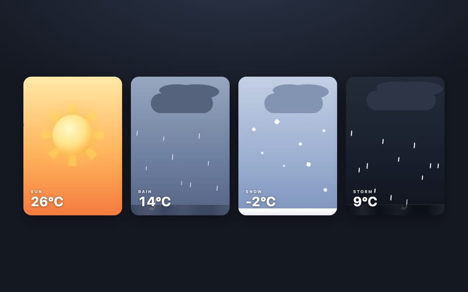
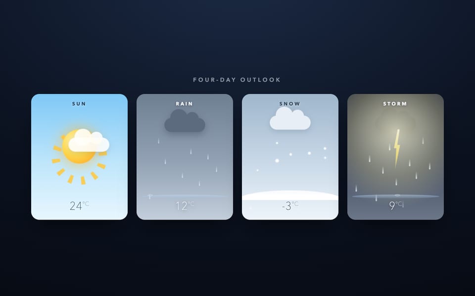
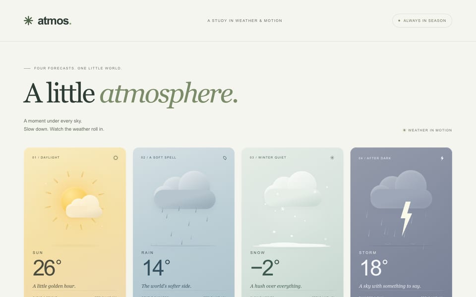
Four weather cards — CSS only, built by Flint
NVFP4via DaBenchllama.cpp
111tok/s
First token included
26.3Ktokens
3m 57s
Show the code the model wroteHide the code
<!DOCTYPE html>
<html lang="en">
<head>
  <meta charset="UTF-8">
  <meta name="viewport" content="width=device-width, initial-scale=1.0">
  <title>Weather Cards</title>
  <style>
    * { box-sizing: border-box; }
    body {
      margin: 0;
      min-height: 100vh;
      display: flex;
      align-items: center;
      justify-content: center;
      background: #0e1626;
      font-family: system-ui, -apple-system, BlinkMacSystemFont, 'Segoe UI', sans-serif;
      padding: 24px;
    }
    .weather-row {
      display: flex;
      flex-wrap: wrap;
      gap: 24px;
      justify-content: center;
      align-items: stretch;
      width: 100%;
      max-width: 1500px;
    }
    .card {
      position: relative;
      width: min(280px, 45vw);
      min-height: 300px;
      border-radius: 32px;
      padding: 20px;
      display: flex;
      flex-direction: column;
      justify-content: space-between;
      overflow: hidden;
      background: linear-gradient(180deg, #4fb3f1 0%, #8ed2ff 55%, #dcf3ff 100%);
      color: #0f2a44;
      box-shadow: 0 20px 40px rgba(10, 40, 70, 0.25), inset 0 0 0 1px rgba(255, 255, 255, 0.6);
    }
    .card.storm {
      background: linear-gradient(180deg, #2a3a5c 0%, #1b2742 55%, #121a30 100%);
      color: #e8f1ff;
      box-shadow: 0 20px 40px rgba(0, 0, 0, 0.5), inset 0 0 0 1px rgba(255, 255, 255, 0.15);
    }
    .info { position: relative; z-index: 3; }
    .label {
      display: block;
      font-size: 12px;
      letter-spacing: 0.35em;
      text-transform: uppercase;
      font-weight: 700;
      opacity: 0.75;
    }
    .temp {
      display: block;
      font-size: 60px;
      font-weight: 200;
      line-height: 1;
      margin-top: 4px;
      letter-spacing: -0.05em;
    }
    .scene { position: absolute; inset: 0; z-index: 2; pointer-events: none; }

    /* Sun */
    .sun-disc {
      position: absolute;
      top: 55%;
      left: 50%;
      transform: translate(-50%, -50%);
      width: 92px;
      height: 92px;
      border-radius: 50%;
      background: radial-gradient(circle at 35% 35%, #fffbe8, #ffe066 45%, #ffb703 75%, #fb8500);
      box-shadow: 0 0 24px 10px rgba(255, 215, 64, 0.55), 0 0 60px 30px rgba(255, 160, 50, 0.35);
      animation: sun-pulse 3.2s ease-in-out infinite;
      animation-delay: -1s;
      z-index: 2;
    }
    .rays {
      position: absolute;
      top: 50%;
      left: 50%;
      width: 200px;
      height: 200px;
      transform: translate(-50%, -50%);
      border-radius: 50%;
      background: repeating-conic-gradient(from 0deg, rgba(255, 215, 61, 0.85) 0deg 12deg, rgba(255, 215, 61, 0) 12deg 24deg);
      animation: spin 16s linear infinite;
      z-index: 1;
    }
    .cloud-sun {
      position: absolute;
      top: 12%;
      left: 50%;
      transform: translateX(-50%);
      width: 90px;
      height: 28px;
      background: #fff;
      border-radius: 999px;
      animation: drift 12s ease-in-out infinite;
      z-index: 3;
    }
    .cloud-sun::before, .cloud-sun::after { content: ''; position: absolute; background: inherit; border-radius: 50%; }
    .cloud-sun::before { width: 45px; height: 45px; top: -22px; left: 12px; }
    .cloud-sun::after { width: 32px; height: 32px; top: -14px; right: 12px; }

    /* Rain */
    .cloud {
      position: absolute;
      top: 10%;
      left: 50%;
      transform: translateX(-50%);
      width: 130px;
      height: 40px;
      background: #dfe7ee;
      border-radius: 999px;
      animation: none;
      z-index: 2;
    }
    .cloud::before, .cloud::after { content: ''; position: absolute; background: inherit; border-radius: 50%; }
    .cloud::before { width: 70px; height: 70px; top: -35px; left: 12px; }
    .cloud::after { width: 50px; height: 50px; top: -20px; right: 12px; }
    .drop {
      position: absolute;
      top: 35px;
      width: 4px;
      height: 16px;
      background: linear-gradient(to bottom, transparent, #8fc1e8);
      border-radius: 2px;
      animation: rain-fall 0.9s linear infinite;
      opacity: 0;
    }
    .drop:nth-child(1) { left: 15%; animation-delay: 0s; }
    .drop:nth-child(2) { left: 30%; animation-delay: 0.2s; }
    .drop:nth-child(3) { left: 45%; animation-delay: 0.4s; }
    .drop:nth-child(4) { left: 60%; animation-delay: 0.6s; }
    .drop:nth-child(5) { left: 75%; animation-delay: 0.8s; }
    .drop:nth-child(6) { left: 90%; animation-delay: 1.0s; }
    .puddle {
      position: absolute;
      bottom: 0;
      left: 0;
      right: 0;
      height: 30px;
      background: linear-gradient(to top, #9ec9e8, #6ba3d0);
      border-top-left-radius: 20px;
      border-top-right-radius: 20px;
      opacity: 0.8;
    }

    /* Snow */
    .flake {
      position: absolute;
      top: -10px;
      border-radius: 50%;
      background: #fff;
      opacity: 0;
      animation: snow-fall 7s linear infinite;
    }
    .flake:nth-child(1) { width: 6px; height: 6px; left: 20%; animation-delay: 0s; }
    .flake:nth-child(2) { width: 8px; height: 8px; left: 40%; animation-delay: 2s; }
    .flake:nth-child(3) { width: 5px; height: 5px; left: 60%; animation-delay: 4s; }
    .flake:nth-child(4) { width: 9px; height: 9px; left: 80%; animation-delay: 6s; }
    .snow-ground {
      position: absolute;
      bottom: 0;
      left: 0;
      right: 0;
      height: 40px;
      background: linear-gradient(to top, #ffffff, #eef4ff);
      border-top-left-radius: 40px;
      border-top-right-radius: 40px;
      opacity: 0.9;
    }

    /* Storm */
    .storm-cloud { background: #3d4a63; }
    .storm-cloud::before, .storm-cloud::after { background: inherit; }
    .storm .drop { background: linear-gradient(to bottom, transparent, #54688c); width: 5px; height: 18px; animation-duration: 0.6s; }
    .lightning {
      position: absolute;
      inset: 0;
      background: #eaf4ff;
      opacity: 0;
      z-index: 20;
      pointer-events: none;
      animation: lightning 18s infinite;
      animation-delay: -2s;
    }

    /* Animations */
    @keyframes spin {
      from { transform: translate(-50%, -50%) rotate(0deg); }
      to { transform: translate(-50%, -50%) rotate(360deg); }
    }
    @keyframes sun-pulse {
      0%, 100% { box-shadow: 0 0 24px 10px rgba(255, 215, 64, 0.55), 0 0 60px 30px rgba(255, 160, 50, 0.35); }
      50% { box-shadow: 0 0 40px 18px rgba(255, 215, 64, 0.8), 0 0 90px 45px rgba(255, 160, 50, 0.5); }
    }
    @keyframes drift {
      0% { transform: translateX(-130%); }
      100% { transform: translateX(230%); }
    }
    @keyframes rain-fall {
      0% { transform: translateY(0); opacity: 0; }
      10% { opacity: 1; }
      90% { opacity: 1; }
      100% { transform: translateY(235px); opacity: 0; }
    }
    @keyframes snow-fall {
      0% { transform: translate(0, -10px); opacity: 0; }
      10% { opacity: 1; }
      100% { transform: translate(30px, 280px); opacity: 0; }
    }
    @keyframes lightning {
      0%, 100% { opacity: 0; }
      1% { opacity: 0.9; }
      1.5% { opacity: 0; }
      6% { opacity: 0.5; }
      6.5% { opacity: 0; }
      10% { opacity: 1; }
      10.5% { opacity: 0; }
      14% { opacity: 0; }
      16% { opacity: 0.8; }
      16.5% { opacity: 0; }
    }
  </style>
</head>
<body>
  <div class="weather-row">
    <article class="card day sun">
      <div class="info">
        <span class="label">SUN</span>
        <span class="temp">24°</span>
      </div>
      <div class="scene">
        <div class="sun-disc"></div>
        <div class="rays"></div>
        <div class="cloud-sun"></div>
      </div>
    </article>

    <article class="card day rain">
      <div class="info">
        <span class="label">RAIN</span>
        <span class="temp">18°</span>
      </div>
      <div class="scene">
        <div class="cloud"></div>
        <span class="drop"></span>
        <span class="drop"></span>
        <span class="drop"></span>
        <span class="drop"></span>
        <span class="drop"></span>
        <span class="drop"></span>
        <div class="puddle"></div>
      </div>
    </article>

    <article class="card day snow">
      <div class="info">
        <span class="label">SNOW</span>
        <span class="temp">6°</span>
      </div>
      <div class="scene">
        <div class="cloud"></div>
        <span class="flake"></span>
        <span class="flake"></span>
        <span class="flake"></span>
        <span class="flake"></span>
        <div class="snow-ground"></div>
      </div>
    </article>

    <article class="card storm">
      <div class="info">
        <span class="label">STORM</span>
        <span class="temp">15°</span>
      </div>
      <div class="scene">
        <div class="cloud storm-cloud"></div>
        <span class="drop"></span>
        <span class="drop"></span>
        <span class="drop"></span>
        <span class="drop"></span>
        <span class="drop"></span>
        <span class="drop"></span>
        <div class="lightning"></div>
      </div>
    </article>
  </div>
</body>
</html>
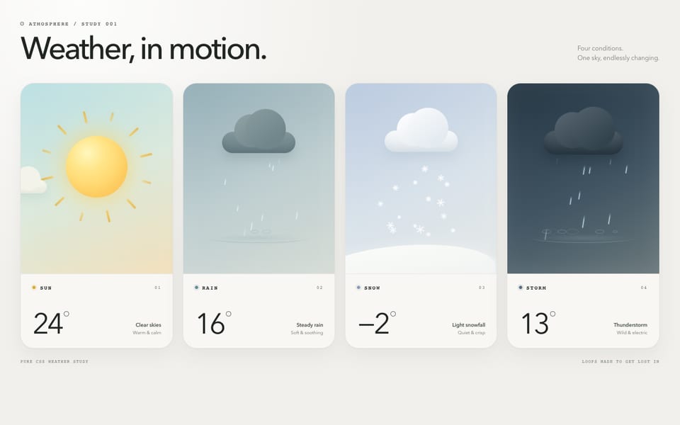
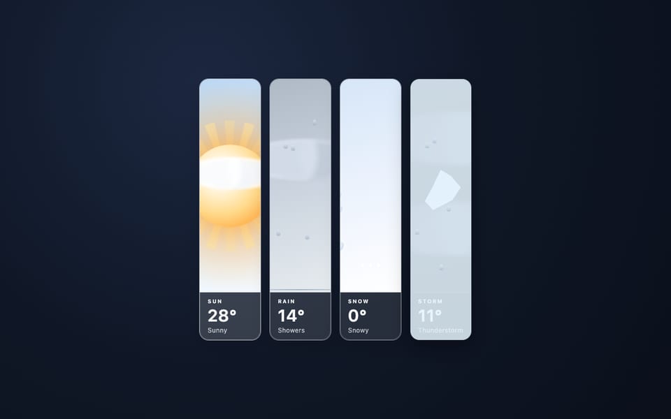
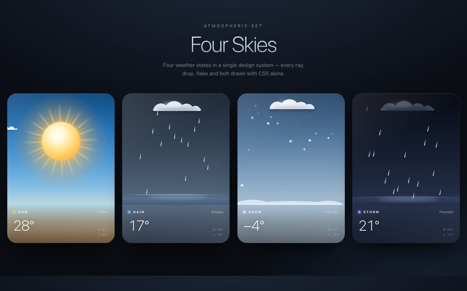
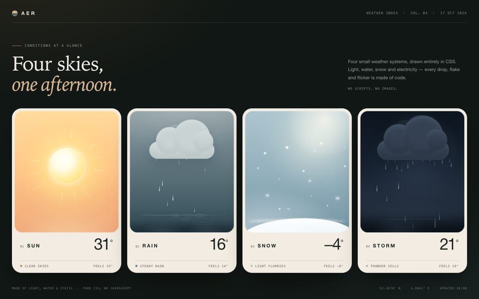
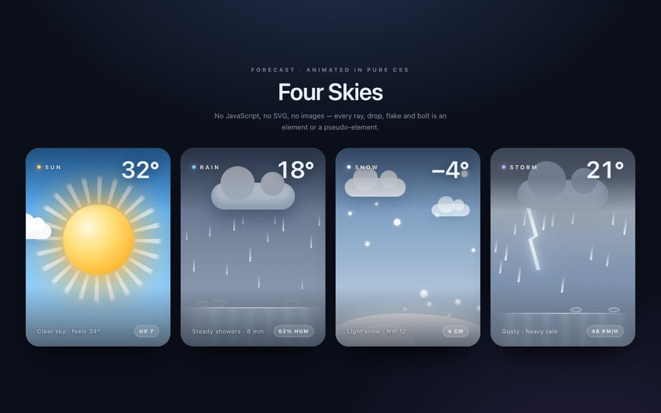
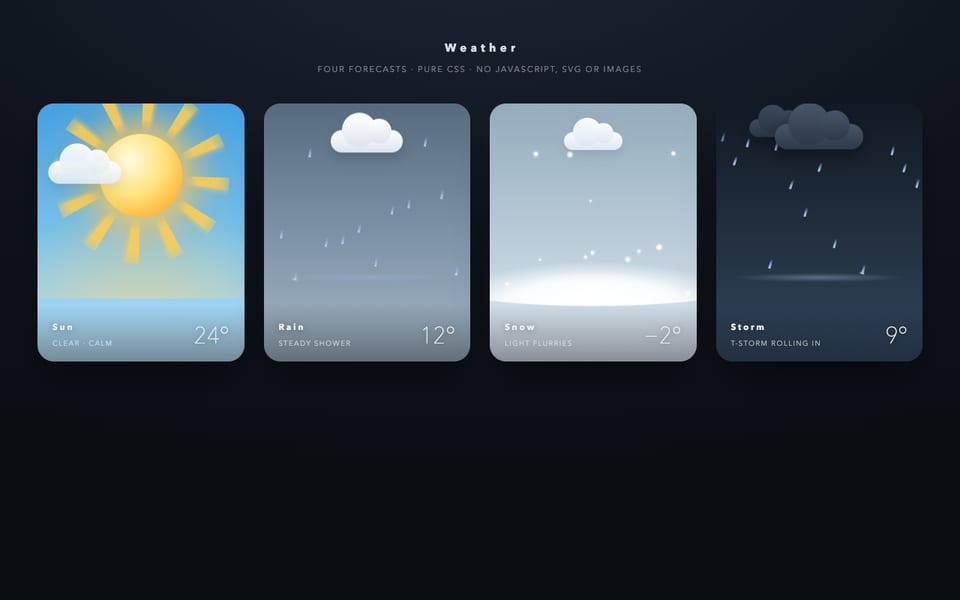
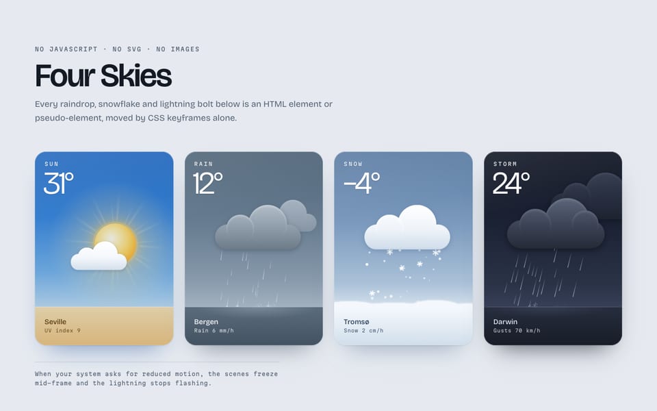
Same prompt, other models
One email when a new model lands on the board or in the showcase. Unsubscribe anytime.