
Four weather cards — CSS only, built by Mistral Large 4
Hostedvia OpenCodeOpenRouter
Show the code the model wroteHide the code
<!DOCTYPE html>
<html lang="en">
<head>
<meta charset="UTF-8">
<meta name="viewport" content="width=device-width, initial-scale=1.0">
<title>Weather Cards — Pure CSS</title>
<style>
  /* ============ Design tokens ============ */
  :root {
    --card-w: 260px;
    --card-h: 340px;
    --radius: 22px;
    --font: "Avenir Next", "Segoe UI", system-ui, -apple-system, sans-serif;
    --ink: #f4f7fb;
    --ink-dim: rgba(244, 247, 251, 0.72);
  }

  * { margin: 0; padding: 0; box-sizing: border-box; }

  body {
    min-height: 100vh;
    font-family: var(--font);
    background: radial-gradient(120% 120% at 50% -10%, #1b2a44 0%, #0b1220 60%, #070b14 100%);
    display: flex;
    flex-direction: column;
    align-items: center;
    justify-content: center;
    padding: 48px 24px;
    gap: 28px;
  }

  h1 {
    color: var(--ink);
    font-weight: 600;
    font-size: 15px;
    letter-spacing: 0.35em;
    text-transform: uppercase;
    opacity: 0.55;
  }

  /* ============ Responsive row → 2×2 grid ============ */
  .row {
    display: flex;
    flex-wrap: wrap;
    justify-content: center;
    gap: 24px;
    max-width: calc(var(--card-w) * 4 + 24px * 3 + 48px);
  }
  @media (max-width: 1180px) {
    .row { max-width: calc(var(--card-w) * 2 + 24px + 48px); }
  }

  /* ============ Card shell (shared design system) ============ */
  .card {
    position: relative;
    width: var(--card-w);
    height: var(--card-h);
    border-radius: var(--radius);
    overflow: hidden;
    box-shadow: 0 24px 50px -18px rgba(0, 0, 0, 0.65), inset 0 1px 0 rgba(255,255,255,0.08);
    color: var(--ink);
  }

  .card .sky {
    position: absolute;
    inset: 0;
    z-index: 0;
  }

  .card .label {
    position: absolute;
    z-index: 30;
    top: 18px;
    left: 0;
    right: 0;
    text-align: center;
    font-size: 13px;
    font-weight: 700;
    letter-spacing: 0.3em;
    text-transform: uppercase;
    color: var(--ink);
    text-shadow: 0 1px 6px rgba(0,0,0,0.4);
  }

  .card .temp {
    position: absolute;
    z-index: 30;
    bottom: 16px;
    left: 0;
    right: 0;
    text-align: center;
    font-size: 30px;
    font-weight: 300;
    letter-spacing: 0.02em;
    color: var(--ink);
    text-shadow: 0 2px 10px rgba(0,0,0,0.45);
  }
  .card .temp small {
    font-size: 15px;
    opacity: 0.7;
    vertical-align: super;
  }

  /* Shared cloud shape built from a main puff + two pseudo puffs */
  .cloud {
    position: absolute;
    width: 110px;
    height: 38px;
    border-radius: 40px;
    background: var(--cloud, #cfd8e3);
  }
  .cloud::before,
  .cloud::after {
    content: "";
    position: absolute;
    border-radius: 50%;
    background: inherit;
  }
  .cloud::before {
    width: 46px; height: 46px;
    top: -24px; left: 16px;
  }
  .cloud::after {
    width: 34px; height: 34px;
    top: -16px; right: 18px;
  }

  /* =========================================================
     SUN CARD
     ========================================================= */
  .card.sun .sky {
    background: linear-gradient(180deg, #7ec8f7 0%, #bfe6fb 55%, #e8f7ff 100%);
  }
  .card.sun .label, .card.sun .temp { color: #23405c; text-shadow: 0 1px 4px rgba(255,255,255,0.5); }

  .sun-disc {
    position: absolute;
    z-index: 2;
    top: 96px;
    left: 50%;
    width: 92px;
    height: 92px;
    margin-left: -46px;
    border-radius: 50%;
    background: radial-gradient(circle at 38% 35%, #fff7c2 0%, #ffd94d 45%, #ff9f1c 100%);
    box-shadow: 0 0 34px 10px rgba(255, 190, 60, 0.55);
    animation: sun-pulse 5s ease-in-out infinite;
  }

  /* Rotating rays: a conic-gradient ring masked into spokes */
  .sun-rays {
    position: absolute;
    z-index: 1;
    top: 96px;
    left: 50%;
    width: 150px;
    height: 150px;
    margin-left: -75px;
    border-radius: 50%;
    background: repeating-conic-gradient(
      from 0deg,
      rgba(255, 200, 60, 0.85) 0deg 9deg,
      rgba(255, 200, 60, 0) 9deg 30deg
    );
    -webkit-mask: radial-gradient(circle, transparent 52px, #000 53px, #000 74px, transparent 75px);
    mask: radial-gradient(circle, transparent 52px, #000 53px, #000 74px, transparent 75px);
    animation: spin 26s linear infinite;
  }

  /* A small drifting cloud that briefly dims the sun */
  .card.sun .cloud {
    --cloud: rgba(255, 255, 255, 0.92);
    z-index: 3;
    top: 118px;
    left: -130px;
    opacity: 0.95;
    filter: drop-shadow(0 6px 8px rgba(60, 90, 120, 0.18));
    animation: sun-cloud-drift 19s linear infinite;
  }

  @keyframes spin { to { transform: rotate(360deg); } }

  @keyframes sun-pulse {
    0%, 100% { box-shadow: 0 0 30px 8px rgba(255, 190, 60, 0.5); transform: scale(1); }
    50%      { box-shadow: 0 0 48px 16px rgba(255, 190, 60, 0.7); transform: scale(1.05); }
  }

  @keyframes sun-cloud-drift {
    0%   { transform: translateX(0);    opacity: 0; }
    6%   { opacity: 0.95; }
    38%  { transform: translateX(300px); opacity: 0.95; } /* passes over the sun */
    46%  { opacity: 0; }
    100% { transform: translateX(300px); opacity: 0; }
  }

  /* =========================================================
     RAIN CARD
     ========================================================= */
  .card.rain .sky {
    background: linear-gradient(180deg, #6f7f92 0%, #93a3b5 55%, #c3cedb 100%);
  }

  .card.rain .cloud {
    --cloud: #5c6b7d;
    z-index: 4;
    top: 64px;
    left: 50%;
    margin-left: -55px;
    filter: drop-shadow(0 8px 10px rgba(30, 40, 55, 0.3));
    animation: cloud-bob 6s ease-in-out infinite;
  }

  /* Raindrops: individual elements with staggered delays/offsets */
  .drop {
    position: absolute;
    z-index: 3;
    top: 108px;
    width: 3px;
    height: 16px;
    border-radius: 2px;
    background: linear-gradient(180deg, rgba(210, 230, 250, 0) 0%, rgba(210, 230, 250, 0.9) 100%);
    opacity: 0;
    animation: rainfall 1.15s linear infinite;
  }

  /* Splashes at the puddle line */
  .splash {
    position: absolute;
    z-index: 3;
    bottom: 64px;
    width: 14px;
    height: 5px;
    border-radius: 50%;
    border: 1.5px solid rgba(220, 238, 252, 0.85);
    opacity: 0;
    animation: splash 1.15s ease-out infinite;
  }

  /* Puddle line */
  .puddle {
    position: absolute;
    z-index: 2;
    left: 18px;
    right: 18px;
    bottom: 58px;
    height: 10px;
    border-radius: 50%;
    background: linear-gradient(180deg, rgba(190, 215, 240, 0.55), rgba(150, 180, 210, 0.25));
    animation: puddle-ripple 3.4s ease-in-out infinite;
  }

  @keyframes rainfall {
    0%   { transform: translateY(-10px); opacity: 0; }
    12%  { opacity: 1; }
    82%  { opacity: 1; }
    100% { transform: translateY(196px); opacity: 0; }
  }
  @keyframes splash {
    0%, 78% { transform: scale(0.2); opacity: 0; }
    84%     { transform: scale(1);   opacity: 0.9; }
    100%    { transform: scale(1.7); opacity: 0; }
  }
  @keyframes puddle-ripple {
    0%, 100% { transform: scaleX(1); opacity: 0.7; }
    50%      { transform: scaleX(1.06); opacity: 1; }
  }
  @keyframes cloud-bob {
    0%, 100% { transform: translateY(0); }
    50%      { transform: translateY(5px); }
  }

  /* =========================================================
     SNOW CARD
     ========================================================= */
  .card.snow .sky {
    background: linear-gradient(180deg, #9fb6cc 0%, #c9d9e8 55%, #eef5fb 100%);
  }
  .card.snow .label, .card.snow .temp { color: #2c4257; text-shadow: 0 1px 4px rgba(255,255,255,0.6); }

  .card.snow .cloud {
    --cloud: #e8eef5;
    z-index: 4;
    top: 58px;
    left: 50%;
    margin-left: -55px;
    filter: drop-shadow(0 6px 8px rgba(90, 110, 135, 0.25));
    animation: cloud-bob 7.5s ease-in-out infinite;
  }

  .flake {
    position: absolute;
    z-index: 3;
    top: 104px;
    border-radius: 50%;
    background: #ffffff;
    box-shadow: 0 0 4px rgba(255, 255, 255, 0.9);
    opacity: 0;
    animation: snowfall 5.5s linear infinite;
  }

  /* Snow accumulation drift at the bottom */
  .snow-drift {
    position: absolute;
    z-index: 2;
    left: -10px;
    right: -10px;
    bottom: 52px;
    height: 26px;
    background: radial-gradient(60% 100% at 20% 100%, #ffffff 0 60%, transparent 61%),
                radial-gradient(70% 100% at 55% 100%, #ffffff 0 60%, transparent 61%),
                radial-gradient(55% 100% at 85% 100%, #ffffff 0 60%, transparent 61%);
    background-color: rgba(255,255,255,0.85);
    border-radius: 50% 50% 0 0 / 100% 100% 0 0;
    animation: drift-rise 9s ease-in-out infinite;
  }

  @keyframes snowfall {
    0%   { transform: translate(0, -10px) rotate(0deg); opacity: 0; }
    10%  { opacity: 0.95; }
    50%  { transform: translate(var(--sway, 14px), 100px) rotate(180deg); }
    90%  { opacity: 0.9; }
    100% { transform: translate(calc(var(--sway, 14px) * -0.6), 210px) rotate(360deg); opacity: 0; }
  }
  @keyframes drift-rise {
    0%, 100% { transform: translateY(3px); }
    50%      { transform: translateY(-2px); }
  }

  /* =========================================================
     STORM CARD
     ========================================================= */
  .card.storm .sky {
    background: linear-gradient(180deg, #2b3242 0%, #454f63 55%, #6b7688 100%);
  }

  .card.storm .cloud {
    --cloud: #232a38;
    z-index: 4;
    top: 56px;
    left: 50%;
    margin-left: -55px;
    filter: drop-shadow(0 10px 12px rgba(0, 0, 0, 0.45));
    animation: cloud-bob 4.2s ease-in-out infinite;
  }

  /* Heavy rain — reuse .drop but denser/faster via a modifier */
  .card.storm .drop {
    height: 20px;
    width: 3.5px;
    background: linear-gradient(180deg, rgba(200, 220, 245, 0) 0%, rgba(200, 220, 245, 0.95) 100%);
    animation-duration: 0.72s;
  }
  .card.storm .splash { animation-duration: 0.72s; bottom: 64px; }
  .card.storm .puddle {
    background: linear-gradient(180deg, rgba(170, 200, 235, 0.6), rgba(120, 150, 190, 0.3));
    animation-duration: 2.1s;
  }

  /* Lightning overlay: lights the WHOLE card */
  .flash {
    position: absolute;
    inset: 0;
    z-index: 20;
    pointer-events: none;
    background: radial-gradient(80% 60% at 50% 30%, rgba(255, 252, 220, 0.95), rgba(255, 240, 160, 0.35) 60%, transparent 100%);
    opacity: 0;
    /* Long, irregular-feeling cycle: several chained keyframe timings */
    animation: lightning 11.3s linear infinite;
  }

  /* A jagged bolt drawn with clip-path (pure CSS shape, no SVG/img) */
  .bolt {
    position: absolute;
    z-index: 21;
    top: 96px;
    left: 50%;
    width: 26px;
    height: 110px;
    margin-left: -8px;
    background: linear-gradient(180deg, #fffbe0 0%, #ffe97a 60%, rgba(255, 233, 122, 0) 100%);
    clip-path: polygon(58% 0, 20% 46%, 44% 46%, 30% 100%, 82% 38%, 54% 38%, 78% 0);
    opacity: 0;
    filter: drop-shadow(0 0 10px rgba(255, 240, 150, 0.9));
    animation: bolt-flicker 11.3s linear infinite;
  }

  @keyframes lightning {
    /* calm */
    0%, 31%   { opacity: 0; }
    /* first strike: quick double-tap */
    32%       { opacity: 0.95; }
    33.5%     { opacity: 0.15; }
    34.5%     { opacity: 1; }
    36%       { opacity: 0; }
    /* long quiet gap */
    36.01%, 63% { opacity: 0; }
    /* second strike, slightly later & brighter */
    64%       { opacity: 1; }
    65%       { opacity: 0.2; }
    66%       { opacity: 0.9; }
    67.5%     { opacity: 0; }
    /* brief distant flicker */
    68%, 69%  { opacity: 0.35; }
    69.5%     { opacity: 0; }
    /* third strike near the end */
    88%       { opacity: 0.9; }
    89%       { opacity: 0.1; }
    90%       { opacity: 1; }
    91.5%     { opacity: 0; }
    100%      { opacity: 0; }
  }

  @keyframes bolt-flicker {
    0%, 31.5% { opacity: 0; transform: translateX(0) scaleY(1); }
    32%       { opacity: 1; transform: translateX(-3px) scaleY(1.05); }
    33.5%     { opacity: 0.2; }
    34.5%     { opacity: 1; transform: translateX(2px); }
    36%       { opacity: 0; }
    64%       { opacity: 1; transform: translateX(3px) scaleY(1.1); }
    65%       { opacity: 0.2; }
    66%       { opacity: 0.9; }
    67.5%     { opacity: 0; }
    88%       { opacity: 0.9; transform: translateX(-2px); }
    89%       { opacity: 0.15; }
    90%       { opacity: 1; }
    91.5%, 100% { opacity: 0; }
  }

  /* ============ Stagger the four cards so they never pulse in unison ============ */
  .card.sun   .sun-disc   { animation-delay: 0s; }
  .card.rain  .cloud     { animation-delay: -1.3s; }
  .card.rain  .drop      { /* per-drop delays set inline */ }
  .card.snow  .cloud     { animation-delay: -2.7s; }
  .card.storm .cloud     { animation-delay: -0.6s; }
  .card.storm .flash     { animation-delay: -4.1s; }
  .card.storm .bolt      { animation-delay: -4.1s; }
</style>
</head>
<body>

  <h1>Four-Day Outlook</h1>

  <div class="row">

    <!-- ================= SUN ================= -->
    <div class="card sun">
      <div class="sky"></div>
      <div class="sun-rays"></div>
      <div class="sun-disc"></div>
      <div class="cloud"></div>
      <div class="label">Sun</div>
      <div class="temp">24<small>°C</small></div>
    </div>

    <!-- ================= RAIN ================= -->
    <div class="card rain">
      <div class="sky"></div>
      <div class="cloud"></div>

      <!-- staggered raindrops: varied left offsets + delays so the loop never looks mechanical -->
      <span class="drop" style="left: 34px;  animation-delay: -0.00s"></span>
      <span class="drop" style="left: 58px;  animation-delay: -0.31s"></span>
      <span class="drop" style="left: 76px;  animation-delay: -0.62s"></span>
      <span class="drop" style="left: 99px;  animation-delay: -0.18s"></span>
      <span class="drop" style="left: 122px; animation-delay: -0.83s"></span>
      <span class="drop" style="left: 145px; animation-delay: -0.47s"></span>
      <span class="drop" style="left: 168px; animation-delay: -0.95s"></span>
      <span class="drop" style="left: 191px; animation-delay: -0.55s"></span>
      <span class="drop" style="left: 214px; animation-delay: -0.74s"></span>

      <!-- splashes aligned under drops -->
      <span class="splash" style="left: 30px;  animation-delay: -0.00s"></span>
      <span class="splash" style="left: 96px;  animation-delay: -0.62s"></span>
      <span class="splash" style="left: 140px; animation-delay: -0.18s"></span>
      <span class="splash" style="left: 186px; animation-delay: -0.83s"></span>
      <span class="splash" style="left: 208px; animation-delay: -0.47s"></span>

      <div class="puddle"></div>
      <div class="label">Rain</div>
      <div class="temp">12<small>°C</small></div>
    </div>

    <!-- ================= SNOW ================= -->
    <div class="card snow">
      <div class="sky"></div>
      <div class="cloud"></div>

      <!-- flakes: different sizes, sways, durations, delays -->
      <span class="flake" style="left: 28px;  width: 7px;  height: 7px;  --sway: 18px;  animation-duration: 6.2s; animation-delay: -0.4s"></span>
      <span class="flake" style="left: 52px;  width: 4px;  height: 4px;  --sway: -12px; animation-duration: 5.1s; animation-delay: -2.1s"></span>
      <span class="flake" style="left: 74px;  width: 9px;  height: 9px;  --sway: 22px;  animation-duration: 7.4s; animation-delay: -4.6s"></span>
      <span class="flake" style="left: 98px;  width: 5px;  height: 5px;  --sway: -18px; animation-duration: 5.8s; animation-delay: -1.2s"></span>
      <span class="flake" style="left: 120px; width: 6px;  height: 6px;  --sway: 14px;  animation-duration: 6.8s; animation-delay: -3.3s"></span>
      <span class="flake" style="left: 142px; width: 8px;  height: 8px;  --sway: -22px; animation-duration: 7.9s; animation-delay: -0.9s"></span>
      <span class="flake" style="left: 164px; width: 4px;  height: 4px;  --sway: 16px;  animation-duration: 5.4s; animation-delay: -5.2s"></span>
      <span class="flake" style="left: 186px; width: 7px;  height: 7px;  --sway: -14px; animation-duration: 6.5s; animation-delay: -2.8s"></span>
      <span class="flake" style="left: 208px; width: 5px;  height: 5px;  --sway: 20px;  animation-duration: 7.1s; animation-delay: -4.0s"></span>
      <span class="flake" style="left: 228px; width: 6px;  height: 6px;  --sway: -16px; animation-duration: 5.9s; animation-delay: -1.7s"></span>

      <div class="snow-drift"></div>
      <div class="label">Snow</div>
      <div class="temp">-3<small>°C</small></div>
    </div>

    <!-- ================= STORM ================= -->
    <div class="card storm">
      <div class="sky"></div>
      <div class="cloud"></div>

      <!-- heavy rain: more drops, tighter spacing -->
      <span class="drop" style="left: 22px;  animation-delay: -0.00s"></span>
      <span class="drop" style="left: 40px;  animation-delay: -0.21s"></span>
      <span class="drop" style="left: 58px;  animation-delay: -0.44s"></span>
      <span class="drop" style="left: 76px;  animation-delay: -0.09s"></span>
      <span class="drop" style="left: 94px;  animation-delay: -0.55s"></span>
      <span class="drop" style="left: 112px; animation-delay: -0.33s"></span>
      <span class="drop" style="left: 130px; animation-delay: -0.66s"></span>
      <span class="drop" style="left: 148px; animation-delay: -0.15s"></span>
      <span class="drop" style="left: 166px; animation-delay: -0.48s"></span>
      <span class="drop" style="left: 184px; animation-delay: -0.60s"></span>
      <span class="drop" style="left: 202px; animation-delay: -0.27s"></span>
      <span class="drop" style="left: 220px; animation-delay: -0.51s"></span>

      <span class="splash" style="left: 36px;  animation-delay: -0.21s"></span>
      <span class="splash" style="left: 90px;  animation-delay: -0.55s"></span>
      <span class="splash" style="left: 128px; animation-delay: -0.09s"></span>
      <span class="splash" style="left: 162px; animation-delay: -0.44s"></span>
      <span class="splash" style="left: 198px; animation-delay: -0.33s"></span>

      <div class="puddle"></div>
      <div class="bolt"></div>
      <div class="flash"></div>
      <div class="label">Storm</div>
      <div class="temp">9<small>°C</small></div>
    </div>

  </div>

</body>
</html>
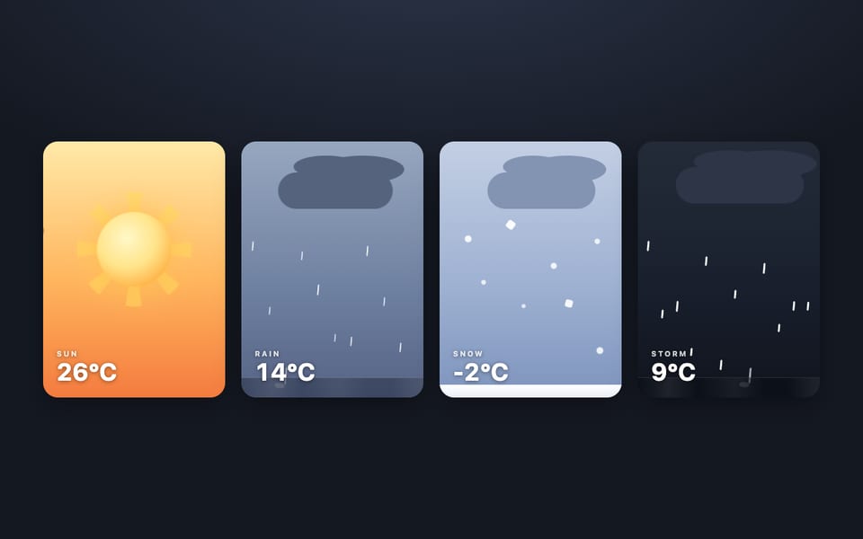
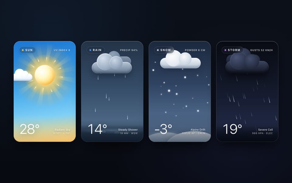
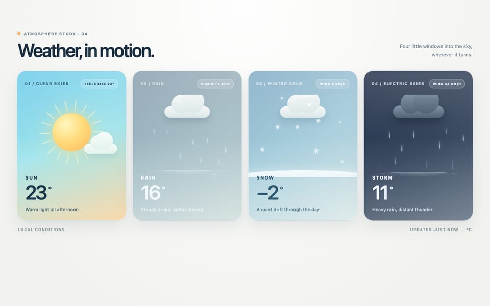
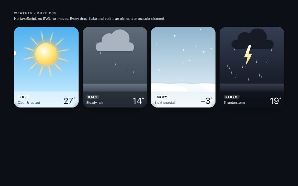
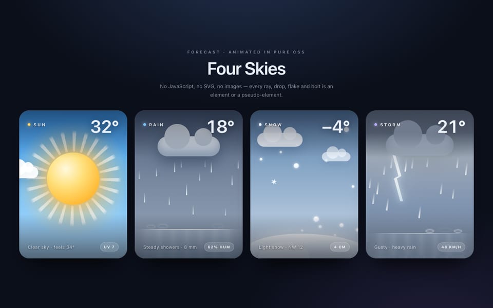
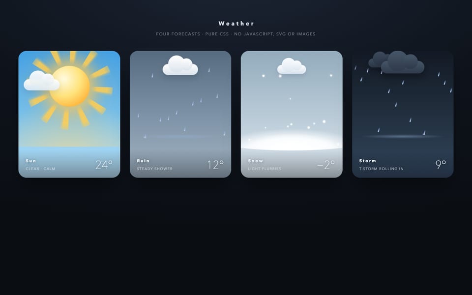
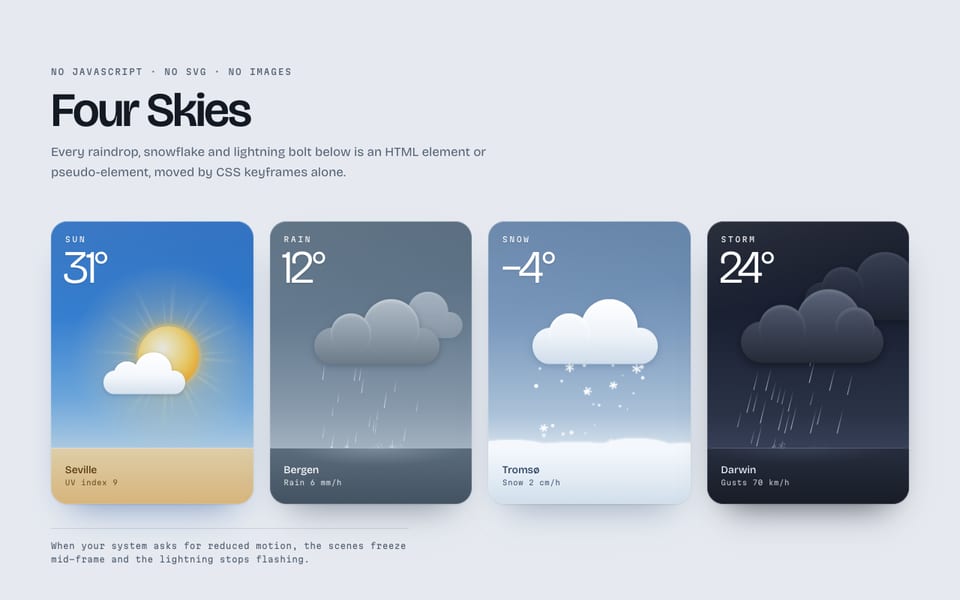
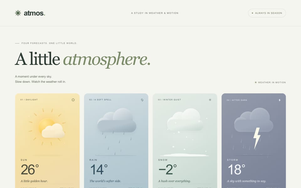
Same prompt, other models
One email when a new model lands on the board or in the showcase. Unsubscribe anytime.