
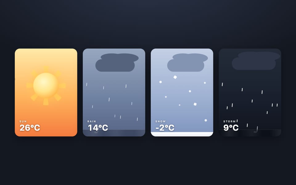
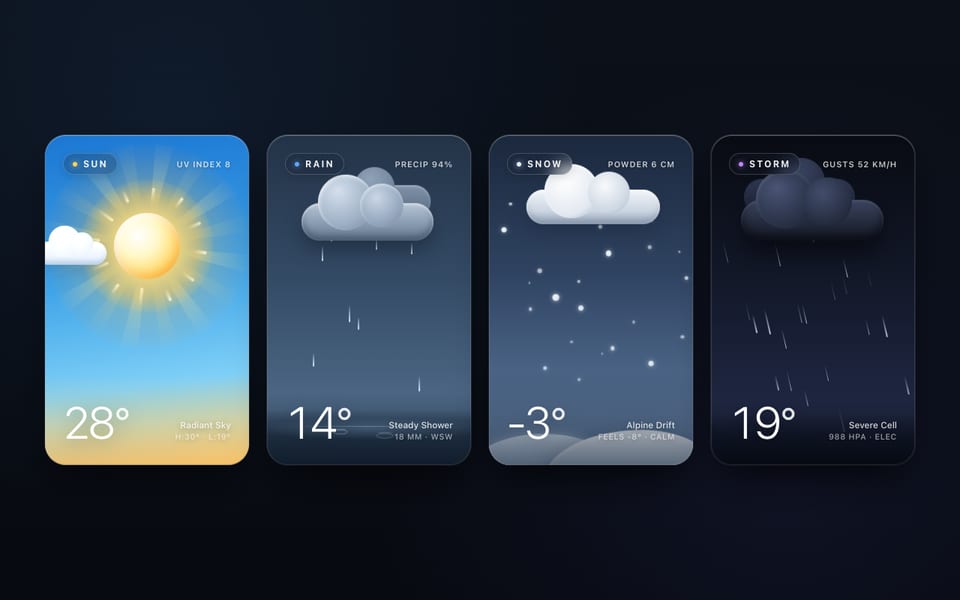
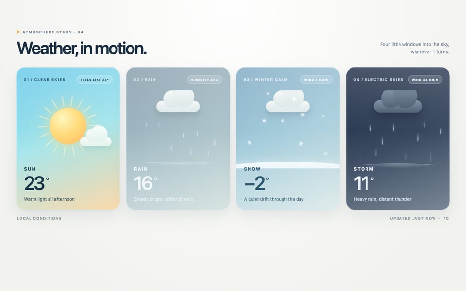
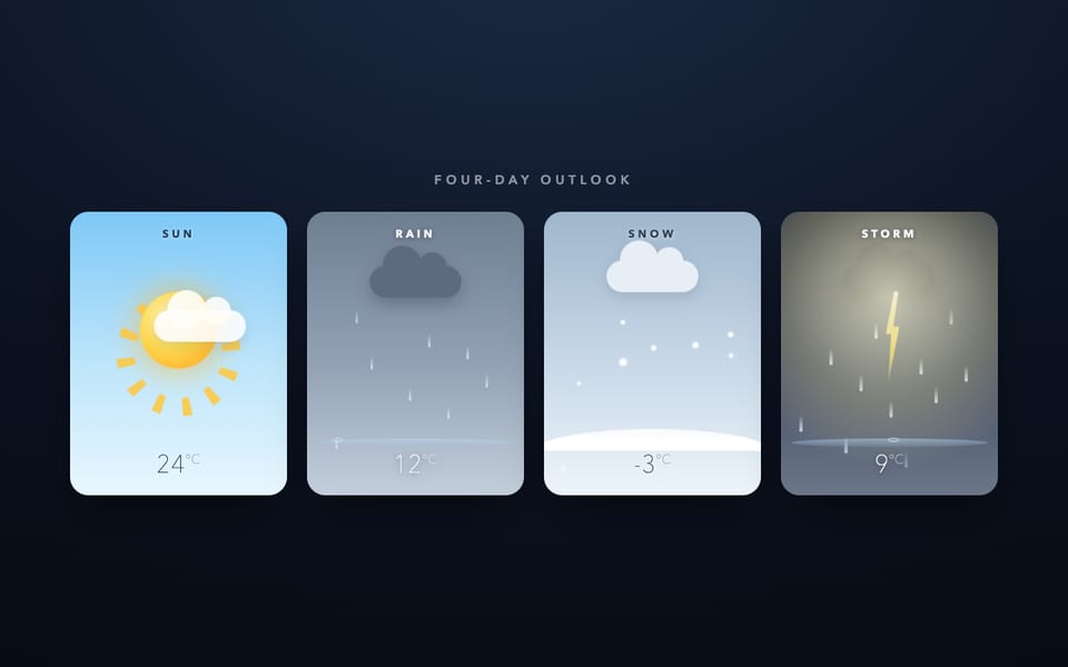
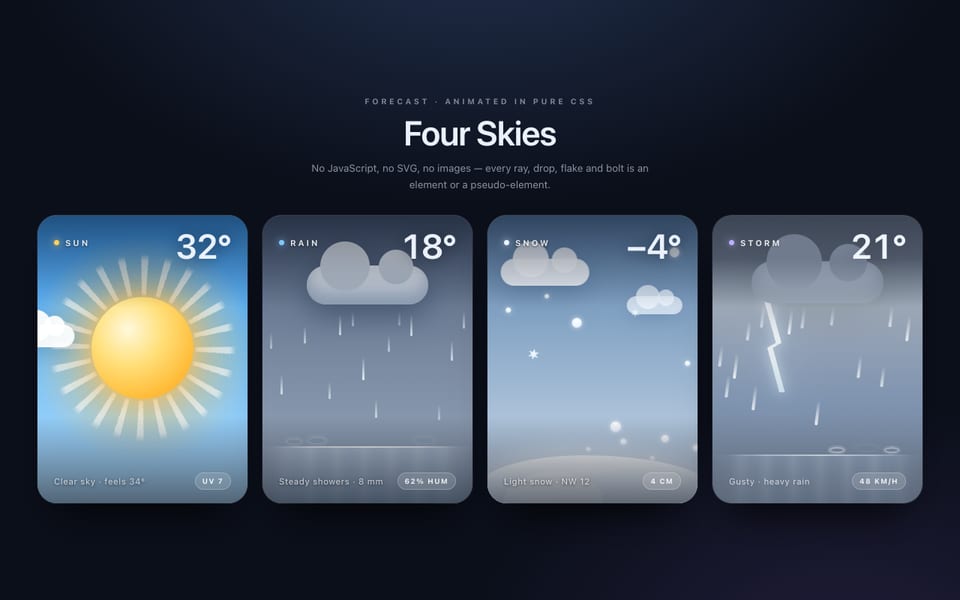
Four weather cards — CSS only, built by Claude Haiku 5.5
Hostedvia Claude CodeOpenRouter
Show the code the model wroteHide the code
<!doctype html>
<html lang="en">
<head>
<meta charset="utf-8">
<meta name="viewport" content="width=device-width, initial-scale=1">
<title>Weather cards · pure CSS</title>
<style>
:root {
--radius: 26px;
--page: #0c1016;
--ink-light: #13202d;
--ink-dark: #f4f8fc;
--glass-light: rgba(255, 255, 255, .42);
--glass-dark: rgba(6, 10, 16, .34);
--font: ui-rounded, "SF Pro Rounded", system-ui, -apple-system, "Segoe UI", Roboto, "Helvetica Neue", Arial, sans-serif;
}
* { box-sizing: border-box; }
html, body { margin: 0; }
body {
min-height: 100vh;
background: var(--page);
color: var(--ink-dark);
font-family: var(--font);
padding: 48px 16px 64px;
}
.gallery { max-width: 1160px; margin: 0 auto; }
.intro { margin: 0 0 28px; }
.eyebrow {
margin: 0 0 6px;
font-size: 13px;
font-weight: 700;
letter-spacing: .18em;
text-transform: uppercase;
opacity: .6;
}
.note { margin: 0; font-size: 15px; opacity: .75; }
.row {
display: grid;
grid-template-columns: repeat(4, minmax(0, 1fr));
gap: 18px;
}
@media (max-width: 880px) {
.row { grid-template-columns: repeat(2, minmax(0, 1fr)); gap: 14px; }
}
/* ---------- Shared card system ---------- */
.card {
--sky: linear-gradient(180deg, #4fb0ee 0%, #9fd9fb 62%, #d8f1ff 100%);
--ink: var(--ink-light);
--glass: var(--glass-light);
--chip: rgba(255, 255, 255, .55);
position: relative;
display: flex;
flex-direction: column;
aspect-ratio: 4 / 5;
border-radius: var(--radius);
overflow: hidden;
isolation: isolate;
container-type: inline-size;
background: var(--sky);
color: var(--ink);
box-shadow: 0 22px 40px -22px rgba(0, 0, 0, .7), inset 0 0 0 1px rgba(255, 255, 255, .12);
}
.card--snow {
--sky: linear-gradient(180deg, #8fb4cc 0%, #c9deeb 60%, #eef6fa 100%);
}
.card--rain {
--sky: linear-gradient(180deg, #5f6b79 0%, #444f5d 60%, #303a46 100%);
--ink: var(--ink-dark);
--glass: var(--glass-dark);
--chip: rgba(255, 255, 255, .14);
}
.card--storm {
--sky: linear-gradient(180deg, #353e52 0%, #1d2331 55%, #0d1119 100%);
--ink: var(--ink-dark);
--glass: var(--glass-dark);
--chip: rgba(255, 255, 255, .14);
}
.stage {
position: relative;
flex: 1;
min-height: 0;
overflow: hidden;
}
.meta {
position: relative;
z-index: 4;
display: flex;
align-items: flex-end;
justify-content: space-between;
gap: 8px;
padding: 12px 14px 13px 16px;
background: var(--glass);
-webkit-backdrop-filter: blur(8px);
backdrop-filter: blur(8px);
}
.label {
display: inline-block;
padding: 4px 9px 3px;
border-radius: 999px;
background: var(--chip);
font-size: 11px;
font-weight: 800;
letter-spacing: .2em;
line-height: 1;
}
.cond {
display: block;
margin-top: 7px;
font-size: clamp(11px, 5.4cqi, 14px);
opacity: .8;
}
.temp {
font-size: clamp(30px, 13cqi, 46px);
font-weight: 300;
line-height: .85;
letter-spacing: -.03em;
font-variant-numeric: tabular-nums;
white-space: nowrap;
}
.temp sup {
font-size: .45em;
font-weight: 500;
vertical-align: top;
margin-left: 2px;
}
/* Clouds: one base pill plus two puffs (pseudo-elements). */
.cloud {
--cloud: #ffffff;
position: absolute;
z-index: 2;
border-radius: 999px;
background: var(--cloud);
filter: drop-shadow(0 1cqi 1.5cqi rgba(20, 40, 60, .2));
}
.cloud::before,
.cloud::after {
content: "";
position: absolute;
border-radius: 50%;
background: var(--cloud);
}
/* ---------- Sun ---------- */
.sun {
position: absolute;
inset: 0;
animation: sun-dim 24s ease-in-out infinite;
}
.sun-disc,
.sun-rays {
position: absolute;
left: 50%;
top: 42%;
translate: -50% -50%;
}
.sun-disc {
width: 34cqi;
height: 34cqi;
border-radius: 50%;
background: radial-gradient(circle at 40% 36%, #fffef4 0%, #ffe77f 44%, #ffb640 100%);
animation: sun-pulse 5.5s ease-in-out -1.7s infinite;
}
.sun-rays {
width: 100cqi;
height: 100cqi;
background: repeating-conic-gradient(
from 0deg,
rgba(255, 238, 170, .7) 0deg 4deg,
rgba(255, 238, 170, 0) 4deg 30deg
);
-webkit-mask: radial-gradient(circle closest-side, transparent 0 36%, #000 40% 58%, transparent 76%);
mask: radial-gradient(circle closest-side, transparent 0 36%, #000 40% 58%, transparent 76%);
animation: spin 48s linear infinite;
}
.cloud--sun {
--cloud: #ffffff;
left: 0;
top: 36%;
width: 32cqi;
height: 9cqi;
animation: sun-cloud 24s linear infinite;
}
.cloud--sun::before { width: 13cqi; height: 13cqi; left: 4.5cqi; bottom: 3.5cqi; }
.cloud--sun::after { width: 16cqi; height: 16cqi; left: 12cqi; bottom: 3.5cqi; }
/* ---------- Rain ---------- */
.cloud--rain {
--cloud: #aab4c0;
left: 20%;
top: 24%;
width: 60cqi;
height: 14cqi;
animation: drift 7.4s ease-in-out -2.1s infinite alternate;
}
.cloud--rain::before { width: 24cqi; height: 24cqi; left: 9cqi; bottom: 4cqi; }
.cloud--rain::after { width: 30cqi; height: 30cqi; left: 23cqi; bottom: 4cqi; }
/* A lane is one static element. Its ::before is the falling drop and its
::after is the splash, so both share one timeline without a moving parent. */
.lane {
position: absolute;
left: var(--x);
top: 22%;
height: 66%;
width: 0;
z-index: 1;
}
.lane::before {
content: "";
position: absolute;
left: 0;
width: 2px;
height: var(--len, 12px);
margin-left: -1px;
border-radius: 2px;
background: linear-gradient(rgba(214, 232, 248, 0), rgba(226, 240, 252, .95));
opacity: 0;
animation: fall var(--d) linear var(--t) infinite;
}
.lane::after {
content: "";
position: absolute;
left: -7px;
bottom: -3px;
width: 14px;
height: 5px;
border: 1px solid rgba(226, 240, 252, .8);
border-radius: 50%;
opacity: 0;
transform: scale(0);
animation: splash var(--d) linear var(--t) infinite;
}
.puddle {
position: absolute;
left: 0;
right: 0;
bottom: 0;
top: 88%;
z-index: 1;
background: linear-gradient(180deg, rgba(210, 226, 240, .34), rgba(210, 226, 240, .06));
box-shadow: inset 0 1px 0 rgba(235, 245, 252, .55);
animation: shimmer 6s ease-in-out infinite alternate;
}
/* ---------- Snow ---------- */
.flake {
position: absolute;
left: var(--x);
top: -6%;
width: var(--s);
height: var(--s);
margin-left: calc(var(--s) / -2);
border-radius: 50%;
background: radial-gradient(circle, #ffffff 60%, rgba(255, 255, 255, .4) 72%, rgba(255, 255, 255, 0) 74%);
box-shadow: 0 0 calc(var(--s) * .8) rgba(255, 255, 255, .55);
opacity: 0;
z-index: 1;
animation:
snowfall var(--d) linear var(--t) infinite,
sway var(--sw) ease-in-out var(--t) infinite alternate;
}
.pile {
position: absolute;
left: -6%;
right: -6%;
bottom: -1px;
height: 14%;
z-index: 1;
background:
radial-gradient(46% 100% at 14% 100%, #ffffff 90%, rgba(255, 255, 255, 0) 100%),
radial-gradient(40% 100% at 47% 100%, #f5faff 90%, rgba(245, 250, 255, 0) 100%),
radial-gradient(44% 100% at 80% 100%, #ffffff 90%, rgba(255, 255, 255, 0) 100%);
filter: drop-shadow(0 -1px 1.5px rgba(40, 70, 100, .25));
}
/* ---------- Thunderstorm ---------- */
.cloud--storm {
--cloud: #161b26;
left: 17%;
top: 20%;
width: 66cqi;
height: 14cqi;
animation: drift 6.1s ease-in-out -3.1s infinite alternate;
}
.cloud--storm::before { width: 22cqi; height: 22cqi; left: 10cqi; bottom: 4cqi; }
.cloud--storm::after { width: 28cqi; height: 28cqi; left: 27cqi; bottom: 4cqi; }
.card--storm .lane {
--len: 16px;
transform: rotate(10deg);
transform-origin: 0 0;
}
.card--storm .puddle {
background: linear-gradient(180deg, rgba(170, 190, 220, .26), rgba(170, 190, 220, .03));
}
.bolt {
position: absolute;
top: 28%;
left: 36%;
width: 16cqi;
height: 34cqi;
z-index: 3;
background: linear-gradient(180deg, #ffffff, #fff1a6 50%, #ffd45c);
clip-path: polygon(58% 0, 12% 56%, 46% 56%, 24% 100%, 90% 40%, 56% 40%, 80% 0);
opacity: 0;
animation: bolt 31.4s linear infinite;
}
/* Sits above the footer too, so the whole card lights up. */
.flash {
position: absolute;
inset: 0;
z-index: 5;
pointer-events: none;
background: radial-gradient(120% 80% at 50% 10%, #ffffff 0%, #e4ebff 60%, #cdd8f5 100%);
opacity: 0;
animation: storm-flash 31.4s linear infinite;
}
/* ---------- Keyframes ---------- */
@keyframes spin {
to { transform: rotate(360deg); }
}
@keyframes sun-pulse {
0%, 100% {
box-shadow: 0 0 3cqi 0 rgba(255, 205, 90, .55), 0 0 9cqi 2cqi rgba(255, 176, 70, .28);
}
50% {
box-shadow: 0 0 6cqi 2cqi rgba(255, 220, 110, .9), 0 0 20cqi 6cqi rgba(255, 184, 80, .42);
}
}
/* The cloud crosses the disc between roughly 14% and 29% of the cycle. */
@keyframes sun-dim {
0%, 12%, 100% { filter: brightness(1); }
16%, 24% { filter: brightness(.72); }
30% { filter: brightness(1); }
}
/* Starts fully off the left edge and ends off the right edge, so the reset is invisible. */
@keyframes sun-cloud {
0% { transform: translateX(-70cqi); }
42%, 100% { transform: translateX(130cqi); }
}
@keyframes drift {
from { transform: translateX(-1.2cqi); }
to { transform: translateX(1.2cqi); }
}
@keyframes fall {
0% { top: -8%; opacity: 0; }
6% { opacity: .95; }
97% { top: calc(100% - var(--len, 12px)); opacity: .95; }
100% { top: calc(100% - var(--len, 12px)); opacity: 0; }
}
@keyframes splash {
0%, 96% { opacity: 0; transform: scale(.1); }
97% { opacity: .9; transform: scale(.35); }
100% { opacity: 0; transform: scale(2.1); }
}
@keyframes shimmer {
from { opacity: .75; }
to { opacity: 1; }
}
@keyframes snowfall {
0% { top: -6%; opacity: 0; }
8% { opacity: .95; }
84% { opacity: .95; }
100% { top: 88%; opacity: 0; }
}
@keyframes sway {
from { transform: translateX(-2.2cqi); }
to { transform: translateX(2.2cqi); }
}
/* Percentages are of the 31.4s cycle. Each strike is a 1–3 frame flash, and the bolt
holds briefly after it. Strikes come in clusters at uneven gaps, so it never reads
as a regular strobe. Both timelines use the same stops, so the bolt and flash stay in sync. */
@keyframes storm-flash {
0%, 6.1% { opacity: 0; }
6.2% { opacity: .92; }
6.3%, 11.7% { opacity: 0; }
11.8% { opacity: .9; }
11.9%, 12% { opacity: 0; }
12.02% { opacity: .8; }
12.12%, 47.2% { opacity: 0; }
47.3% { opacity: .95; }
47.4% { opacity: .5; }
47.45% { opacity: .95; }
47.55%, 58.8% { opacity: 0; }
58.9% { opacity: .9; }
58.99%, 59.05% { opacity: 0; }
59.06% { opacity: .7; }
59.14%, 83.5% { opacity: 0; }
83.6% { opacity: .85; }
83.7%, 100% { opacity: 0; }
}
@keyframes bolt {
0%, 6.1% { opacity: 0; left: 36%; }
6.2%, 6.6% { opacity: 1; left: 36%; }
6.75% { opacity: 0; left: 36%; }
11.6% { opacity: 0; left: 58%; }
11.8%, 12.2% { opacity: 1; left: 58%; }
12.3% { opacity: 0; left: 58%; }
47.2% { opacity: 0; left: 46%; }
47.3%, 47.7% { opacity: 1; left: 46%; }
47.85% { opacity: 0; left: 46%; }
58.8% { opacity: 0; left: 64%; }
58.9%, 59.3% { opacity: 1; left: 64%; }
59.45% { opacity: 0; left: 64%; }
83.5% { opacity: 0; left: 52%; }
83.6%, 84% { opacity: 1; left: 52%; }
84.15%, 100% { opacity: 0; left: 52%; }
}
@media (prefers-reduced-motion: reduce) {
*, *::before, *::after { animation-play-state: paused !important; }
}
</style>
</head>
<body>
<main class="gallery">
<header class="intro">
<p class="eyebrow">Weather · pure CSS</p>
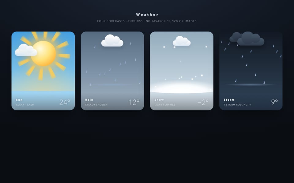
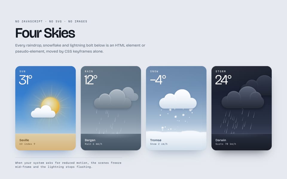
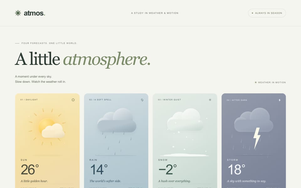
<p class="note">No JavaScript, no SVG, no images. Every drop, flake and bolt is an element or pseudo-element.</p>
</header>
<div class="row">
<!-- SUN -->
<article class="card card--sun" aria-label="Sun, 27 degrees, clear and radiant">
<div class="stage" aria-hidden="true">
<div class="sun">
<span class="sun-rays"></span>
<span class="sun-disc"></span>
</div>
<span class="cloud cloud--sun"></span>
</div>
<footer class="meta">
<div>
<span class="label">SUN</span>
<span class="cond">Clear & radiant</span>
</div>
<span class="temp">27<sup>°</sup></span>
</footer>
</article>
<!-- RAIN -->
<article class="card card--rain" aria-label="Rain, 14 degrees, steady rain">
<div class="stage" aria-hidden="true">
<span class="lane" style="--x: 22%; --d: 1.18s; --t: -0.41s"></span>
<span class="lane" style="--x: 28%; --d: 0.93s; --t: -0.07s"></span>
<span class="lane" style="--x: 33%; --d: 1.31s; --t: -0.83s"></span>
<span class="lane" style="--x: 39%; --d: 1.07s; --t: -0.29s"></span>
<span class="lane" style="--x: 45%; --d: 0.86s; --t: -0.60s"></span>
<span class="lane" style="--x: 51%; --d: 1.22s; --t: -1.05s"></span>
<span class="lane" style="--x: 57%; --d: 1.01s; --t: -0.18s"></span>
<span class="lane" style="--x: 63%; --d: 1.37s; --t: -0.95s"></span>
<span class="lane" style="--x: 69%; --d: 0.97s; --t: -0.52s"></span>
<span class="lane" style="--x: 74%; --d: 1.13s; --t: -0.73s"></span>
<span class="lane" style="--x: 79%; --d: 1.27s; --t: -0.12s"></span>
<span class="cloud cloud--rain"></span>
<span class="puddle"></span>
</div>
<footer class="meta">
<div>
<span class="label">RAIN</span>
<span class="cond">Steady rain</span>
</div>
<span class="temp">14<sup>°</sup></span>
</footer>
</article>
<!-- SNOW -->
<article class="card card--snow" aria-label="Snow, minus 3 degrees, light snowfall">
<div class="stage" aria-hidden="true">
<span class="flake" style="--x: 6%; --s: 3px; --d: 9.4s; --t: -1.2s; --sw: 3.1s"></span>
<span class="flake" style="--x: 14%; --s: 5px; --d: 11.2s; --t: -6.5s; --sw: 3.8s"></span>
<span class="flake" style="--x: 22%; --s: 2.5px; --d: 8.1s; --t: -3.3s; --sw: 2.7s"></span>
<span class="flake" style="--x: 29%; --s: 4px; --d: 10.3s; --t: -8.8s; --sw: 3.4s"></span>
<span class="flake" style="--x: 36%; --s: 6px; --d: 12.4s; --t: -0.4s; --sw: 4.1s"></span>
<span class="flake" style="--x: 43%; --s: 3px; --d: 7.6s; --t: -4.7s; --sw: 2.6s"></span>
<span class="flake" style="--x: 49%; --s: 4.5px; --d: 9.9s; --t: -2.2s; --sw: 3.3s"></span>
<span class="flake" style="--x: 56%; --s: 2.5px; --d: 8.8s; --t: -7.1s; --sw: 2.9s"></span>
<span class="flake" style="--x: 62%; --s: 5px; --d: 11.7s; --t: -5.0s; --sw: 3.6s"></span>
<span class="flake" style="--x: 69%; --s: 3px; --d: 7.9s; --t: -0.9s; --sw: 2.8s"></span>
<span class="flake" style="--x: 75%; --s: 4px; --d: 10.6s; --t: -9.6s; --sw: 3.7s"></span>
<span class="flake" style="--x: 81%; --s: 6px; --d: 12.9s; --t: -3.9s; --sw: 4.2s"></span>
<span class="flake" style="--x: 87%; --s: 2.5px; --d: 8.4s; --t: -6.0s; --sw: 2.7s"></span>
<span class="flake" style="--x: 92%; --s: 4px; --d: 9.7s; --t: -1.9s; --sw: 3.2s"></span>
<span class="flake" style="--x: 25%; --s: 3.5px; --d: 11.0s; --t: -8.2s; --sw: 3.9s"></span>
<span class="flake" style="--x: 52%; --s: 3px; --d: 7.2s; --t: -2.7s; --sw: 2.5s"></span>
<span class="pile"></span>
</div>
<footer class="meta">
<div>
<span class="label">SNOW</span>
<span class="cond">Light snowfall</span>
</div>
<span class="temp">−3<sup>°</sup></span>
</footer>
</article>
<!-- THUNDERSTORM -->
<article class="card card--storm" aria-label="Thunderstorm, 19 degrees, heavy rain and lightning">
<div class="stage" aria-hidden="true">
<span class="cloud cloud--storm"></span>
<span class="lane" style="--x: 19%; --d: 0.61s; --t: -0.12s"></span>
<span class="lane" style="--x: 23%; --d: 0.54s; --t: -0.44s"></span>
<span class="lane" style="--x: 25.5%; --d: 0.73s; --t: -0.27s"></span>
<span class="lane" style="--x: 27%; --d: 0.58s; --t: -0.69s"></span>
<span class="lane" style="--x: 31%; --d: 0.67s; --t: -0.05s"></span>
<span class="lane" style="--x: 35%; --d: 0.50s; --t: -0.36s"></span>
<span class="lane" style="--x: 39%; --d: 0.78s; --t: -0.58s"></span>
<span class="lane" style="--x: 43%; --d: 0.63s; --t: -0.21s"></span>
<span class="lane" style="--x: 47%; --d: 0.56s; --t: -0.77s"></span>
<span class="lane" style="--x: 51%; --d: 0.71s; --t: -0.31s"></span>
<span class="lane" style="--x: 55%; --d: 0.52s; --t: -0.49s"></span>
<span class="lane" style="--x: 59%; --d: 0.69s; --t: -0.09s"></span>
<span class="lane" style="--x: 63%; --d: 0.60s; --t: -0.63s"></span>
<span class="lane" style="--x: 65.5%; --d: 0.76s; --t: -0.26s"></span>
<span class="lane" style="--x: 67%; --d: 0.55s; --t: -0.72s"></span>
<span class="lane" style="--x: 71%; --d: 0.65s; --t: -0.41s"></span>
<span class="lane" style="--x: 75%; --d: 0.74s; --t: -0.03s"></span>
<span class="lane" style="--x: 79%; --d: 0.58s; --t: -0.54s"></span>
<span class="lane" style="--x: 83%; --d: 0.70s; --t: -0.18s"></span>
<span class="bolt"></span>
<span class="puddle"></span>
</div>
<footer class="meta">
<div>
<span class="label">STORM</span>
<span class="cond">Thunderstorm</span>
</div>
<span class="temp">19<sup>°</sup></span>
</footer>
<span class="flash" aria-hidden="true"></span>
</article>
</div>
</main>
</body>
</html>Same prompt, other models
One email when a new model lands on the board or in the showcase. Unsubscribe anytime.