
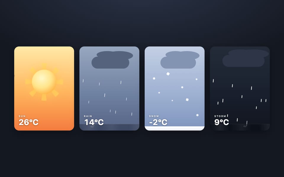
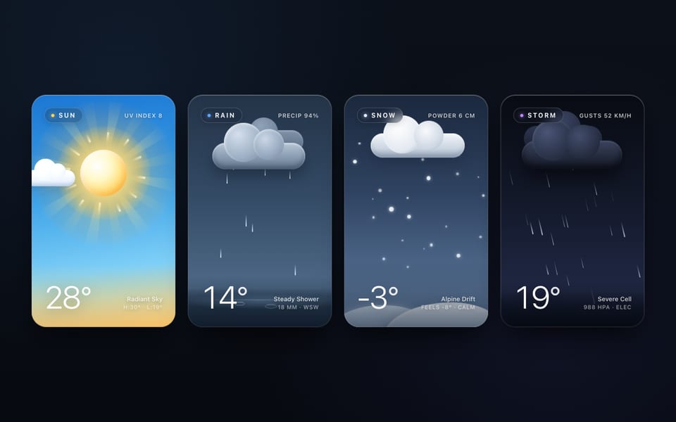
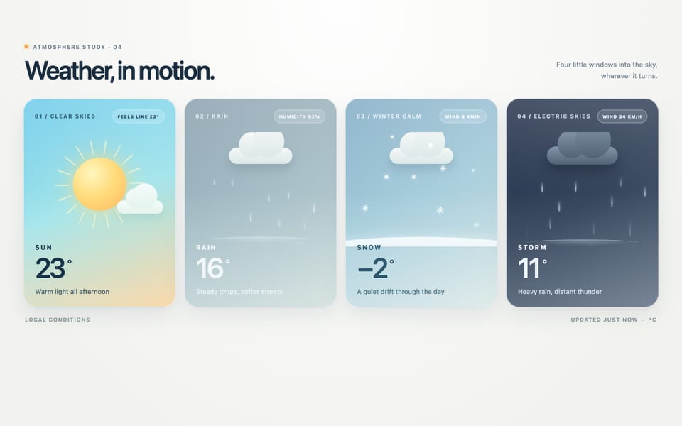
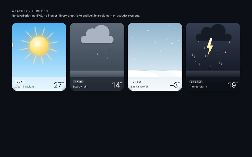
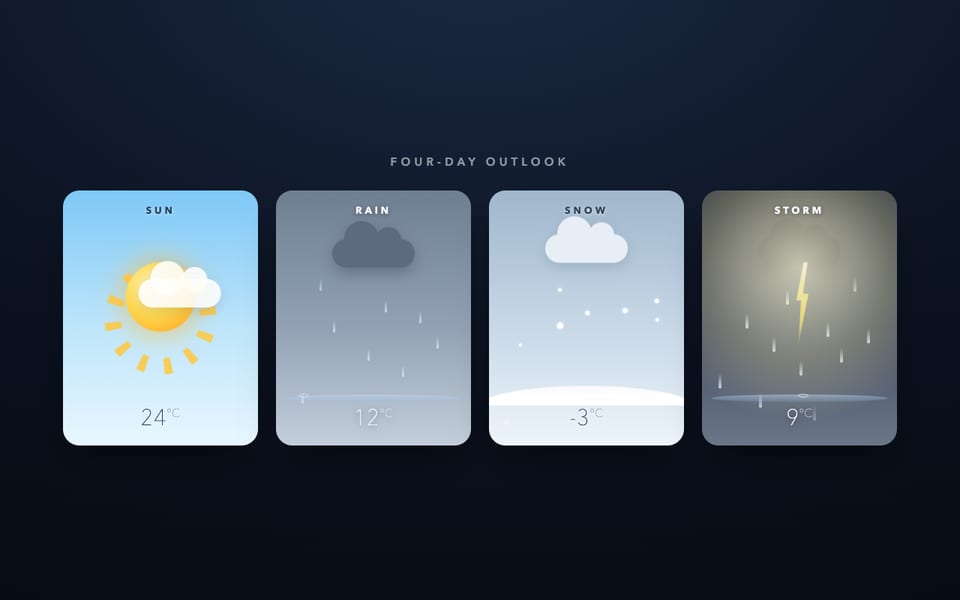
Four weather cards — CSS only, built by Ling 3.1 Flash
Hostedvia OpenCodeOpenRouter
Show the code the model wroteHide the code
<!doctype html>
<html lang="en">
<head>
<meta charset="utf-8" />
<meta name="viewport" content="width=device-width, initial-scale=1" />
<title>Weather — four pure-CSS cards</title>
<style>
/* ============================================================
Design system — one size, one radius, one typeface
============================================================ */
:root {
--card-h: 344px;
--radius: 22px;
--font: "Avenir Next", Futura, "Segoe UI", system-ui, -apple-system, "Helvetica Neue", sans-serif;
}
* { margin: 0; padding: 0; box-sizing: border-box; }
body {
min-height: 100vh;
font-family: var(--font);
background: radial-gradient(120% 90% at 50% -10%, #1c2534 0%, #0e131b 55%, #0a0e13 100%);
color: #e9eff5;
display: flex;
flex-direction: column;
align-items: center;
padding: 54px 24px 56px;
user-select: none;
}
header { text-align: center; margin-bottom: 38px; }
header h1 {
font-size: 15px;
font-weight: 700;
letter-spacing: .36em;
text-indent: .36em; /* optically re-centre tracked caps */
opacity: .92;
}
header p {
margin-top: 11px;
font-size: 11px;
letter-spacing: .16em;
text-transform: uppercase;
opacity: .45;
}
/* ============================================================
Responsive row → 2×2 grid → single column
============================================================ */
.sky {
display: grid;
grid-template-columns: repeat(4, minmax(0, 1fr));
gap: 26px;
width: 100%;
max-width: 1180px;
}
@media (max-width: 1024px) { .sky { grid-template-columns: repeat(2, minmax(0, 1fr)); } }
@media (max-width: 560px) { .sky { grid-template-columns: 1fr; } }
/* ============================================================
Card shell + breathing aura (staggered so cards never pulse in unison)
============================================================ */
.card {
position: relative;
width: 100%;
max-width: 292px;
height: var(--card-h);
margin: 0 auto;
border-radius: var(--radius);
box-shadow:
0 26px 48px -18px rgba(0, 0, 0, .55),
inset 0 0 0 1px rgba(255, 255, 255, .12);
}
.card::before {
content: "";
position: absolute;
inset: -16px;
border-radius: calc(var(--radius) + 14px);
background: radial-gradient(closest-side, var(--aura), rgba(0, 0, 0, 0) 78%);
filter: blur(18px);
z-index: -1;
animation: aura var(--ad) ease-in-out infinite alternate;
animation-delay: var(--adl);
}
@keyframes aura {
from { opacity: var(--ao); transform: scale(1); }
to { opacity: calc(var(--ao) + .16); transform: scale(1.045); }
}
.card--sun { --aura: rgba(255, 186, 64, .55); --ao: .30; --ad: 6.4s; --adl: -1.2s; }
.card--rain { --aura: rgba(110, 150, 195, .50); --ao: .28; --ad: 7.6s; --adl: -3.1s; }
.card--snow { --aura: rgba(190, 215, 240, .45); --ao: .26; --ad: 6.9s; --adl: -5.2s; }
.card--storm { --aura: rgba(96, 116, 190, .50); --ao: .30; --ad: 8.3s; --adl: -2.4s; }
.clip { position: absolute; inset: 0; border-radius: var(--radius); overflow: hidden; }
.scene { position: absolute; left: 0; right: 0; top: 0; bottom: 84px; } /* 260px stage */
/* Card skies — day versus storm moods */
.card--sun .clip { background: linear-gradient(180deg, #3f9fe6 0%, #6fbdee 46%, #bfe4f7 100%); }
.card--rain .clip { background: linear-gradient(180deg, #576b80 0%, #7e93a7 52%, #a4b5c2 100%); }
.card--snow .clip { background: linear-gradient(180deg, #93abbc 0%, #bccdd9 55%, #e2ebf2 100%); }
.card--storm .clip { background: linear-gradient(180deg, #121924 0%, #22303f 52%, #33465e 100%); }
/* Sun card: warm horizon glow */
.card--sun .scene {
background: radial-gradient(130% 90% at 50% 108%, rgba(255, 214, 120, .55), rgba(255, 214, 120, 0) 62%);
}
/* ============================================================
Meta bar — label, caption, temperature
============================================================ */
.meta {
position: absolute;
left: 0; right: 0; bottom: 0;
z-index: 6;
display: flex;
justify-content: space-between;
align-items: flex-end;
padding: 18px 20px;
background: linear-gradient(to top, rgba(8, 14, 22, .42), rgba(8, 14, 22, 0));
}
.meta .label {
font-size: 11.5px;
font-weight: 700;
letter-spacing: .24em;
text-shadow: 0 1px 8px rgba(0, 0, 0, .35);
}
.meta .caption {
display: block;
margin-top: 5px;
font-size: 9.5px;
letter-spacing: .15em;
text-transform: uppercase;
opacity: .68;
}
.meta .temp {
font-size: 31px;
font-weight: 300;
line-height: 1;
text-shadow: 0 1px 10px rgba(0, 0, 0, .3);
}
/* ============================================================
Cloud — one element plus two pseudo-element bumps
============================================================ */
.cloud { position: absolute; width: 96px; height: 30px; border-radius: 999px; }
.cloud::before, .cloud::after { content: ""; position: absolute; border-radius: 50%; background: inherit; }
.cloud::before { width: 46px; height: 46px; top: -23px; left: 15px; }
.cloud::after { width: 33px; height: 33px; top: -15px; right: 15px; }
.cloud--sm { width: 78px; height: 24px; }
.cloud--sm::before { width: 38px; height: 38px; top: -19px; left: 12px; }
.cloud--sm::after { width: 27px; height: 27px; top: -12px; right: 12px; }
.cloud--lg { width: 118px; height: 34px; }
.cloud--lg::before { width: 56px; height: 56px; top: -28px; left: 18px; }
.cloud--lg::after { width: 40px; height: 40px; top: -18px; right: 18px; }
.cloud--drift {
top: 27%;
left: 112%;
background: linear-gradient(180deg, rgba(255, 255, 255, .98), rgba(226, 237, 246, .94));
filter: drop-shadow(0 8px 10px rgba(40, 70, 100, .16));
opacity: 0;
z-index: 3; /* crosses in front of the sun, briefly dimming it */
animation: drift 19s linear infinite;
animation-delay: -7s;
}
@keyframes drift {
0% { left: 112%; opacity: 0; transform: translateY(0) scale(.94); }
9% { opacity: .97; }
50% { transform: translateY(6px) scale(1); }
91% { opacity: .93; }
100% { left: -64%; opacity: 0; transform: translateY(10px) scale(1.07); }
}
.cloud--rain {
top: 12%;
left: 50%;
margin-left: -48px;
background: linear-gradient(180deg, #ffffff, #dbe4ec);
filter: drop-shadow(0 8px 8px rgba(25, 40, 55, .22));
z-index: 2;
animation: bob 5.4s ease-in-out infinite alternate;
animation-delay: -2.2s;
}
.cloud--snow {
top: 13%;
left: 50%;
margin-left: -39px;
background: linear-gradient(180deg, #fbfdff, #dde7f0);
filter: drop-shadow(0 6px 7px rgba(60, 80, 105, .18));
z-index: 2;
animation: bob 6.2s ease-in-out infinite alternate;
animation-delay: -3.5s;
}
.cloud--storm, .cloud--storm-wisp {
background: linear-gradient(180deg, #46566a, #2e3a49);
filter: drop-shadow(0 10px 10px rgba(0, 0, 0, .35));
}
.cloud--storm {
top: 9%;
left: 50%;
margin-left: -59px;
z-index: 2;
animation: bob 4.8s ease-in-out infinite alternate;
animation-delay: -1.6s;
}
.cloud--storm-wisp {
top: 6%;
left: 16%;
opacity: .8;
z-index: 1;
animation: bob 6.6s ease-in-out infinite alternate;
animation-delay: -1.1s;
}
@keyframes bob {
from { transform: translateY(0); }
to { transform: translateY(5px); }
}
/* ============================================================
SUN — radiant disc, rotating rays, pulsing glow
============================================================ */
.sun-glow {
position: absolute;
left: 50%;
top: 37%;
width: 200px;
height: 200px;
border-radius: 50%;
background: radial-gradient(circle, rgba(255, 205, 90, .5), rgba(255, 190, 70, .18) 45%, rgba(255, 190, 70, 0) 70%);
transform: translate(-50%, -50%);
animation: glow-pulse 6.2s ease-in-out infinite alternate;
animation-delay: -2.1s;
}
@keyframes glow-pulse {
from { transform: translate(-50%, -50%) scale(.94); opacity: .75; }
to { transform: translate(-50%, -50%) scale(1.06); opacity: 1; }
}
.sun-rays {
position: absolute;
left: 50%;
top: 37%;
width: 236px;
height: 236px;
border-radius: 50%;
background: repeating-conic-gradient(
from 0deg,
rgba(255, 208, 84, .85) 0deg 8deg,
rgba(255, 208, 84, .3) 10deg,
rgba(255, 208, 84, 0) 13deg 30deg
);
-webkit-mask-image: radial-gradient(ellipse at center, rgba(0, 0, 0, 0) 0 35%, #000 45%, #000 62%, rgba(0, 0, 0, 0) 79%);
mask-image: radial-gradient(ellipse at center, rgba(0, 0, 0, 0) 0 35%, #000 45%, #000 62%, rgba(0, 0, 0, 0) 79%);
transform: translate(-50%, -50%);
animation: spin 52s linear infinite;
}
@keyframes spin {
to { transform: translate(-50%, -50%) rotate(360deg); }
}
.sun-disc {
position: absolute;
left: 50%;
top: 37%;
width: 106px;
height: 106px;
border-radius: 50%;
background: radial-gradient(circle at 36% 32%, #fffbe0 0%, #ffe27a 46%, #ffb63d 78%, #ff9d2e 100%);
transform: translate(-50%, -50%);
animation: disc-pulse 4.6s ease-in-out infinite alternate;
animation-delay: -1.4s;
}
@keyframes disc-pulse {
from {
transform: translate(-50%, -50%) scale(1);
box-shadow: 0 0 26px 6px rgba(255, 197, 70, .45), 0 0 70px 20px rgba(255, 176, 54, .22);
}
to {
transform: translate(-50%, -50%) scale(1.055);
box-shadow: 0 0 38px 12px rgba(255, 205, 90, .7), 0 0 96px 34px rgba(255, 186, 64, .34);
}
}
/* ============================================================
RAIN — staggered drops, synced splashes, puddle line
============================================================ */
.puddle {
position: absolute;
left: 50%;
bottom: 22px;
width: 80%;
height: 12px;
border-radius: 50%;
background: radial-gradient(ellipse at center, rgba(150, 180, 215, .45), rgba(150, 180, 215, 0) 70%);
transform: translateX(-50%);
animation: puddle 4.2s ease-in-out infinite alternate;
}
@keyframes puddle {
from { transform: translateX(-50%) scaleX(.94); opacity: .65; }
to { transform: translateX(-50%) scaleX(1.05); opacity: 1; }
}
.drop {
position: absolute;
top: var(--top, 62px);
left: var(--x);
width: 2.5px;
height: 13px;
border-radius: 999px;
background: linear-gradient(180deg, rgba(170, 195, 225, 0), rgba(150, 180, 220, .95) 60%, rgba(190, 215, 245, .95));
transform: rotate(var(--tilt, 8deg));
opacity: 0;
animation: fall var(--d, 1.2s) cubic-bezier(.45, .02, .7, .4) infinite;
animation-delay: var(--dl, 0s);
}
/* Splash core + ripple ring — same duration/delay as the fall, so they fire the instant the drop lands */
.drop::before, .drop::after {
content: "";
position: absolute;
left: 50%;
bottom: -1px;
border-radius: 50%;
transform: translateX(-50%) scale(0);
opacity: 0;
}
.drop::before {
width: 8px;
height: 3px;
background: rgba(200, 222, 248, .95);
animation: splash var(--d, 1.2s) linear infinite;
animation-delay: var(--dl, 0s);
}
.drop::after {
width: 13px;
height: 5px;
border: 1px solid rgba(200, 222, 248, .55);
animation: splash-ring var(--d, 1.2s) linear infinite;
animation-delay: var(--dl, 0s);
}
@keyframes fall {
0% { transform: translateY(-24px) rotate(var(--tilt, 8deg)); opacity: 0; }
12% { opacity: 1; }
86% { opacity: 1; }
93% { transform: translateY(var(--fall, 150px)) rotate(var(--tilt, 8deg)); opacity: 1; }
99% { transform: translateY(calc(var(--fall, 150px) + 4px)) rotate(var(--tilt, 8deg)); opacity: 0; }
100% { transform: translateY(calc(var(--fall, 150px) + 4px)) rotate(var(--tilt, 8deg)); opacity: 0; }
}
@keyframes splash {
0%, 91% { transform: translateX(-50%) scale(0); opacity: 0; }
94% { transform: translateX(-50%) scale(.75); opacity: .95; }
98% { transform: translateX(-50%) scale(1.15); opacity: 0; }
100% { transform: translateX(-50%) scale(1.15); opacity: 0; }
}
@keyframes splash-ring {
0%, 92% { transform: translateX(-50%) scale(0); opacity: 0; }
95% { transform: translateX(-50%) scale(.5); opacity: .6; }
100% { transform: translateX(-50%) scale(1.3); opacity: 0; }
}
/* ============================================================
SNOW — swaying flakes, soft accumulation
============================================================ */
.flake {
position: absolute;
top: 0;
left: var(--x);
width: var(--s, 6px);
height: var(--s, 6px);
border-radius: 50%;
background: radial-gradient(circle, #ffffff 35%, rgba(255, 255, 255, .55) 70%, rgba(255, 255, 255, 0));
box-shadow: 0 0 5px rgba(255, 255, 255, .45);
opacity: 0;
animation: snow var(--d, 8s) ease-in-out infinite;
animation-delay: var(--dl, 0s);
}
@keyframes snow {
0% { transform: translate(0, -14px) rotate(0deg); opacity: 0; }
7% { opacity: var(--so, 1); }
25% { transform: translate(var(--sw, 16px), 64px) rotate(150deg); }
50% { transform: translate(calc(var(--sw, 16px) * -.55), 130px) rotate(300deg); }
75% { transform: translate(var(--sw, 16px), 196px) rotate(450deg); }
93% { opacity: var(--so, 1); }
100% { transform: translate(0, 254px) rotate(570deg); opacity: 0; }
}
.drift-mound {
position: absolute;
left: 50%;
bottom: -10px;
width: 150%;
height: 60px;
border-radius: 50%;
background: radial-gradient(ellipse at 50% 110%, #ffffff 18%, rgba(252, 254, 255, .9) 42%, rgba(255, 255, 255, 0) 70%);
transform: translateX(-50%);
animation: settle 6.8s ease-in-out infinite alternate;
animation-delay: -1.9s;
}
.drift-mound--2 {
width: 96%;
height: 44px;
bottom: -6px;
opacity: .8;
animation-duration: 8.4s;
animation-delay: -4.4s;
}
@keyframes settle {
from { transform: translateX(-50%) scaleX(.97); }
to { transform: translateX(-50%) scaleX(1.03); }
}
/* ============================================================
STORM — heavy slanted rain, chained lightning on an 11s loop
(flashes at ~0.7s / 3.7s / 5.7s / 7.8s / 9.7s with restrikes)
============================================================ */
.bolt {
position: absolute;
top: 9%;
left: 57%;
width: 26px;
height: 172px;
background: linear-gradient(180deg, #fffbe8, #ffe98a);
clip-path: polygon(58% 0, 100% 0, 71% 35%, 95% 35%, 27% 100%, 47% 57%, 23% 57%);
filter: drop-shadow(0 0 14px rgba(255, 244, 175, .95)) drop-shadow(0 0 34px rgba(255, 240, 160, .5));
opacity: 0;
z-index: 1; /* emerges from behind the cloud */
animation: bolt 11s linear infinite;
}
@keyframes bolt {
0%, 5.7% { opacity: 0; }
5.9% { opacity: 1; }
6.3% { opacity: .1; }
6.6% { opacity: .85; }
7.2%, 33.6% { opacity: 0; }
33.9% { opacity: .95; }
34.5% { opacity: 0; }
51.7%, 51.9% { opacity: 0; }
52% { opacity: .75; }
52.6%, 70.6% { opacity: 0; }
70.9% { opacity: 1; }
71.5% { opacity: .2; }
71.9% { opacity: .9; }
72.7%, 87.7% { opacity: 0; }
88% { opacity: .6; }
88.6%, 100% { opacity: 0; }
}
/* Whole-card flash */
.flash {
position: absolute;
inset: 0;
border-radius: var(--radius);
background: radial-gradient(130% 100% at 58% -6%, rgba(255, 252, 230, .98) 0%, rgba(214, 228, 255, .72) 38%, rgba(150, 180, 220, .25) 62%, rgba(150, 180, 220, 0) 82%);
mix-blend-mode: screen;
opacity: 0;
pointer-events: none;
z-index: 5;
animation: flash 11s linear infinite;
}
@keyframes flash {
0%, 5.6% { opacity: 0; }
6% { opacity: .55; }
6.5% { opacity: .08; }
6.9% { opacity: .4; }
7.5%, 33.4% { opacity: 0; }
33.8% { opacity: .92; }
34.7% { opacity: .05; }
35.1% { opacity: .3; }
35.8%, 51.5% { opacity: 0; }
51.9% { opacity: .5; }
52.5%, 70.4% { opacity: 0; }
70.8% { opacity: .95; }
71.4% { opacity: .15; }
71.8% { opacity: .8; }
72.9%, 87.4% { opacity: 0; }
87.8% { opacity: .45; }
88.4%, 100% { opacity: 0; }
}
/* The storm sky itself brightens with the same chained timing */
.card--storm .scene { animation: scene-flash 11s linear infinite; }
@keyframes scene-flash {
0%, 5.8% { filter: brightness(1); }
6.2% { filter: brightness(1.5); }
6.8% { filter: brightness(1.08); }
7.2%, 33.6% { filter: brightness(1); }
34% { filter: brightness(1.75); }
34.9% { filter: brightness(1.1); }
35.4%, 51.7% { filter: brightness(1); }
52.1% { filter: brightness(1.4); }
52.8%, 70.6% { filter: brightness(1); }
71% { filter: brightness(1.8); }
71.6% { filter: brightness(1.15); }
72% { filter: brightness(1.55); }
73%, 87.6% { filter: brightness(1); }
88% { filter: brightness(1.35); }
88.6%, 100% { filter: brightness(1); }
}
/* ============================================================
Accessibility — honour reduced motion
============================================================ */
@media (prefers-reduced-motion: reduce) {
*, *::before, *::after { animation: none !important; }
.drop, .flake, .bolt, .flash, .cloud--drift { opacity: 0; }
}
</style>
</head>
<body>
<header>
<h1>Weather</h1>
<p>four forecasts · pure css · no javascript, svg or images</p>
</header>
<main class="sky">
<!-- ================= SUN ================= -->
<section class="card card--sun" aria-label="Sunny, 24 degrees">
<div class="clip">
<div class="scene">
<div class="sun-glow"></div>
<div class="sun-rays"></div>
<div class="sun-disc"></div>
<div class="cloud cloud--drift"></div>
</div>
</div>
<div class="meta">
<div>
<span class="label">Sun</span>
<span class="caption">clear · calm</span>
</div>
<span class="temp">24°</span>
</div>
</section>
<!-- ================= RAIN ================= -->
<section class="card card--rain" aria-label="Rain, 12 degrees">
<div class="clip">
<div class="scene">
<div class="cloud cloud--rain"></div>
<div class="puddle"></div>
<span class="drop" style="--x:8%; --d:1.24s; --dl:-.18s; --fall:152px; --tilt:8deg"></span>
<span class="drop" style="--x:15%; --d:1.06s; --dl:-.72s; --fall:160px; --tilt:11deg"></span>
<span class="drop" style="--x:22%; --d:1.38s; --dl:-.09s; --fall:146px; --tilt:7deg"></span>
<span class="drop" style="--x:30%; --d:1.14s; --dl:-.95s; --fall:163px; --tilt:12deg"></span>
<span class="drop" style="--x:38%; --d:1.31s; --dl:-.48s; --fall:150px; --tilt:9deg"></span>
<span class="drop" style="--x:46%; --d:1.02s; --dl:-.33s; --fall:157px; --tilt:12deg"></span>
<span class="drop" style="--x:54%; --d:1.44s; --dl:-1.12s; --fall:144px; --tilt:7deg"></span>
<span class="drop" style="--x:62%; --d:1.10s; --dl:-.62s; --fall:162px; --tilt:10deg"></span>
<span class="drop" style="--x:70%; --d:1.27s; --dl:-.14s; --fall:149px; --tilt:8deg"></span>
<span class="drop" style="--x:78%; --d:1.04s; --dl:-.86s; --fall:159px; --tilt:11deg"></span>
<span class="drop" style="--x:86%; --d:1.36s; --dl:-.42s; --fall:145px; --tilt:9deg"></span>
<span class="drop" style="--x:93%; --d:1.17s; --dl:-1.24s; --fall:154px; --tilt:10deg"></span>
</div>
</div>
<div class="meta">
<div>
<span class="label">Rain</span>
<span class="caption">steady shower</span>
</div>
<span class="temp">12°</span>
</div>
</section>
<!-- ================= SNOW ================= -->
<section class="card card--snow" aria-label="Snow, minus 2 degrees">
<div class="clip">
<div class="scene">
<div class="cloud cloud--sm cloud--snow"></div>
<div class="drift-mound"></div>
<div class="drift-mound drift-mound--2"></div>
<span class="flake" style="--x:6%; --s:5px; --d:7.4s; --dl:-2.2s; --sw:14px; --so:.9"></span>
<span class="flake" style="--x:13%; --s:7px; --d:9.1s; --dl:-6.8s; --sw:22px; --so:1"></span>
<span class="flake" style="--x:20%; --s:4px; --d:6.6s; --dl:-.9s; --sw:12px; --so:.8; filter:blur(.4px)"></span>
<span class="flake" style="--x:28%; --s:8px; --d:10.3s; --dl:-8.4s; --sw:26px; --so:1"></span>
<span class="flake" style="--x:35%; --s:5px; --d:8.2s; --dl:-4.1s; --sw:16px; --so:.9"></span>
<span class="flake" style="--x:42%; --s:6px; --d:7.8s; --dl:-1.3s; --sw:18px; --so:.95"></span>
<span class="flake" style="--x:50%; --s:4px; --d:6.9s; --dl:-5.6s; --sw:11px; --so:.75; filter:blur(.4px)"></span>
<span class="flake" style="--x:58%; --s:7px; --d:9.6s; --dl:-3.3s; --sw:24px; --so:1"></span>
<span class="flake" style="--x:66%; --s:5px; --d:7.1s; --dl:-7.7s; --sw:15px; --so:.9"></span>
<span class="flake" style="--x:73%; --s:8px; --d:10.8s; --dl:-2.9s; --sw:26px; --so:1"></span>
<span class="flake" style="--x:81%; --s:6px; --d:8.6s; --dl:-6.1s; --sw:19px; --so:.95"></span>
<span class="flake" style="--x:88%; --s:4px; --d:6.4s; --dl:-1.8s; --sw:10px; --so:.8; filter:blur(.4px)"></span>
<span class="flake" style="--x:94%; --s:7px; --d:9.9s; --dl:-4.9s; --sw:23px; --so:1"></span>
<span class="flake" style="--x:40%; --s:5px; --d:7.6s; --dl:-9.2s; --sw:17px; --so:.9"></span>
</div>
</div>
<div class="meta">
<div>
<span class="label">Snow</span>
<span class="caption">light flurries</span>
</div>
<span class="temp">−2°</span>
</div>
</section>
<!-- ================= STORM ================= -->
<section class="card card--storm" aria-label="Thunderstorm, 9 degrees">
<div class="clip">
<div class="scene">
<div class="cloud cloud--sm cloud--storm-wisp"></div>
<div class="bolt"></div>
<div class="cloud cloud--lg cloud--storm"></div>
<div class="puddle"></div>
<span class="drop" style="--top:60px; --x:3%; --d:.78s; --dl:-.22s; --fall:160px; --tilt:16deg"></span>
<span class="drop" style="--top:60px; --x:9%; --d:.68s; --dl:-.51s; --fall:166px; --tilt:19deg"></span>
<span class="drop" style="--top:60px; --x:15%; --d:.88s; --dl:-.07s; --fall:152px; --tilt:15deg"></span>
<span class="drop" style="--top:60px; --x:22%; --d:.74s; --dl:-.66s; --fall:163px; --tilt:18deg"></span>
<span class="drop" style="--top:60px; --x:26%; --d:.79s; --dl:-.92s; --fall:158px; --tilt:17deg"></span>
<span class="drop" style="--top:60px; --x:29%; --d:.93s; --dl:-.38s; --fall:149px; --tilt:14deg"></span>
<span class="drop" style="--top:60px; --x:36%; --d:.71s; --dl:-.84s; --fall:165px; --tilt:20deg"></span>
<span class="drop" style="--top:60px; --x:43%; --d:.82s; --dl:-.15s; --fall:156px; --tilt:16deg"></span>
<span class="drop" style="--top:60px; --x:50%; --d:.67s; --dl:-.47s; --fall:162px; --tilt:19deg"></span>
<span class="drop" style="--top:60px; --x:57%; --d:.90s; --dl:-.73s; --fall:150px; --tilt:15deg"></span>
<span class="drop" style="--top:60px; --x:64%; --d:.76s; --dl:-.05s; --fall:164px; --tilt:18deg"></span>
<span class="drop" style="--top:60px; --x:71%; --d:.86s; --dl:-.58s; --fall:154px; --tilt:16deg"></span>
<span class="drop" style="--top:60px; --x:78%; --d:.69s; --dl:-.31s; --fall:161px; --tilt:20deg"></span>
<span class="drop" style="--top:60px; --x:85%; --d:.84s; --dl:-.79s; --fall:151px; --tilt:15deg"></span>
<span class="drop" style="--top:60px; --x:91%; --d:.73s; --dl:-.19s; --fall:163px; --tilt:18deg"></span>
<span class="drop" style="--top:60px; --x:97%; --d:.91s; --dl:-.55s; --fall:148px; --tilt:14deg"></span>
</div>
<div class="flash"></div>
</div>
<div class="meta">
<div>
<span class="label">Storm</span>
<span class="caption">t-storm rolling in</span>
</div>
<span class="temp">9°</span>
</div>
</section>
</main>
</body>
</html>Same prompt, other models
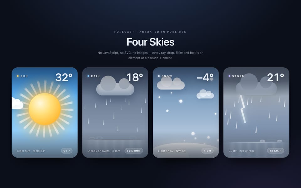
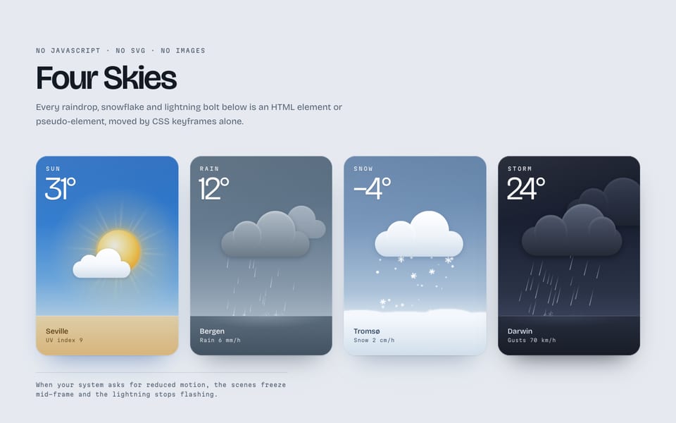
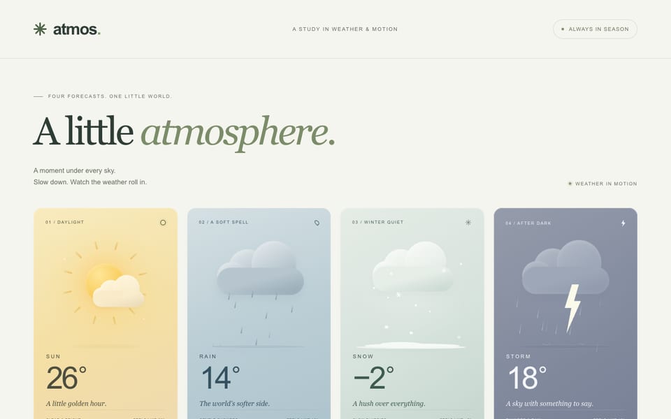
One email when a new model lands on the board or in the showcase. Unsubscribe anytime.