
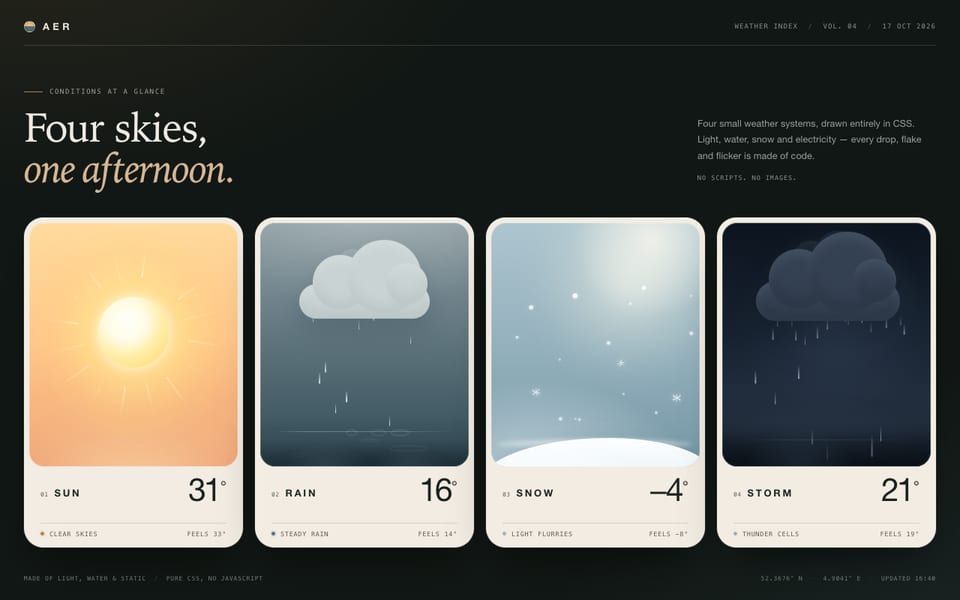
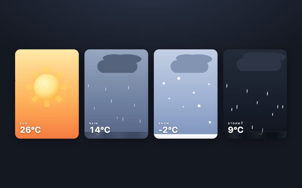
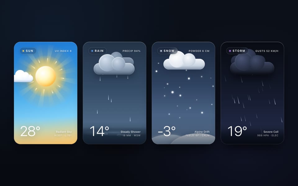
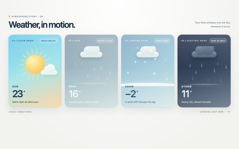
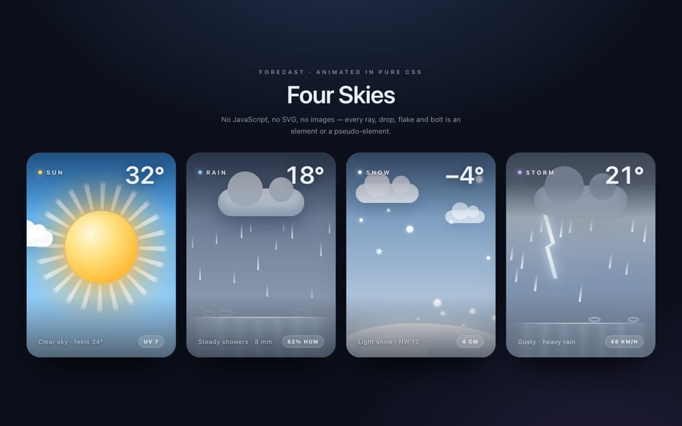
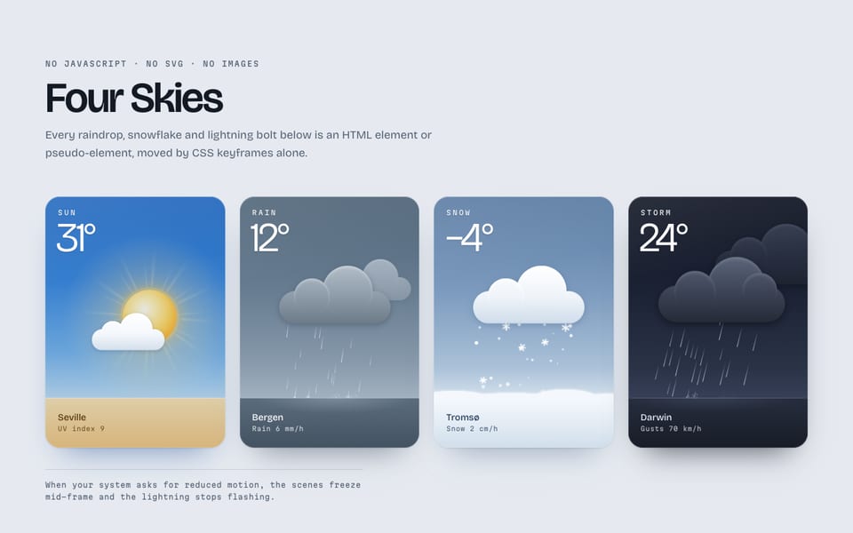
Four weather cards — CSS only, built by MiniMax M3.1 Flash
Hostedvia OpenCodeOpenRouter
197tok/s
First token included
127.1Ktokens
10m 45s
Show the code the model wroteHide the code
<!doctype html>
<html lang="en">
<head>
<meta charset="utf-8">
<meta name="viewport" content="width=device-width, initial-scale=1">
<title>Four Skies · pure-CSS weather cards</title>
<style>
/* ============================================================
   FOUR SKIES — one design system, four animated weather states.
   No JavaScript. No SVG. No images. Every drop, flake, ray and
   bolt is a real element or pseudo-element driven by keyframes.
   ============================================================ */

/* ---------- tokens ---------- */
:root{
  --font: "Inter", -apple-system, BlinkMacSystemFont, "Segoe UI", system-ui, "Helvetica Neue", sans-serif;
  --gap: clamp(14px, 1.7vw, 26px);
  --radius: 26px;
  --muted: rgba(238,245,255,.60);
  --faint: rgba(238,245,255,.34);
}
*,*::before,*::after{ box-sizing:border-box; }
html{ -webkit-text-size-adjust:100%; }
body{
  margin:0;
  min-height:100%;
  font-family:var(--font);
  color:#f2f6fc;
  background:
    radial-gradient(1400px 760px at 50% -18%, #1e2a3c 0%, rgba(30,42,60,0) 62%),
    radial-gradient(900px 700px at 92% 108%, #14202f 0%, rgba(20,32,47,0) 60%),
    linear-gradient(180deg,#0b0f16 0%,#090c11 100%);
  display:flex;
  flex-direction:column;
  align-items:center;
  padding:clamp(30px,5vw,74px) 20px clamp(48px,7vw,96px);
  -webkit-font-smoothing:antialiased;
  text-rendering:optimizeLegibility;
}

/* ---------- masthead ---------- */
.masthead{ text-align:center; margin-bottom:clamp(26px,3.4vw,44px); }
.masthead__eyebrow{
  margin:0 0 14px;
  font-size:11px; font-weight:600; letter-spacing:.34em; text-transform:uppercase;
  color:rgba(255,255,255,.42);
}
.masthead__title{
  margin:0;
  font-size:clamp(34px,5.2vw,60px);
  font-weight:200; letter-spacing:-.028em; line-height:1;
  background:linear-gradient(180deg,#ffffff 0%,#9fb3cc 100%);
  -webkit-background-clip:text; background-clip:text; color:transparent;
}
.masthead__sub{
  margin:16px auto 0; max-width:46ch;
  font-size:14.5px; line-height:1.6; font-weight:400;
  color:rgba(226,236,248,.5);
}

/* ---------- deck ---------- */
.deck{
  display:grid;
  grid-template-columns:repeat(4,minmax(0,1fr));
  gap:var(--gap);
  width:100%;
  max-width:1360px;
}
@media (max-width:1080px){
  .deck{ grid-template-columns:repeat(2,minmax(0,1fr)); max-width:680px; }
}
@media (max-width:540px){
  .deck{ grid-template-columns:minmax(0,1fr); max-width:340px; }
}

/* ---------- card shell (shared design system) ---------- */
.card{
  position:relative;
  isolation:isolate;
  container-type:inline-size;
  display:flex;
  flex-direction:column;
  overflow:hidden;
  aspect-ratio:5/7;
  border-radius:var(--radius);
  background:var(--sky);
  box-shadow:
    0 1px 0 rgba(255,255,255,.10) inset,
    0 0 0 1px rgba(255,255,255,.07),
    0 34px 60px -26px rgba(0,0,0,.85),
    0 8px 18px -12px rgba(0,0,0,.6);
}
.card::after{ /* glass sheen across every card */
  content:"";
  position:absolute; inset:0; z-index:8; pointer-events:none;
  background:linear-gradient(148deg,rgba(255,255,255,.10) 0%,rgba(255,255,255,0) 34%,rgba(255,255,255,0) 72%,rgba(255,255,255,.045) 100%);
}
.stage{ position:relative; flex:1 1 auto; min-height:0; overflow:hidden; }

/* ---------- chrome (shared typography) ---------- */
.chrome{
  position:relative; z-index:7;
  display:flex; flex-direction:column; justify-content:space-between; gap:14px;
  padding:clamp(14px,4.6cqw,26px) clamp(16px,5.2cqw,30px) clamp(18px,5.6cqw,32px);
  background:linear-gradient(180deg,rgba(6,10,18,0) 0%,rgba(7,12,22,.30) 42%,rgba(7,12,22,.60) 100%);
}
.chrome__row{ display:flex; align-items:baseline; justify-content:space-between; gap:12px; }
.tag{
  display:inline-flex; align-items:center; gap:8px;
  font-size:clamp(9px,2.9cqw,12px); font-weight:700; letter-spacing:.22em; text-transform:uppercase;
  color:rgba(255,255,255,.94);
}
.tag::before{
  content:""; width:6px; height:6px; border-radius:50%;
  background:var(--accent);
  box-shadow:0 0 0 3px var(--accent-soft), 0 0 12px var(--accent);
}
.cond{
  font-size:clamp(9px,2.6cqw,11.5px); font-weight:500; letter-spacing:.05em;
  color:var(--muted);
}
.temp{
  font-size:clamp(32px,13.4cqw,54px);
  font-weight:200; letter-spacing:-.045em; line-height:.9;
  color:#fff; font-variant-numeric:tabular-nums;
  text-shadow:0 2px 22px rgba(0,0,0,.35);
}
.stats{ display:flex; flex-direction:column; align-items:flex-end; gap:4px; }
.stats b{
  font-size:clamp(8.5px,2.4cqw,10.5px); font-weight:600; letter-spacing:.10em;
  color:var(--faint); font-variant-numeric:tabular-nums;
}

/* ============================================================
   SUN — radiant disc, slow rotating rays, breathing glow,
   a small cloud drifting past that briefly dims the disc.
   ============================================================ */
.card--sun{
  --sky:linear-gradient(180deg,#0d4a80 0%,#2b79bd 26%,#63a9dd 52%,#a9d5ea 74%,#f6cf95 92%,#f7b871 100%);
  --accent:#ffc247; --accent-soft:rgba(255,194,71,.20);
  --shift:0s;
}
.card--sun .sun{
  position:absolute; left:50%; top:43%;
  width:30cqw; height:30cqw;
  transform:translate(-50%,-50%);
  animation:sun-dim 26s linear infinite;
}
.sun__rays{
  position:absolute; inset:-74%;
  background:repeating-conic-gradient(from 0deg,
    rgba(255,231,150,.60) 0deg 4.4deg, rgba(255,231,150,0) 4.4deg 18deg);
  -webkit-mask-image:radial-gradient(circle 36cqw at 50% 50%,rgba(0,0,0,0) 0 40%,#000 48%,rgba(0,0,0,.45) 72%,rgba(0,0,0,0) 99%);
  mask-image:radial-gradient(circle 36cqw at 50% 50%,rgba(0,0,0,0) 0 40%,#000 48%,rgba(0,0,0,.45) 72%,rgba(0,0,0,0) 99%);
  animation:spin 46s linear infinite;
}
.sun__rays--b{
  inset:-74%;
  background:repeating-conic-gradient(from 9deg,
    rgba(255,246,214,.34) 0deg 1.6deg, rgba(255,246,214,0) 1.6deg 36deg);
  -webkit-mask-image:radial-gradient(circle 36cqw at 50% 50%,rgba(0,0,0,0) 0 42%,#000 50%,rgba(0,0,0,0) 88%);
  mask-image:radial-gradient(circle 36cqw at 50% 50%,rgba(0,0,0,0) 0 42%,#000 50%,rgba(0,0,0,0) 88%);
  animation:spin-back 71s linear infinite;
}
.sun__glow{
  position:absolute; inset:-86%;
  background:radial-gradient(circle at 50% 50%,
    rgba(255,218,140,.92) 0%, rgba(255,196,96,.48) 32%, rgba(255,168,58,.16) 55%, rgba(255,160,50,0) 71%);
  filter:blur(.5cqw);
  animation:breathe 7.4s ease-in-out infinite;
}
.sun__disc{
  position:absolute; inset:-8%; border-radius:50%;
  background:radial-gradient(circle at 41% 34%,
    #fffef8 0%, #fff7d4 22%, #ffe089 46%, #ffc04f 72%, #ffa62f 100%);
  box-shadow:0 0 4cqw rgba(255,204,104,.75), 0 0 11cqw rgba(255,170,62,.45);
  animation:pulse 7.4s ease-in-out infinite;
}
/* the little cloud that drifts across the disc */
.wisp{
  position:absolute; left:0; top:28%;
  width:27cqw; height:5.4cqw;
  animation:drift 26s linear infinite;
}
.wisp__body{
  position:absolute; inset:0;
  background:
    radial-gradient(circle 3.3cqw at 21% 100%,rgba(255,255,255,.95) 97%,rgba(255,255,255,0)),
    radial-gradient(circle 4.4cqw at 47% 100%,rgba(255,255,255,.98) 97%,rgba(255,255,255,0)),
    radial-gradient(circle 3.1cqw at 73% 100%,rgba(255,255,255,.93) 97%,rgba(255,255,255,0));
  filter:drop-shadow(0 .9cqw 1.3cqw rgba(40,60,90,.28));
  animation:bob 7.4s ease-in-out infinite;
}
.wisp__body::after{
  content:""; position:absolute; left:10%; right:7%; bottom:0; height:1.2cqw;
  background:rgba(255,255,255,.96); border-radius:0 0 .6cqw .6cqw/0 0 .9cqw .9cqw;
}
.sun-haze{
  position:absolute; left:0; right:0; bottom:0; height:16cqw;
  background:linear-gradient(180deg,rgba(255,222,170,0) 0%,rgba(255,222,170,.22) 100%);
}

/* ============================================================
   RAIN — grey cloud, staggered drops, splashes on a puddle.
   ============================================================ */
.card--rain{
  --sky:linear-gradient(180deg,#1d2836 0%,#314052 30%,#485a6e 58%,#5f7288 82%,#6d8096 100%);
  --accent:#7fc3ff; --accent-soft:rgba(127,195,255,.20);
  --shift:3.7s;
  --c1:#d9e1eb; --ch:rgba(255,255,255,.50); --cs:rgba(28,44,66,.36);
}
.cloud{
  position:absolute; left:50%; top:5.5cqw; transform:translateX(-50%);
  width:52cqw; height:11cqw;
  background:
    radial-gradient(circle 7.1cqw at 23% 100%,var(--c1) 98%,rgba(0,0,0,0)),
    radial-gradient(circle 9.3cqw at 47% 100%,var(--c1) 98%,rgba(0,0,0,0)),
    radial-gradient(circle 6.9cqw at 69% 100%,var(--c1) 98%,rgba(0,0,0,0)),
    radial-gradient(circle 4.9cqw at 85% 100%,var(--c1) 98%,rgba(0,0,0,0));
  filter:drop-shadow(0 1.6cqw 1.5cqw rgba(12,20,34,.42));
}
.cloud::before{  /* sunlit crown */
  content:""; position:absolute; left:25%; top:3cqw; width:18cqw; height:6cqw;
  border-radius:50%; background:var(--ch); filter:blur(1.8cqw);
}
.cloud::after{   /* shaded underside */
  content:""; position:absolute; left:15%; right:9%; bottom:.1cqw; height:2.8cqw;
  border-radius:50%; background:var(--cs); filter:blur(1.6cqw);
}
.cloud__base{
  position:absolute; left:9%; right:5%; bottom:0; height:2cqw;
  background:var(--c1);
  border-radius:0 0 .9cqw .9cqw/0 0 1.4cqw 1.4cqw;
}
.rain-zone{ position:absolute; left:16%; right:16%; top:15cqw; bottom:9.4cqw; }
.col{
  --x:50%; --dur:1.1s; --d:0s;              /* safe defaults; nth-child rules override */
  position:absolute; left:var(--x); top:0; bottom:0; width:0;
}
.drop{
  position:absolute; top:0; left:0; height:100%; width:0;
  animation:fall var(--dur) linear infinite;
  animation-delay:calc(var(--d) - var(--shift));
}
.drop::before{
  content:""; position:absolute; top:0; left:-.3cqw;
  width:.6cqw; height:5.4cqw; border-radius:.4cqw;
  background:linear-gradient(180deg,rgba(206,230,255,0) 0%,rgba(206,230,255,.94) 58%,rgba(236,246,255,1) 100%);
  transform:rotate(7deg);
}
.splash{ position:absolute; bottom:0; left:0; width:0; height:0; }
.splash::after{
  content:""; position:absolute; left:-2.4cqw; top:-.55cqw;
  width:4.8cqw; height:1.2cqw; border-radius:50%;
  background:radial-gradient(ellipse at 50% 50%,rgba(226,242,255,.98) 0%,rgba(214,236,255,.45) 50%,rgba(214,236,255,0) 76%);
  animation:splash var(--dur) linear infinite;
  animation-delay:calc(var(--d) - var(--shift));
}
.puddle{
  position:absolute; left:0; right:0; bottom:0; height:9.4cqw;
  background:linear-gradient(180deg,rgba(126,166,208,0) 0%,rgba(102,142,188,.20) 34%,rgba(64,98,140,.44) 72%,rgba(52,80,120,.54) 100%);
}
.puddle::before{
  content:""; position:absolute; left:0; right:0; top:0; height:1px;
  background:linear-gradient(90deg,rgba(196,224,255,0) 0%,rgba(214,236,255,.72) 24%,rgba(226,242,255,.88) 58%,rgba(196,224,255,0) 100%);
}
.puddle::after{  /* blurred reflection of the cloud in the water */
  content:""; position:absolute; left:24%; right:20%; top:.6cqw; height:3.4cqw;
  border-radius:50%; background:rgba(196,222,255,.30); filter:blur(1.6cqw);
}

/* ============================================================
   SNOW — soft flakes of mixed size, slow fall, lateral sway,
   and a slow bank of accumulation along the bottom.
   ============================================================ */
.card--snow{
  --sky:linear-gradient(180deg,#2f4c6d 0%,#4d7196 26%,#7d9dbb 52%,#a6bed3 74%,#c4d8e6 90%,#d2e2ed 100%);
  --accent:#dceeff; --accent-soft:rgba(220,238,255,.20);
  --shift:6.4s;
  --c1:#e8eef6; --ch:rgba(255,255,255,.62); --cs:rgba(46,66,94,.28);
}
.card--snow .cloud{ top:4.4cqw; width:48cqw; height:10.4cqw; }
.card--snow .cloud::before{ left:24%; width:16cqw; }
.snow-zone{ position:absolute; left:0; right:0; top:12.4cqw; bottom:6.4cqw; }
.flake{
  --x:50%; --size:1cqw; --dur:14s; --sway:4s; --d:0s; --o:.9;   /* safe defaults */
  position:absolute; left:var(--x); top:0; height:100%; width:0;
  animation:snowfall var(--dur) linear infinite;
  animation-delay:calc(var(--d) - var(--shift));
}
.flake::before{
  content:""; position:absolute; left:calc(var(--size) / -2); top:0;
  width:var(--size); height:var(--size); border-radius:50%;
  background:#fff; opacity:var(--o,.95);
  box-shadow:0 0 1.1cqw rgba(255,255,255,.85);
  animation:sway var(--sway) ease-in-out infinite alternate;
  animation-delay:calc(var(--d) - var(--shift));
}
.drift{
  position:absolute; left:-12%; right:-12%; bottom:-1.2cqw; height:9cqw;
  background:
    radial-gradient(ellipse 58cqw 6.4cqw at 50% 100%,#f7fbff 68%,rgba(247,251,255,0) 74%),
    radial-gradient(ellipse 24cqw 8.2cqw at 21% 100%,#eaf3fe 68%,rgba(234,243,254,0) 74%),
    radial-gradient(ellipse 20cqw 6.8cqw at 78% 100%,#f2f8ff 68%,rgba(242,248,255,0) 74%);
  animation:bank 34s ease-in-out infinite;
}
.drift::after{
  content:""; position:absolute; left:2%; right:2%; bottom:2.2cqw; height:2.4cqw;
  border-radius:50%; background:rgba(88,120,166,.24); filter:blur(1.3cqw);
}

/* ============================================================
   STORM — dark cloud, heavy rain, a bolt and a full-card flash
   on an irregular schedule.
   ============================================================ */
.card--storm{
  --sky:linear-gradient(180deg,#070a12 0%,#101728 26%,#1b2438 52%,#26314a 76%,#2f3c56 100%);
  --accent:#b79bff; --accent-soft:rgba(183,155,255,.20);
  --shift:2.1s;
  --c1:#3b4658; --ch:rgba(178,198,232,.17); --cs:rgba(5,9,16,.55);
}
.card--storm .cloud{ top:3.6cqw; width:58cqw; height:12.4cqw; }
.card--storm .cloud::before{ left:22%; top:4.4cqw; width:21cqw; height:7cqw; }
.card--storm .rain-zone{ top:14.6cqw; bottom:7.4cqw; left:13%; right:13%; }
.card--storm .drop::before{
  width:.66cqw; height:6cqw;
  background:linear-gradient(180deg,rgba(198,220,252,0) 0%,rgba(198,220,252,.92) 56%,rgba(228,240,255,1) 100%);
  transform:rotate(13deg);
}
.card--storm .puddle{
  height:7.4cqw;
  background:linear-gradient(180deg,rgba(120,150,200,.12) 0%,rgba(52,72,110,.45) 44%,rgba(28,40,66,.72) 100%);
}
.card--storm .puddle::before{ background:linear-gradient(90deg,rgba(170,200,255,0),rgba(196,216,255,.55) 34%,rgba(196,216,255,.6) 70%,rgba(170,200,255,0)); }
.bolt{
  position:absolute; left:56%; top:9cqw; width:9cqw; height:26cqw;
  transform:translateX(-50%);
  background:linear-gradient(180deg,#ffffff 0%,#dce9ff 55%,#b9d2ff 100%);
  clip-path:polygon(56% 0%,24% 46%,46% 46%,30% 100%,80% 40%,54% 40%);
  filter:drop-shadow(0 0 1.2cqw rgba(206,228,255,.95)) drop-shadow(0 0 3.4cqw rgba(140,180,255,.75));
  opacity:0;
  animation:bolt 17.9s linear infinite;
  animation-delay:calc(var(--shift));
}
.flash{
  position:absolute; inset:0; z-index:9; pointer-events:none;
  mix-blend-mode:screen; opacity:0;
}
.flash--main{
  background:radial-gradient(130% 100% at 50% 16%,
    rgba(255,255,255,.95) 0%, rgba(200,224,255,.58) 30%, rgba(120,168,255,.20) 60%, rgba(80,120,220,0) 100%);
  animation:flash-main 17.9s linear infinite;
  animation-delay:calc(var(--shift));
}
.flash--after{
  background:radial-gradient(120% 90% at 58% 26%,
    rgba(150,190,255,.34) 0%, rgba(90,130,220,.12) 44%, rgba(70,110,200,0) 74%);
  animation:flash-after 26.3s linear infinite;
  animation-delay:calc(var(--shift));
}

/* ============================================================
   SHARED KEYFRAMES
   ============================================================ */
@keyframes spin{ from{ transform:rotate(0deg) } to{ transform:rotate(360deg) } }
@keyframes spin-back{ from{ transform:rotate(0deg) } to{ transform:rotate(-360deg) } }
@keyframes breathe{
  0%,100%{ transform:scale(.93); opacity:.72 }
  50%    { transform:scale(1.09); opacity:1 }
}
@keyframes pulse{
  0%,100%{ transform:scale(1) }
  50%    { transform:scale(1.035) }
}
/* the disc dims exactly while the wisp crosses it */
@keyframes sun-dim{
  0%,34%    { filter:brightness(1) saturate(1) }
  40%       { filter:brightness(.84) saturate(.97) }
  44%,47%   { filter:brightness(.62) saturate(.90) }
  52%       { filter:brightness(.88) saturate(.98) }
  58%,100%  { filter:brightness(1) saturate(1) }
}
@keyframes drift{
  from{ transform:translateX(-46cqw) }
  to  { transform:translateX(150cqw) }
}
@keyframes bob{
  0%,100%{ transform:translateY(0) }
  50%    { transform:translateY(-.5cqw) }
}
@keyframes fall{
  0%   { transform:translateY(-8%); opacity:0 }
  6%   { opacity:1 }
  80%  { transform:translateY(100%); opacity:1 }
  87%  { opacity:0 }
  100% { transform:translateY(100%); opacity:0 }
}
@keyframes splash{
  0%,77%  { opacity:0; transform:scale(.25) }
  81%     { opacity:.9; transform:scale(.55) }
  89%     { opacity:0; transform:scale(2.1) }
  100%    { opacity:0; transform:scale(.25) }
}
@keyframes snowfall{
  0%   { transform:translateY(-6%); opacity:0 }
  9%   { opacity:var(--o,.95) }
  86%  { opacity:var(--o,.95) }
  100% { transform:translateY(100%); opacity:0 }
}
@keyframes sway{
  from{ transform:translateX(-1.5cqw) }
  to  { transform:translateX(1.5cqw) }
}
@keyframes bank{
  0%,100%{ transform:scale(1,.90); opacity:.90 }
  50%    { transform:scale(1.02,1.04); opacity:1 }
}
/* lightning: four irregularly spaced strike clusters, each a
   double-strike with a re-strike a few frames later */
@keyframes flash-main{
  0%,1.1%     { opacity:0 }
  1.45%       { opacity:.95 }
  1.9%        { opacity:.10 }
  2.6%        { opacity:.62 }
  3.3%        { opacity:0 }
  27.4%       { opacity:0 }
  27.8%       { opacity:.82 }
  28.4%       { opacity:.12 }
  29.1%       { opacity:.48 }
  29.9%       { opacity:0 }
  52.0%       { opacity:0 }
  52.4%       { opacity:.92 }
  53.1%       { opacity:.16 }
  53.8%       { opacity:.55 }
  54.5%       { opacity:0 }
  83.2%       { opacity:0 }
  83.6%       { opacity:.78 }
  84.3%       { opacity:.10 }
  85.0%       { opacity:.44 }
  85.8%       { opacity:0 }
  100%        { opacity:0 }
}
@keyframes flash-after{
  0%,10.4%    { opacity:0 }
  11.0%       { opacity:.30 }
  12.4%       { opacity:0 }
  45.2%       { opacity:0 }
  45.8%       { opacity:.24 }
  47.2%       { opacity:0 }
  77.4%       { opacity:0 }
  78.0%       { opacity:.28 }
  79.4%       { opacity:0 }
  100%        { opacity:0 }
}
@keyframes bolt{
  0%,1.1%     { opacity:0 }
  1.45%       { opacity:1 }
  1.9%        { opacity:.15 }
  2.6%        { opacity:.95 }
  3.3%        { opacity:0 }
  27.4%       { opacity:0 }
  27.8%       { opacity:.9 }
  28.4%       { opacity:.1 }
  29.1%       { opacity:.75 }
  29.9%       { opacity:0 }
  52.0%       { opacity:0 }
  52.4%       { opacity:1 }
  53.1%       { opacity:.12 }
  53.8%       { opacity:.8 }
  54.5%       { opacity:0 }
  83.2%       { opacity:0 }
  83.6%       { opacity:.95 }
  84.3%       { opacity:.12 }
  85.0%       { opacity:.6 }
  85.8%       { opacity:0 }
  100%        { opacity:0 }
}

/* ============================================================
   PER-ELEMENT STAGGER — offsets, durations and phases are all
   different so no two drops, flakes or cards ever move as one.
   ============================================================ */
/* --- rain: 16 columns, every offset and phase unique --- */
.card--rain .col:nth-child(1 ) { --x:  1.0%; --dur:0.99s; --d:-0.64s }
.card--rain .col:nth-child(2 ) { --x:  4.1%; --dur:1.17s; --d:-0.43s }
.card--rain .col:nth-child(3 ) { --x: 10.3%; --dur:1.15s; --d:-0.04s }
.card--rain .col:nth-child(4 ) { --x: 18.4%; --dur:0.95s; --d:-0.09s }
.card--rain .col:nth-child(5 ) { --x: 24.6%; --dur:1.30s; --d:-0.16s }
.card--rain .col:nth-child(6 ) { --x: 29.9%; --dur:1.21s; --d:-1.15s }
.card--rain .col:nth-child(7 ) { --x: 37.9%; --dur:1.10s; --d:-1.08s }
.card--rain .col:nth-child(8 ) { --x: 41.5%; --dur:1.31s; --d:-0.38s }
.card--rain .col:nth-child(9 ) { --x: 48.2%; --dur:0.97s; --d:-0.30s }
.card--rain .col:nth-child(10) { --x: 57.8%; --dur:1.00s; --d:-0.58s }
.card--rain .col:nth-child(11) { --x: 63.2%; --dur:1.09s; --d:-0.60s }
.card--rain .col:nth-child(12) { --x: 66.6%; --dur:0.95s; --d:-0.20s }
.card--rain .col:nth-child(13) { --x: 75.9%; --dur:1.12s; --d:-0.35s }
.card--rain .col:nth-child(14) { --x: 81.7%; --dur:1.13s; --d:-0.34s }
.card--rain .col:nth-child(15) { --x: 89.0%; --dur:1.24s; --d:-0.30s }
.card--rain .col:nth-child(16) { --x: 94.1%; --dur:1.16s; --d:-1.02s }

/* --- storm: 18 columns, heavier and faster --- */
.card--storm .col:nth-child(1 ) { --x:  1.0%; --dur:0.76s; --d:-0.74s }
.card--storm .col:nth-child(2 ) { --x:  3.9%; --dur:0.80s; --d:-0.61s }
.card--storm .col:nth-child(3 ) { --x:  9.6%; --dur:0.83s; --d:-0.03s }
.card--storm .col:nth-child(4 ) { --x: 17.4%; --dur:0.92s; --d:-0.53s }
.card--storm .col:nth-child(5 ) { --x: 23.9%; --dur:0.77s; --d:-0.53s }
.card--storm .col:nth-child(6 ) { --x: 28.2%; --dur:0.86s; --d:-0.39s }
.card--storm .col:nth-child(7 ) { --x: 34.8%; --dur:0.98s; --d:-0.47s }
.card--storm .col:nth-child(8 ) { --x: 39.6%; --dur:0.68s; --d:-0.48s }
.card--storm .col:nth-child(9 ) { --x: 45.1%; --dur:1.00s; --d:-0.82s }
.card--storm .col:nth-child(10) { --x: 49.0%; --dur:0.79s; --d:-0.53s }
.card--storm .col:nth-child(11) { --x: 53.4%; --dur:0.82s; --d:-0.14s }
.card--storm .col:nth-child(12) { --x: 59.4%; --dur:0.68s; --d:-0.52s }
.card--storm .col:nth-child(13) { --x: 65.0%; --dur:0.74s; --d:-0.29s }
.card--storm .col:nth-child(14) { --x: 73.9%; --dur:0.69s; --d:-0.31s }
.card--storm .col:nth-child(15) { --x: 78.0%; --dur:0.96s; --d:-0.79s }
.card--storm .col:nth-child(16) { --x: 85.0%; --dur:0.75s; --d:-0.31s }
.card--storm .col:nth-child(17) { --x: 88.3%; --dur:0.96s; --d:-0.92s }
.card--storm .col:nth-child(18) { --x: 92.9%; --dur:0.72s; --d:-0.17s }

/* --- snow: 20 flakes, four size classes --- */
.card--snow .flake:nth-child(1)  { --x:3%;  --size:1.5cqw; --dur:14.5s; --sway:4.1s; --d:-2.10s;  --o:.98 }
.card--snow .flake:nth-child(2)  { --x:9%;  --size:.8cqw;  --dur:11.2s; --sway:3.3s; --d:-6.40s;  --o:.80 }
.card--snow .flake:nth-child(3)  { --x:15%; --size:1.1cqw; --dur:16.8s; --sway:5.2s; --d:-9.15s;  --o:.92 }
.card--snow .flake:nth-child(4)  { --x:21%; --size:.7cqw;  --dur:10.4s; --sway:2.8s; --d:-1.20s;  --o:.72 }
.card--snow .flake:nth-child(5)  { --x:27%; --size:1.7cqw; --dur:18.6s; --sway:4.6s; --d:-12.30s; --o:1 }
.card--snow .flake:nth-child(6)  { --x:33%; --size:.9cqw;  --dur:12.9s; --sway:3.7s; --d:-4.55s;  --o:.85 }
.card--snow .flake:nth-child(7)  { --x:39%; --size:1.3cqw; --dur:15.7s; --sway:4.9s; --d:-8.80s;  --o:.95 }
.card--snow .flake:nth-child(8)  { --x:44%; --size:.8cqw;  --dur:11.9s; --sway:3.1s; --d:-0.65s;  --o:.78 }
.card--snow .flake:nth-child(9)  { --x:50%; --size:1.6cqw; --dur:17.4s; --sway:5.5s; --d:-14.05s; --o:1 }
.card--snow .flake:nth-child(10) { --x:56%; --size:.7cqw;  --dur:10.9s; --sway:2.6s; --d:-3.20s;  --o:.70 }
.card--snow .flake:nth-child(11) { --x:61%; --size:1.2cqw; --dur:14.1s; --sway:4.3s; --d:-10.60s; --o:.90 }
.card--snow .flake:nth-child(12) { --x:67%; --size:1.5cqw; --dur:19.2s; --sway:5.8s; --d:-16.40s; --o:.98 }
.card--snow .flake:nth-child(13) { --x:72%; --size:.9cqw;  --dur:13.3s; --sway:3.5s; --d:-7.25s;  --o:.84 }
.card--snow .flake:nth-child(14) { --x:78%; --size:1.0cqw; --dur:12.4s; --sway:2.9s; --d:-1.95s;  --o:.88 }
.card--snow .flake:nth-child(15) { --x:84%; --size:1.4cqw; --dur:16.2s; --sway:4.8s; --d:-11.85s; --o:.96 }
.card--snow .flake:nth-child(16) { --x:90%; --size:.8cqw;  --dur:11.6s; --sway:3.9s; --d:-5.05s;  --o:.75 }
.card--snow .flake:nth-child(17) { --x:5%;  --size:1.0cqw; --dur:13.8s; --sway:3.3s; --d:-15.30s; --o:.86 }
.card--snow .flake:nth-child(18) { --x:18%; --size:1.4cqw; --dur:17.9s; --sway:4.4s; --d:-8.20s;  --o:.94 }
.card--snow .flake:nth-child(19) { --x:46%; --size:.9cqw;  --dur:12.1s; --sway:2.7s; --d:-13.60s; --o:.80 }
.card--snow .flake:nth-child(20) { --x:88%; --size:1.2cqw; --dur:15.3s; --sway:5.0s; --d:-4.10s;  --o:.90 }

/* ============================================================
   MOTION PREFERENCES — keep the ambience, drop the strobe.
   ============================================================ */
@media (prefers-reduced-motion:reduce){
  .flash--main, .flash--after, .bolt{ animation:none; opacity:0 }
  .sun__rays, .sun__rays--b{ animation-duration:180s }
}
</style>
</head>
<body>

<header class="masthead">
  <p class="masthead__eyebrow">Atmospheric Set</p>
  <h1 class="masthead__title">Four Skies</h1>
  <p class="masthead__sub">Four weather states in a single design system — every ray, drop, flake and bolt drawn with CSS alone.</p>
</header>

<main class="deck">

  <!-- ======================= SUN ======================= -->
  <article class="card card--sun">
    <div class="stage">
      <div class="sun">
        <div class="sun__rays"></div>
        <div class="sun__rays sun__rays--b"></div>
        <div class="sun__glow"></div>
        <div class="sun__disc"></div>
      </div>
      <div class="wisp"><i class="wisp__body"></i></div>
      <div class="sun-haze"></div>
    </div>
    <div class="chrome">
      <div class="chrome__row">
        <span class="tag">Sun</span>
        <span class="cond">Clear</span>
      </div>
      <div class="chrome__row">
        <span class="temp">28°</span>
        <span class="stats"><b>H 31°</b><b>L 22°</b></span>
      </div>
    </div>
  </article>

  <!-- ======================= RAIN ======================= -->
  <article class="card card--rain">
    <div class="stage">
      <div class="cloud"><i class="cloud__base"></i></div>
      <div class="rain-zone">
        <i class="col"><span class="drop"></span><span class="splash"></span></i>
        <i class="col"><span class="drop"></span><span class="splash"></span></i>
        <i class="col"><span class="drop"></span><span class="splash"></span></i>
        <i class="col"><span class="drop"></span><span class="splash"></span></i>
        <i class="col"><span class="drop"></span><span class="splash"></span></i>
        <i class="col"><span class="drop"></span><span class="splash"></span></i>
        <i class="col"><span class="drop"></span><span class="splash"></span></i>
        <i class="col"><span class="drop"></span><span class="splash"></span></i>
        <i class="col"><span class="drop"></span><span class="splash"></span></i>
        <i class="col"><span class="drop"></span><span class="splash"></span></i>
        <i class="col"><span class="drop"></span><span class="splash"></span></i>
        <i class="col"><span class="drop"></span><span class="splash"></span></i>
        <i class="col"><span class="drop"></span><span class="splash"></span></i>
        <i class="col"><span class="drop"></span><span class="splash"></span></i>
        <i class="col"><span class="drop"></span><span class="splash"></span></i>
        <i class="col"><span class="drop"></span><span class="splash"></span></i>
</div>
      <div class="puddle"></div>
    </div>
    <div class="chrome">
      <div class="chrome__row">
        <span class="tag">Rain</span>
        <span class="cond">Steady</span>
      </div>
      <div class="chrome__row">
        <span class="temp">17°</span>
        <span class="stats"><b>H 19°</b><b>L 13°</b></span>
      </div>
    </div>
  </article>

  <!-- ======================= SNOW ======================= -->
  <article class="card card--snow">
    <div class="stage">
      <div class="cloud"><i class="cloud__base"></i></div>
      <div class="snow-zone">
        <i class="flake"></i>
        <i class="flake"></i>
        <i class="flake"></i>
        <i class="flake"></i>
        <i class="flake"></i>
        <i class="flake"></i>
        <i class="flake"></i>
        <i class="flake"></i>
        <i class="flake"></i>
        <i class="flake"></i>
        <i class="flake"></i>
        <i class="flake"></i>
        <i class="flake"></i>
        <i class="flake"></i>
        <i class="flake"></i>
        <i class="flake"></i>
        <i class="flake"></i>
        <i class="flake"></i>
        <i class="flake"></i>
        <i class="flake"></i>
</div>
      <div class="drift"></div>
    </div>
    <div class="chrome">
      <div class="chrome__row">
        <span class="tag">Snow</span>
        <span class="cond">Flurries</span>
      </div>
      <div class="chrome__row">
        <span class="temp">−4°</span>
        <span class="stats"><b>H −1°</b><b>L −9°</b></span>
      </div>
    </div>
  </article>

  <!-- ====================== STORM ====================== -->
  <article class="card card--storm">
    <div class="stage">
      <div class="cloud"><i class="cloud__base"></i></div>
      <div class="bolt"></div>
      <div class="rain-zone">
        <i class="col"><span class="drop"></span><span class="splash"></span></i>
        <i class="col"><span class="drop"></span><span class="splash"></span></i>
        <i class="col"><span class="drop"></span><span class="splash"></span></i>
        <i class="col"><span class="drop"></span><span class="splash"></span></i>
        <i class="col"><span class="drop"></span><span class="splash"></span></i>
        <i class="col"><span class="drop"></span><span class="splash"></span></i>
        <i class="col"><span class="drop"></span><span class="splash"></span></i>
        <i class="col"><span class="drop"></span><span class="splash"></span></i>
        <i class="col"><span class="drop"></span><span class="splash"></span></i>
        <i class="col"><span class="drop"></span><span class="splash"></span></i>
        <i class="col"><span class="drop"></span><span class="splash"></span></i>
        <i class="col"><span class="drop"></span><span class="splash"></span></i>
        <i class="col"><span class="drop"></span><span class="splash"></span></i>
        <i class="col"><span class="drop"></span><span class="splash"></span></i>
        <i class="col"><span class="drop"></span><span class="splash"></span></i>
        <i class="col"><span class="drop"></span><span class="splash"></span></i>
        <i class="col"><span class="drop"></span><span class="splash"></span></i>
        <i class="col"><span class="drop"></span><span class="splash"></span></i>
</div>
      <div class="puddle"></div>
    </div>
    <div class="chrome">
      <div class="chrome__row">
        <span class="tag">Storm</span>
        <span class="cond">Thunder</span>
      </div>
      <div class="chrome__row">
        <span class="temp">21°</span>
        <span class="stats"><b>H 23°</b><b>L 17°</b></span>
      </div>
    </div>
    <div class="flash flash--after"></div>
    <div class="flash flash--main"></div>
  </article>

</main>

</body>
</html>
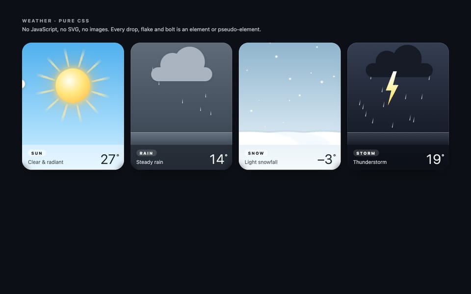
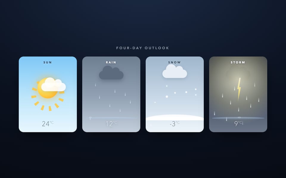
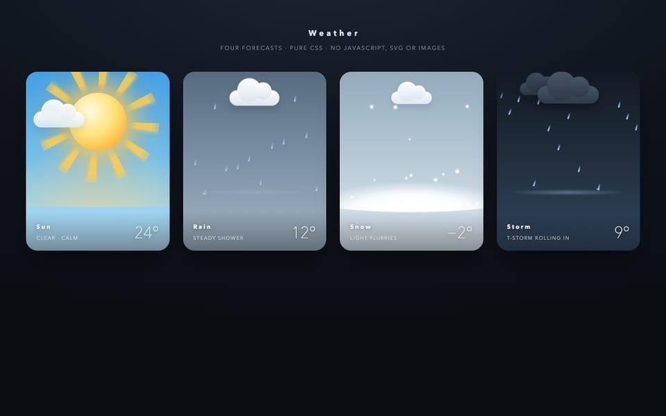
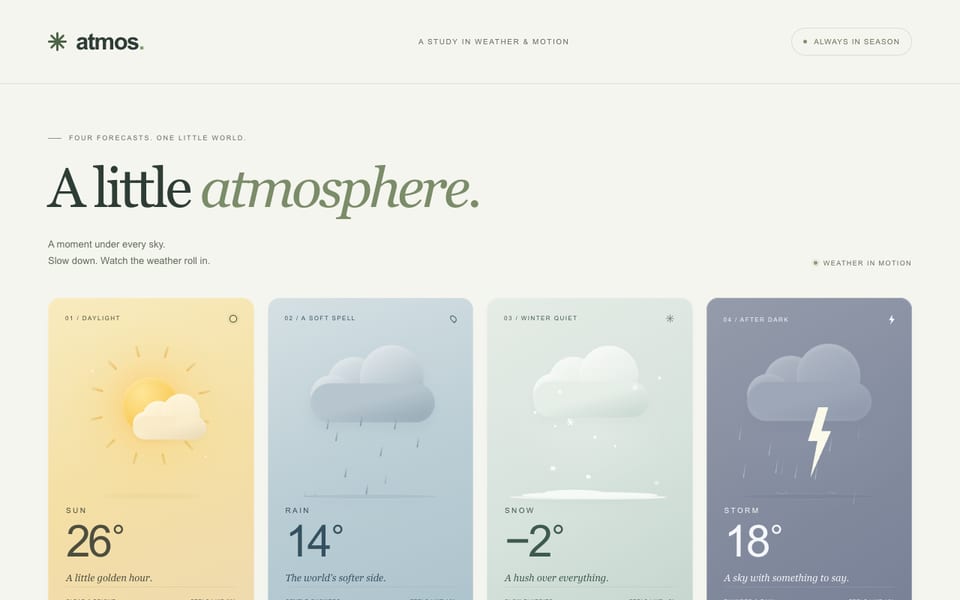
Same prompt, other models
One email when a new model lands on the board or in the showcase. Unsubscribe anytime.