
Four weather cards — CSS only, built by Gemini 4 Argon
Hostedvia DaBenchOpenRouter
$0.12
Show the code the model wroteHide the code
<!DOCTYPE html>
<html lang="en">
<head>
<meta charset="UTF-8">
<meta name="viewport" content="width=device-width, initial-scale=1.0">
<title>Pure CSS Weather Cards — Sun, Rain, Snow, Storm</title>
<style>
*, *::before, *::after {
box-sizing: border-box;
margin: 0;
padding: 0;
}
:root {
--card-radius: 28px;
--card-height: 440px;
--font-sans: -apple-system, BlinkMacSystemFont, "SF Pro Display", "Segoe UI", Roboto, Helvetica, Arial, sans-serif;
}
body {
min-height: 100vh;
background-color: #090d14;
background-image:
radial-gradient(circle at 18% 20%, rgba(56, 128, 217, 0.10) 0%, transparent 45%),
radial-gradient(circle at 82% 80%, rgba(99, 102, 241, 0.08) 0%, transparent 45%),
linear-gradient(180deg, #0b1019 0%, #070a10 100%);
color: #ffffff;
font-family: var(--font-sans);
display: flex;
flex-direction: column;
align-items: center;
justify-content: center;
padding: 40px 24px;
-webkit-font-smoothing: antialiased;
-moz-osx-font-smoothing: grayscale;
overflow-x: hidden;
}
/* =========================================================
LAYOUT: 4 SIDE-BY-SIDE -> WRAPS TO 2x2 GRID ON NARROW
========================================================= */
.weather-deck {
display: grid;
grid-template-columns: repeat(4, minmax(230px, 272px));
gap: 24px;
width: 100%;
max-width: 1160px;
justify-content: center;
}
@media (max-width: 1080px) {
.weather-deck {
grid-template-columns: repeat(2, minmax(230px, 280px));
gap: 22px;
}
}
@media (max-width: 540px) {
body {
padding: 20px 12px;
}
.weather-deck {
grid-template-columns: repeat(2, minmax(155px, 1fr));
gap: 12px;
}
:root {
--card-height: 360px;
--card-radius: 22px;
}
}
/* =========================================================
SHARED CARD DESIGN SYSTEM
========================================================= */
.weather-card {
position: relative;
height: var(--card-height);
border-radius: var(--card-radius);
overflow: hidden;
isolation: isolate;
display: flex;
flex-direction: column;
justify-content: space-between;
padding: 24px;
user-select: none;
box-shadow:
0 26px 50px -14px rgba(0, 0, 0, 0.72),
0 0 0 1px rgba(255, 255, 255, 0.11),
inset 0 1px 1px rgba(255, 255, 255, 0.32),
inset 0 -1px 1px rgba(0, 0, 0, 0.35);
transition: transform 0.45s cubic-bezier(0.22, 1, 0.36, 1), box-shadow 0.45s ease;
}
.weather-card:hover {
transform: translateY(-5px);
box-shadow:
0 34px 64px -12px rgba(0, 0, 0, 0.82),
0 0 0 1px rgba(255, 255, 255, 0.2),
inset 0 1px 1px rgba(255, 255, 255, 0.45),
inset 0 -1px 1px rgba(0, 0, 0, 0.35);
}
/* Subtle inner glass frame overlay */
.weather-card::after {
content: "";
position: absolute;
inset: 0;
border-radius: var(--card-radius);
box-shadow: inset 0 0 0 1px rgba(255, 255, 255, 0.10);
pointer-events: none;
z-index: 30;
}
/* Typography Header & Footer */
.card-header {
position: relative;
z-index: 20;
display: flex;
align-items: center;
justify-content: space-between;
}
.card-label {
display: inline-flex;
align-items: center;
gap: 8px;
font-size: 0.75rem;
font-weight: 700;
letter-spacing: 0.18em;
text-transform: uppercase;
padding: 6px 12px;
border-radius: 999px;
background: rgba(15, 23, 42, 0.24);
backdrop-filter: blur(10px);
-webkit-backdrop-filter: blur(10px);
border: 1px solid rgba(255, 255, 255, 0.18);
color: rgba(255, 255, 255, 0.96);
box-shadow: 0 4px 12px rgba(0, 0, 0, 0.12);
}
.status-dot {
width: 6px;
height: 6px;
border-radius: 50%;
display: inline-block;
}
.card-meta {
font-size: 0.68rem;
font-weight: 600;
letter-spacing: 0.08em;
text-transform: uppercase;
color: rgba(255, 255, 255, 0.78);
text-shadow: 0 1px 4px rgba(0, 0, 0, 0.25);
}
.card-footer {
position: relative;
z-index: 20;
display: flex;
align-items: flex-end;
justify-content: space-between;
padding-bottom: 6px;
}
.temp-readout {
font-size: 3.75rem;
font-weight: 300;
line-height: 0.92;
letter-spacing: -0.04em;
font-variant-numeric: tabular-nums;
color: #ffffff;
text-shadow: 0 6px 24px rgba(0, 0, 0, 0.28);
}
.temp-degree {
font-weight: 300;
opacity: 0.88;
}
.condition-detail {
text-align: right;
font-size: 0.74rem;
line-height: 1.45;
font-weight: 500;
color: rgba(255, 255, 255, 0.85);
text-shadow: 0 2px 8px rgba(0, 0, 0, 0.35);
}
.condition-detail span {
display: block;
font-size: 0.66rem;
letter-spacing: 0.06em;
text-transform: uppercase;
opacity: 0.72;
}
@media (max-width: 540px) {
.weather-card {
padding: 16px;
}
.temp-readout {
font-size: 2.75rem;
}
.card-meta {
display: none;
}
}
/* =========================================================
CARD 1: SUN
Radiant disc, slowly rotating rays, pulsing warm glow,
small cloud drifting past & briefly dimming the sun/card
========================================================= */
.card-sun {
background: linear-gradient(172deg, #1b76d2 0%, #3ca2e8 42%, #7fd0f7 74%, #f8d98b 100%);
}
.card-sun .status-dot {
background: #ffd452;
box-shadow: 0 0 8px #ffd452;
}
/* Sky shadow veil synchronized with the passing cloud (15s loop) */
.sun-sky-dim {
position: absolute;
inset: 0;
background: linear-gradient(180deg, rgba(24, 52, 92, 0.34) 0%, rgba(36, 68, 108, 0.22) 60%, rgba(25, 45, 75, 0.14) 100%);
opacity: 0;
pointer-events: none;
z-index: 6;
animation: sunCloudShade 15s linear infinite;
animation-delay: -3.2s;
}
/* Warm horizon glow at bottom */
.sun-horizon {
position: absolute;
inset: auto 0 0 0;
height: 120px;
background: linear-gradient(180deg, transparent 0%, rgba(255, 204, 102, 0.32) 55%, rgba(251, 169, 61, 0.48) 100%);
z-index: 2;
pointer-events: none;
}
.sun-stage {
position: absolute;
top: 148px;
left: 50%;
transform: translate(-50%, -50%);
width: 120px;
height: 120px;
z-index: 4;
animation: sunTransitDim 15s linear infinite;
animation-delay: -3.2s;
}
/* Outer pulsing warm ambient glow */
.sun-glow-outer {
position: absolute;
inset: -72px;
border-radius: 50%;
background: radial-gradient(circle,
rgba(255, 232, 133, 0.55) 0%,
rgba(255, 189, 74, 0.28) 38%,
rgba(255, 160, 50, 0.08) 64%,
transparent 76%
);
animation: sunPulseOuter 5.4s ease-in-out infinite;
animation-delay: -1.1s;
}
.sun-glow-inner {
position: absolute;
inset: -28px;
border-radius: 50%;
background: radial-gradient(circle,
rgba(255, 250, 210, 0.85) 0%,
rgba(255, 208, 92, 0.48) 52%,
transparent 75%
);
animation: sunPulseInner 3.8s ease-in-out infinite;
animation-delay: -2.4s;
}
/* Soft volumetric conic rays rotating continuously */
.sun-conic-rays {
position: absolute;
inset: -84px;
border-radius: 50%;
background: repeating-conic-gradient(
from 0deg,
rgba(255, 243, 176, 0.24) 0deg 10deg,
transparent 10deg 22.5deg,
rgba(255, 230, 140, 0.14) 22.5deg 32deg,
transparent 32deg 45deg
);
-webkit-mask-image: radial-gradient(circle, transparent 22%, #000 34%, transparent 70%);
mask-image: radial-gradient(circle, transparent 22%, #000 34%, transparent 70%);
animation: sunRotateRays 38s linear infinite;
}
/* Crisp geometric sun rays rotating slowly */
.sun-rays-ring {
position: absolute;
inset: 0;
animation: sunRotateRays 28s linear infinite;
}
.sun-ray {
position: absolute;
top: 50%;
left: 50%;
width: 4px;
height: 158px;
margin-left: -2px;
margin-top: -79px;
border-radius: 999px;
}
.sun-ray::before,
.sun-ray::after {
content: "";
position: absolute;
left: 0;
width: 100%;
height: 22px;
border-radius: 999px;
background: linear-gradient(180deg, rgba(255, 252, 225, 0.95), rgba(255, 214, 102, 0.15));
box-shadow: 0 0 10px rgba(255, 230, 128, 0.55);
animation: rayBreath 3.6s ease-in-out infinite;
}
.sun-ray::before {
top: 0;
}
.sun-ray::after {
bottom: 0;
transform: rotate(180deg);
animation-delay: -1.8s;
}
.sun-ray.r1 { transform: rotate(0deg); }
.sun-ray.r2 { transform: rotate(30deg); }
.sun-ray.r3 { transform: rotate(60deg); }
.sun-ray.r4 { transform: rotate(90deg); }
.sun-ray.r5 { transform: rotate(120deg); }
.sun-ray.r6 { transform: rotate(150deg); }
.sun-ray.r2::before, .sun-ray.r2::after,
.sun-ray.r4::before, .sun-ray.r4::after,
.sun-ray.r6::before, .sun-ray.r6::after {
height: 15px;
opacity: 0.72;
animation-delay: -0.9s;
}
/* Radiant Sun Core Disc */
.sun-disc {
position: absolute;
inset: 16px;
border-radius: 50%;
background: radial-gradient(circle at 36% 34%,
#ffffff 0%,
#fff8c9 34%,
#ffdb6e 68%,
#ffae2b 92%,
#f58814 100%
);
box-shadow:
0 0 28px rgba(255, 224, 112, 0.95),
0 0 60px rgba(255, 179, 56, 0.65),
inset -4px -6px 12px rgba(242, 122, 12, 0.35),
inset 4px 4px 10px rgba(255, 255, 255, 0.9);
}
/* Small cloud drifting past the sun */
.sun-passing-cloud {
position: absolute;
top: 142px;
left: 0;
width: 96px;
height: 32px;
border-radius: 999px;
background: linear-gradient(180deg, #ffffff 0%, #e6eef8 65%, #c7d6ea 100%);
box-shadow:
0 10px 22px rgba(22, 55, 96, 0.18),
inset 0 2px 4px rgba(255, 255, 255, 0.95),
inset 0 -3px 6px rgba(154, 178, 209, 0.55);
z-index: 8;
animation: sunCloudDrift 15s linear infinite;
animation-delay: -3.2s;
}
.sun-passing-cloud::before {
content: "";
position: absolute;
width: 44px;
height: 44px;
border-radius: 50%;
top: -22px;
left: 16px;
background: radial-gradient(circle at 38% 35%, #ffffff 0%, #edf3fb 68%, #d2dfef 100%);
box-shadow: inset 0 2px 3px rgba(255, 255, 255, 0.95);
}
.sun-passing-cloud::after {
content: "";
position: absolute;
width: 32px;
height: 32px;
border-radius: 50%;
top: -13px;
left: 46px;
background: radial-gradient(circle at 40% 35%, #ffffff 0%, #e9f0f9 72%, #cbd9ec 100%);
}
@keyframes sunRotateRays {
from { transform: rotate(0deg); }
to { transform: rotate(360deg); }
}
@keyframes sunPulseOuter {
0%, 100% { transform: scale(0.94); opacity: 0.82; }
50% { transform: scale(1.08); opacity: 1; }
}
@keyframes sunPulseInner {
0%, 100% { transform: scale(0.96); opacity: 0.88; }
50% { transform: scale(1.06); opacity: 1; }
}
@keyframes rayBreath {
0%, 100% { transform: scaleY(0.86); opacity: 0.75; }
50% { transform: scaleY(1.12); opacity: 1; }
}
/* Cloud starts well off-screen left and exits well off-screen right for an invisible loop seam */
@keyframes sunCloudDrift {
0% {
transform: translate3d(-145px, 4px, 0) scale(0.92);
filter: brightness(1);
}
34% {
transform: translate3d(38px, -2px, 0) scale(0.98);
filter: brightness(1.04);
}
50% {
/* Directly in front of the sun: cloud catches golden rim-light while shading the core */
transform: translate3d(92px, -4px, 0) scale(1);
filter: brightness(0.95) drop-shadow(0 0 12px rgba(255, 232, 148, 0.95));
}
66% {
transform: translate3d(148px, -1px, 0) scale(0.98);
filter: brightness(1.04);
}
100% {
transform: translate3d(335px, 5px, 0) scale(0.92);
filter: brightness(1);
}
}
@keyframes sunTransitDim {
0%, 30%, 70%, 100% {
filter: brightness(1);
transform: translate(-50%, -50%) scale(1);
}
46%, 54% {
filter: brightness(0.76) saturate(0.9);
transform: translate(-50%, -50%) scale(0.94);
}
}
@keyframes sunCloudShade {
0%, 30%, 70%, 100% { opacity: 0; }
46%, 54% { opacity: 1; }
}
/* =========================================================
CARD 2: RAIN
Grey multi-puff cloud, staggered falling raindrops,
synchronized splashes at a wet puddle line
========================================================= */
.card-rain {
background: linear-gradient(180deg, #233347 0%, #344b66 44%, #4b6582 78%, #293c52 100%);
}
.card-rain .status-dot {
background: #60a5fa;
box-shadow: 0 0 8px #60a5fa;
}
/* Grey Rain Cloud Assembly */
.rain-cloud-rig {
position: absolute;
top: 72px;
left: 50%;
width: 192px;
height: 70px;
transform: translateX(-50%);
z-index: 10;
animation: cloudBobRain 6.4s ease-in-out infinite;
animation-delay: -1.7s;
}
/* Rear secondary cloud puff */
.rain-cloud-back {
position: absolute;
top: -10px;
right: 10px;
width: 124px;
height: 44px;
border-radius: 999px;
background: linear-gradient(180deg, #7f92a8 0%, #5c6f86 100%);
box-shadow: inset 0 2px 3px rgba(255, 255, 255, 0.28);
animation: cloudShiftSubtle 4.8s ease-in-out infinite alternate;
}
.rain-cloud-back::before {
content: "";
position: absolute;
width: 54px;
height: 54px;
border-radius: 50%;
top: -24px;
left: 22px;
background: radial-gradient(circle at 40% 30%, #8fa2b8 0%, #63778f 100%);
}
/* Foreground main rain cloud */
.rain-cloud-front {
position: absolute;
bottom: 6px;
left: 6px;
width: 176px;
height: 50px;
border-radius: 999px;
background: linear-gradient(180deg, #b8c6d6 0%, #8a9db3 52%, #63778e 100%);
box-shadow:
0 14px 26px rgba(13, 24, 38, 0.42),
inset 0 2px 4px rgba(255, 255, 255, 0.65),
inset 0 -5px 10px rgba(47, 63, 82, 0.65);
}
.rain-cloud-front::before {
content: "";
position: absolute;
width: 74px;
height: 74px;
border-radius: 50%;
top: -38px;
left: 22px;
background: radial-gradient(circle at 36% 30%, #d4dfec 0%, #9eb0c5 62%, #74889f 100%);
box-shadow: inset 2px 3px 5px rgba(255, 255, 255, 0.65);
}
.rain-cloud-front::after {
content: "";
position: absolute;
width: 58px;
height: 58px;
border-radius: 50%;
top: -26px;
left: 78px;
background: radial-gradient(circle at 38% 32%, #cad7e6 0%, #92a5bc 65%, #6b7f96 100%);
box-shadow: inset 1px 2px 4px rgba(255, 255, 255, 0.55);
}
/* Puddle surface at bottom of card */
.puddle-surface {
position: absolute;
inset: auto 0 0 0;
height: 74px;
background:
radial-gradient(ellipse 85% 28% at 50% 34%, rgba(165, 206, 245, 0.22) 0%, transparent 70%),
linear-gradient(180deg, rgba(26, 41, 58, 0.0) 0%, rgba(20, 34, 50, 0.68) 38%, rgba(15, 26, 40, 0.92) 100%);
z-index: 4;
pointer-events: none;
}
/* Glossy water horizon shimmer line */
.puddle-surface::before {
content: "";
position: absolute;
top: 22px;
left: 10%;
right: 10%;
height: 1px;
background: linear-gradient(90deg, transparent, rgba(186, 220, 255, 0.35), transparent);
}
/* Rain Curtain & Synchronized Puddle Splashes
Each .r-col spans from cloud belly to its specific puddle line depth.
::before is the falling raindrop; ::after is the exact splash ring on impact! */
.rain-curtain {
position: absolute;
top: 122px;
left: 50%;
width: 170px;
bottom: 34px;
transform: translateX(-50%);
z-index: 6;
pointer-events: none;
}
.r-col {
position: absolute;
top: 0;
left: var(--x);
bottom: var(--puddle-y, 12px);
width: 2px;
}
/* The falling raindrop */
.r-col::before {
content: "";
position: absolute;
top: 0;
left: 0;
width: 1.8px;
height: var(--len, 18px);
border-radius: 999px;
background: linear-gradient(180deg, rgba(190, 227, 255, 0) 0%, rgba(190, 227, 255, 0.55) 45%, rgba(230, 246, 255, 0.95) 100%);
opacity: 0;
animation: raindropFall var(--dur, 1.1s) cubic-bezier(0.32, 0, 0.85, 0.72) infinite;
animation-delay: var(--delay, 0s);
}
/* The puddle splash ring + crown bounce at the bottom of the drop's path */
.r-col::after {
content: "";
position: absolute;
bottom: -4px;
left: 50%;
width: 18px;
height: 6px;
border-radius: 50%;
border: 1.2px solid rgba(205, 233, 255, 0.78);
box-shadow: 0 -3px 0 -2px rgba(215, 238, 255, 0.65);
transform: translate(-50%, 50%) scale(0.1);
opacity: 0;
animation: puddleSplash var(--dur, 1.1s) ease-out infinite;
animation-delay: var(--delay, 0s);
}
/* 14 staggered raindrop columns with non-harmonic durations & puddle depths */
.r-col.c1 { --x: 6%; --puddle-y: 18px; --len: 17px; --dur: 1.07s; --delay: -0.15s; }
.r-col.c2 { --x: 13%; --puddle-y: 8px; --len: 21px; --dur: 0.93s; --delay: -0.62s; }
.r-col.c3 { --x: 20%; --puddle-y: 24px; --len: 15px; --dur: 1.24s; --delay: -0.89s; }
.r-col.c4 { --x: 27%; --puddle-y: 14px; --len: 19px; --dur: 1.01s; --delay: -0.34s; }
.r-col.c5 { --x: 34%; --puddle-y: 5px; --len: 22px; --dur: 0.88s; --delay: -0.77s; }
.r-col.c6 { --x: 41%; --puddle-y: 20px; --len: 16px; --dur: 1.18s; --delay: -0.09s; }
.r-col.c7 { --x: 48%; --puddle-y: 11px; --len: 20px; --dur: 0.97s; --delay: -0.51s; }
.r-col.c8 { --x: 55%; --puddle-y: 26px; --len: 15px; --dur: 1.31s; --delay: -1.04s; }
.r-col.c9 { --x: 62%; --puddle-y: 9px; --len: 21px; --dur: 0.91s; --delay: -0.28s; }
.r-col.c10 { --x: 69%; --puddle-y: 17px; --len: 18px; --dur: 1.13s; --delay: -0.71s; }
.r-col.c11 { --x: 76%; --puddle-y: 6px; --len: 22px; --dur: 0.95s; --delay: -0.43s; }
.r-col.c12 { --x: 83%; --puddle-y: 22px; --len: 16px; --dur: 1.22s; --delay: -0.96s; }
.r-col.c13 { --x: 89%; --puddle-y: 12px; --len: 19px; --dur: 1.04s; --delay: -0.19s; }
.r-col.c14 { --x: 95%; --puddle-y: 19px; --len: 17px; --dur: 1.16s; --delay: -0.58s; }
@keyframes cloudBobRain {
0%, 100% { transform: translate(-50%, 0px); }
50% { transform: translate(-50%, 6px); }
}
@keyframes cloudShiftSubtle {
0% { transform: translateX(-4px); }
100% { transform: translateX(5px); }
}
@keyframes raindropFall {
0% {
top: -6px;
opacity: 0;
transform: scaleY(0.4);
}
12% {
opacity: 0.95;
transform: scaleY(1);
}
76% {
top: calc(100% - 18px);
opacity: 0.95;
transform: scaleY(1.1);
}
80%, 100% {
top: 100%;
opacity: 0;
transform: scaleY(0.15);
}
}
@keyframes puddleSplash {
0%, 75% {
opacity: 0;
transform: translate(-50%, 50%) scale(0.15);
}
78% {
opacity: 0.9;
transform: translate(-50%, 50%) scale(0.35);
}
96% {
opacity: 0;
transform: translate(-50%, 50%) scale(1.65);
}
100% {
opacity: 0;
transform: translate(-50%, 50%) scale(1.7);
}
}
/* =========================================================
CARD 3: SNOW
Flakes of varied sizes drifting down with horizontal sway,
slower than rain, with snowbank accumulation at bottom
========================================================= */
.card-snow {
background: linear-gradient(180deg, #1b283d 0%, #2f4361 42%, #4e688a 76%, #7c98b8 100%);
}
.card-snow .status-dot {
background: #e0f2fe;
box-shadow: 0 0 8px #e0f2fe;
}
/* Soft Winter Cloud at Top */
.snow-cloud {
position: absolute;
top: 68px;
left: 50%;
width: 178px;
height: 46px;
margin-left: -89px;
border-radius: 999px;
background: linear-gradient(180deg, #f1f5f9 0%, #cbd5e1 62%, #94a3b8 100%);
box-shadow:
0 12px 28px rgba(15, 23, 42, 0.25),
inset 0 2px 5px rgba(255, 255, 255, 0.95),
inset 0 -4px 8px rgba(100, 116, 139, 0.45);
z-index: 9;
animation: snowCloudFloat 7.8s ease-in-out infinite;
animation-delay: -2.9s;
}
.snow-cloud::before {
content: "";
position: absolute;
width: 72px;
height: 72px;
border-radius: 50%;
top: -34px;
left: 24px;
background: radial-gradient(circle at 38% 32%, #ffffff 0%, #e2e8f0 68%, #94a3b8 100%);
box-shadow: inset 0 2px 4px rgba(255, 255, 255, 0.9);
}
.snow-cloud::after {
content: "";
position: absolute;
width: 56px;
height: 56px;
border-radius: 50%;
top: -24px;
left: 82px;
background: radial-gradient(circle at 40% 34%, #f8fafc 0%, #cbd5e1 70%, #94a3b8 100%);
}
@keyframes snowCloudFloat {
0%, 100% { transform: translateY(0px) translateX(-2px); }
50% { transform: translateY(5px) translateX(3px); }
}
/* Snowfall Field
Each .flake animates vertical descent (opacity 0 at 0% & 100% for zero seam)
while its ::before and ::after children oscillate horizontally at different speeds & sizes! */
.snow-field {
position: absolute;
inset: 90px 0 38px 0;
z-index: 7;
pointer-events: none;
overflow: hidden;
}
.flake {
position: absolute;
top: -16px;
left: var(--x);
width: 1px;
height: 1px;
animation: snowFallVertical var(--fall-dur, 6.5s) linear infinite;
animation-delay: var(--fall-delay, 0s);
}
/* Primary snowflake in pair */
.flake::before {
content: "";
position: absolute;
width: var(--sz, 6px);
height: var(--sz, 6px);
border-radius: 50%;
background: radial-gradient(circle at 35% 35%, #ffffff 0%, #e2f1ff 75%, rgba(226, 241, 255, 0.2) 100%);
box-shadow: 0 0 6px rgba(255, 255, 255, 0.75);
opacity: var(--alpha, 0.9);
animation: snowSwayHorizontal var(--sway-dur, 2.8s) ease-in-out infinite alternate;
animation-delay: var(--fall-delay, 0s);
}
/* Secondary companion snowflake offset in space and sway phase */
.flake::after {
content: "";
position: absolute;
top: -34px;
left: 14px;
width: calc(var(--sz, 6px) * 0.65);
height: calc(var(--sz, 6px) * 0.65);
border-radius: 50%;
background: #ffffff;
box-shadow: 0 0 4px rgba(255, 255, 255, 0.6);
opacity: calc(var(--alpha, 0.9) * 0.68);
animation: snowSwayHorizontalAlt calc(var(--sway-dur, 2.8s) * 1.18) ease-in-out infinite alternate;
animation-delay: calc(var(--fall-delay, 0s) - 1.1s);
}
.flake.f1 { --x: 8%; --sz: 7px; --alpha: 0.95; --sway: 16px; --fall-dur: 5.8s; --sway-dur: 2.3s; --fall-delay: -0.4s; }
.flake.f2 { --x: 16%; --sz: 4.5px; --alpha: 0.65; --sway: 11px; --fall-dur: 7.4s; --sway-dur: 3.1s; --fall-delay: -3.2s; }
.flake.f3 { --x: 24%; --sz: 8.5px; --alpha: 0.92; --sway: 20px; --fall-dur: 5.2s; --sway-dur: 2.5s; --fall-delay: -1.8s; }
.flake.f4 { --x: 31%; --sz: 5px; --alpha: 0.72; --sway: 14px; --fall-dur: 6.9s; --sway-dur: 2.9s; --fall-delay: -4.7s; }
.flake.f5 { --x: 39%; --sz: 6.5px; --alpha: 0.88; --sway: 18px; --fall-dur: 6.1s; --sway-dur: 2.4s; --fall-delay: -2.5s; }
.flake.f6 { --x: 47%; --sz: 4px; --alpha: 0.58; --sway: 10px; --fall-dur: 8.2s; --sway-dur: 3.4s; --fall-delay: -6.1s; }
.flake.f7 { --x: 54%; --sz: 7.5px; --alpha: 0.94; --sway: 19px; --fall-dur: 5.5s; --sway-dur: 2.2s; --fall-delay: -0.9s; }
.flake.f8 { --x: 62%; --sz: 5.5px; --alpha: 0.78; --sway: 15px; --fall-dur: 6.6s; --sway-dur: 2.7s; --fall-delay: -3.9s; }
.flake.f9 { --x: 70%; --sz: 8px; --alpha: 0.90; --sway: 21px; --fall-dur: 5.4s; --sway-dur: 2.6s; --fall-delay: -5.2s; }
.flake.f10 { --x: 77%; --sz: 4.5px; --alpha: 0.62; --sway: 12px; --fall-dur: 7.7s; --sway-dur: 3.2s; --fall-delay: -1.3s; }
.flake.f11 { --x: 84%; --sz: 6.5px; --alpha: 0.86; --sway: 17px; --fall-dur: 6.3s; --sway-dur: 2.5s; --fall-delay: -4.1s; }
.flake.f12 { --x: 91%; --sz: 5px; --alpha: 0.74; --sway: 13px; --fall-dur: 7.1s; --sway-dur: 2.8s; --fall-delay: -2.1s; }
@keyframes snowFallVertical {
0% {
transform: translateY(0px);
opacity: 0;
}
12% {
opacity: 1;
}
86% {
opacity: 1;
}
100% {
transform: translateY(310px);
opacity: 0;
}
}
@keyframes snowSwayHorizontal {
0% { transform: translateX(calc(-1 * var(--sway, 15px))); }
100% { transform: translateX(var(--sway, 15px)); }
}
@keyframes snowSwayHorizontalAlt {
0% { transform: translateX(calc(0.8 * var(--sway, 15px))); }
100% { transform: translateX(calc(-0.8 * var(--sway, 15px))); }
}
/* Snow Accumulation Drifts at the Bottom */
.snow-accumulation {
position: absolute;
inset: auto 0 0 0;
height: 68px;
z-index: 8;
pointer-events: none;
overflow: hidden;
}
/* Distant snowdrift ridge */
.snow-accumulation::before {
content: "";
position: absolute;
bottom: -18px;
left: -12%;
width: 78%;
height: 62px;
border-radius: 50% 50% 0 0 / 100% 100% 0 0;
background: linear-gradient(180deg, #e2eef8 0%, #bfd2e6 60%, #9ab2cc 100%);
box-shadow: 0 -2px 12px rgba(255, 255, 255, 0.35);
animation: snowDriftSettle 9s ease-in-out infinite alternate;
}
/* Foreground sculpted snowbank */
.snow-accumulation::after {
content: "";
position: absolute;
bottom: -22px;
right: -15%;
width: 88%;
height: 66px;
border-radius: 55% 45% 0 0 / 100% 100% 0 0;
background: linear-gradient(180deg, #ffffff 0%, #dce9f5 52%, #b0c6de 100%);
box-shadow:
-8px -4px 18px rgba(30, 48, 72, 0.18),
inset 0 3px 6px rgba(255, 255, 255, 0.95);
animation: snowDriftSettle 11s ease-in-out infinite alternate-reverse;
}
/* Dark gradient scrim behind white bottom text so temperature stays crisp on snow */
.snow-text-scrim {
position: absolute;
inset: auto 0 0 0;
height: 125px;
background: linear-gradient(180deg, transparent 0%, rgba(23, 37, 58, 0.42) 65%, rgba(19, 31, 49, 0.62) 100%);
z-index: 12;
pointer-events: none;
}
@keyframes snowDriftSettle {
0% { transform: scaleY(0.95) translateY(1px); }
100% { transform: scaleY(1.05) translateY(-1px); }
}
/* =========================================================
CARD 4: THUNDERSTORM
Dark brooding cloud, heavy slanted rain, and a lightning
flash that illuminates the WHOLE card for a frame or two
at irregular intervals (13s multi-strike master cycle)
========================================================= */
.card-storm {
background: linear-gradient(180deg, #080b12 0%, #131829 44%, #1e2640 80%, #111626 100%);
}
.card-storm .status-dot {
background: #c084fc;
box-shadow: 0 0 8px #c084fc;
}
/* Whole-Card Lightning Illumination Layer
Lights up the entire card sky, rain, and edges for 1-2 frames at irregular intervals */
.storm-card-flash {
position: absolute;
inset: 0;
background:
radial-gradient(circle at 52% 28%, rgba(240, 246, 255, 0.98) 0%, rgba(186, 212, 255, 0.85) 36%, rgba(139, 162, 248, 0.62) 72%, rgba(99, 125, 225, 0.45) 100%);
opacity: 0;
z-index: 3;
pointer-events: none;
animation: wholeCardFlash 13s linear infinite;
animation-delay: -1.8s;
}
/* High-voltage flash rim-glare across the whole card including foreground */
.storm-screen-glare {
position: absolute;
inset: 0;
background: rgba(226, 238, 255, 0.34);
mix-blend-mode: screen;
opacity: 0;
z-index: 25;
pointer-events: none;
animation: wholeCardFlash 13s linear infinite;
animation-delay: -1.8s;
}
/* Dark Thunderhead Cloud System */
.storm-cloud-rig {
position: absolute;
top: 68px;
left: 50%;
width: 204px;
height: 76px;
transform: translateX(-50%);
z-index: 11;
animation: stormCloudBrood 5.2s ease-in-out infinite;
animation-delay: -0.8s;
}
/* Internal plasma glow inside cloud before/during strikes */
.storm-cloud-plasma {
position: absolute;
inset: -12px -10px -16px -10px;
border-radius: 50%;
background: radial-gradient(circle at 48% 60%,
rgba(224, 238, 255, 0.95) 0%,
rgba(165, 196, 255, 0.65) 42%,
transparent 72%
);
opacity: 0;
z-index: 1;
animation: cloudInternalFlash 13s linear infinite;
animation-delay: -1.8s;
}
.storm-cloud-back {
position: absolute;
top: -12px;
left: 10px;
width: 148px;
height: 48px;
border-radius: 999px;
background: linear-gradient(180deg, #2e364f 0%, #1b2033 100%);
z-index: 2;
}
.storm-cloud-back::before {
content: "";
position: absolute;
width: 64px;
height: 64px;
border-radius: 50%;
top: -28px;
left: 44px;
background: radial-gradient(circle at 40% 28%, #3c4663 0%, #1e2438 100%);
}
.storm-cloud-front {
position: absolute;
bottom: 6px;
left: 6px;
width: 190px;
height: 54px;
border-radius: 999px;
background: linear-gradient(180deg, #3c4560 0%, #242b3d 54%, #141824 100%);
box-shadow:
0 16px 32px rgba(4, 6, 12, 0.72),
inset 0 2px 3px rgba(148, 163, 196, 0.25),
inset 0 -6px 12px rgba(8, 10, 18, 0.85);
z-index: 3;
animation: cloudRimFlash 13s linear infinite;
animation-delay: -1.8s;
}
.storm-cloud-front::before {
content: "";
position: absolute;
width: 78px;
height: 78px;
border-radius: 50%;
top: -40px;
left: 20px;
background: radial-gradient(circle at 36% 30%, #4a5575 0%, #2b334a 62%, #191e2e 100%);
box-shadow: inset 1px 2px 4px rgba(180, 196, 230, 0.22);
}
.storm-cloud-front::after {
content: "";
position: absolute;
width: 64px;
height: 64px;
border-radius: 50%;
top: -30px;
left: 84px;
background: radial-gradient(circle at 38% 32%, #434d6b 0%, #262e42 66%, #161b29 100%);
}
/* Pure CSS Jagged Lightning Bolts (Constructed from angled CSS segments) */
/* Primary Bolt (Fires on Double-Strike around 24% of 13s loop) */
.lightning-bolt-main {
position: absolute;
top: 122px;
left: 48%;
width: 40px;
height: 230px;
transform: translateX(-50%);
z-index: 9;
pointer-events: none;
opacity: 0;
filter: drop-shadow(0 0 10px #93c5fd) drop-shadow(0 0 24px #6366f1);
animation: boltMainStrike 13s linear infinite;
animation-delay: -1.8s;
}
.bolt-seg {
position: absolute;
background: #ffffff;
border-radius: 2px;
}
/* Segment 1: upper trunk */
.bolt-seg.s1 {
top: 0;
left: 18px;
width: 4.5px;
height: 64px;
transform: skewX(-18deg);
}
/* Segment 2: jog right-down */
.bolt-seg.s2 {
top: 56px;
left: 12px;
width: 4px;
height: 58px;
transform: skewX(24deg);
}
/* Segment 3: sharp slash left-down */
.bolt-seg.s3 {
top: 106px;
left: 14px;
width: 3.2px;
height: 68px;
transform: skewX(-22deg);
}
/* Segment 4: lower ground leader */
.bolt-seg.s4 {
top: 166px;
left: 6px;
width: 2.2px;
height: 62px;
transform: skewX(14deg);
background: linear-gradient(180deg, #ffffff 0%, rgba(191, 219, 254, 0.2) 100%);
}
/* Side branches using pseudo-elements */
.bolt-seg.s2::before {
content: "";
position: absolute;
top: 18px;
left: -14px;
width: 2px;
height: 42px;
background: linear-gradient(180deg, #ffffff, transparent);
transform: skewX(-38deg);
}
.bolt-seg.s3::after {
content: "";
position: absolute;
top: 12px;
left: 14px;
width: 1.8px;
height: 38px;
background: linear-gradient(180deg, #ffffff, transparent);
transform: skewX(36deg);
}
/* Secondary Bolt (Fires on sharp single strike at 83% of 13s loop) */
.lightning-bolt-alt {
position: absolute;
top: 124px;
left: 64%;
width: 30px;
height: 200px;
transform: translateX(-50%) scaleX(-0.88);
z-index: 9;
pointer-events: none;
opacity: 0;
filter: drop-shadow(0 0 10px #a5b4fc) drop-shadow(0 0 20px #818cf8);
animation: boltAltStrike 13s linear infinite;
animation-delay: -1.8s;
}
/* Heavy Wind-Slanted Downpour in Storm Card */
.storm-rain-curtain {
position: absolute;
top: 118px;
left: 52%;
width: 210px;
bottom: 24px;
transform: translateX(-50%) rotate(-13deg);
z-index: 8;
pointer-events: none;
}
.s-drop {
position: absolute;
top: -20px;
left: var(--x);
width: 1.6px;
height: var(--len, 28px);
border-radius: 999px;
background: linear-gradient(180deg, transparent 0%, rgba(165, 198, 240, 0.52) 45%, rgba(224, 240, 255, 0.88) 100%);
opacity: 0;
animation: stormRainFall var(--dur, 0.62s) linear infinite;
animation-delay: var(--delay, 0s);
}
.s-drop::after {
content: "";
position: absolute;
top: 85px;
left: 11px;
width: 1.3px;
height: calc(var(--len, 28px) * 0.85);
border-radius: 999px;
background: linear-gradient(180deg, transparent 0%, rgba(165, 198, 240, 0.42) 50%, rgba(215, 235, 255, 0.72) 100%);
}
.s-drop.sd1 { --x: 5%; --len: 30px; --dur: 0.56s; --delay: -0.08s; }
.s-drop.sd2 { --x: 13%; --len: 25px; --dur: 0.64s; --delay: -0.41s; }
.s-drop.sd3 { --x: 21%; --len: 34px; --dur: 0.52s; --delay: -0.23s; }
.s-drop.sd4 { --x: 29%; --len: 27px; --dur: 0.69s; --delay: -0.55s; }
.s-drop.sd5 { --x: 37%; --len: 32px; --dur: 0.58s; --delay: -0.14s; }
.s-drop.sd6 { --x: 45%; --len: 26px; --dur: 0.61s; --delay: -0.37s; }
.s-drop.sd7 { --x: 53%; --len: 35px; --dur: 0.51s; --delay: -0.49s; }
.s-drop.sd8 { --x: 61%; --len: 28px; --dur: 0.66s; --delay: -0.19s; }
.s-drop.sd9 { --x: 69%; --len: 31px; --dur: 0.55s; --delay: -0.61s; }
.s-drop.sd10 { --x: 77%; --len: 26px; --dur: 0.63s; --delay: -0.29s; }
.s-drop.sd11 { --x: 85%; --len: 33px; --dur: 0.54s; --delay: -0.04s; }
.s-drop.sd12 { --x: 93%; --len: 29px; --dur: 0.60s; --delay: -0.44s; }
/* Wet storm ground reflection */
.storm-ground {
position: absolute;
inset: auto 0 0 0;
height: 68px;
background: linear-gradient(180deg, transparent 0%, rgba(10, 14, 26, 0.72) 48%, rgba(6, 9, 18, 0.94) 100%);
z-index: 7;
pointer-events: none;
}
@keyframes stormCloudBrood {
0%, 100% { transform: translate(-50%, 0px); }
50% { transform: translate(-50%, 5px); }
}
@keyframes stormRainFall {
0% {
transform: translateY(0px);
opacity: 0;
}
15% {
opacity: 0.92;
}
85% {
opacity: 0.92;
}
100% {
transform: translateY(275px);
opacity: 0;
}
}
/* =========================================================
IRREGULAR LIGHTNING KEYFRAME TIMELINES (13-second cycle)
- Event 1 (23.5% - 26.2%): Startling double-return ground strike
- Event 2 (58.0% - 59.2%): Brief in-cloud sheet flicker
- Event 3 (82.8% - 84.5%): Crisp single ground strike
Intervals between flashes (~4.3s, ~3.1s, ~5.3s) feel organic & non-mechanical
========================================================= */
@keyframes wholeCardFlash {
0%, 23.2% { opacity: 0; }
/* Event 1: Double-return strike */
23.5% { opacity: 0.85; }
23.9% { opacity: 0.12; }
24.3% { opacity: 1; }
24.9% { opacity: 0.92; }
25.4% { opacity: 0.28; }
26.5%, 57.6% { opacity: 0; }
/* Event 2: Distant sheet lightning flicker */
58.0% { opacity: 0.36; }
58.4% { opacity: 0.08; }
58.8% { opacity: 0.24; }
59.5%, 82.5% { opacity: 0; }
/* Event 3: Sharp single snap strike */
82.9% { opacity: 0.96; }
83.4% { opacity: 0.88; }
84.0% { opacity: 0.22; }
85.0%, 100% { opacity: 0; }
}
@keyframes cloudInternalFlash {
0%, 22.8% { opacity: 0; }
23.2% { opacity: 0.7; }
23.5% { opacity: 1; }
24.3% { opacity: 1; }
26.8%, 57.2% { opacity: 0; }
57.8% { opacity: 0.9; }
58.8% { opacity: 0.65; }
59.8%, 82.2% { opacity: 0; }
82.7% { opacity: 1; }
83.6% { opacity: 0.85; }
85.2%, 100% { opacity: 0; }
}
@keyframes cloudRimFlash {
0%, 23.2%, 26.5%, 57.6%, 59.5%, 82.5%, 85.0%, 100% {
filter: brightness(1);
}
23.5%, 24.3%, 82.9% {
filter: brightness(1.65) contrast(1.15) drop-shadow(0 0 16px rgba(191, 219, 254, 0.85));
}
58.0% {
filter: brightness(1.3);
}
}
@keyframes boltMainStrike {
0%, 23.3% { opacity: 0; }
23.5% { opacity: 0.92; }
23.9% { opacity: 0.15; }
24.3% { opacity: 1; }
24.9% { opacity: 0.95; }
25.6%, 100% { opacity: 0; }
}
@keyframes boltAltStrike {
0%, 82.7% { opacity: 0; }
82.9% { opacity: 1; }
83.5% { opacity: 0.9; }
84.2%, 100% { opacity: 0; }
}
</style>
</head>
<body>
<main class="weather-deck" aria-label="Animated Weather Forecast Cards">
<!-- ==================== 1. SUN CARD ==================== -->
<article class="weather-card card-sun">
<div class="sun-sky-dim"></div>
<div class="sun-horizon"></div>
<div class="sun-stage" aria-hidden="true">
<div class="sun-glow-outer"></div>
<div class="sun-conic-rays"></div>
<div class="sun-glow-inner"></div>
<div class="sun-rays-ring">
<div class="sun-ray r1"></div>
<div class="sun-ray r2"></div>
<div class="sun-ray r3"></div>
<div class="sun-ray r4"></div>
<div class="sun-ray r5"></div>
<div class="sun-ray r6"></div>
</div>
<div class="sun-disc"></div>
</div>
<div class="sun-passing-cloud" aria-hidden="true"></div>
<header class="card-header">
<div class="card-label">
<span class="status-dot"></span>
SUN
</div>
<div class="card-meta">UV Index 8</div>
</header>
<footer class="card-footer">
<div class="temp-readout">28<span class="temp-degree">°</span></div>
<div class="condition-detail">
Radiant Sky
<span>H:30° · L:19°</span>
</div>
</footer>
</article>
<!-- ==================== 2. RAIN CARD ==================== -->
<article class="weather-card card-rain">
<div class="rain-cloud-rig" aria-hidden="true">
<div class="rain-cloud-back"></div>
<div class="rain-cloud-front"></div>
</div>
<div class="rain-curtain" aria-hidden="true">
<i class="r-col c1"></i>
<i class="r-col c2"></i>
<i class="r-col c3"></i>
<i class="r-col c4"></i>
<i class="r-col c5"></i>
<i class="r-col c6"></i>
<i class="r-col c7"></i>
<i class="r-col c8"></i>
<i class="r-col c9"></i>
<i class="r-col c10"></i>
<i class="r-col c11"></i>
<i class="r-col c12"></i>
<i class="r-col c13"></i>
<i class="r-col c14"></i>
</div>
<div class="puddle-surface" aria-hidden="true"></div>
<header class="card-header">
<div class="card-label">
<span class="status-dot"></span>
RAIN
</div>
<div class="card-meta">Precip 94%</div>
</header>
<footer class="card-footer">
<div class="temp-readout">14<span class="temp-degree">°</span></div>
<div class="condition-detail">
Steady Shower
<span>18 mm · WSW</span>
</div>
</footer>
</article>
<!-- ==================== 3. SNOW CARD ==================== -->
<article class="weather-card card-snow">
<div class="snow-cloud" aria-hidden="true"></div>
<div class="snow-field" aria-hidden="true">
<i class="flake f1"></i>
<i class="flake f2"></i>
<i class="flake f3"></i>
<i class="flake f4"></i>
<i class="flake f5"></i>
<i class="flake f6"></i>
<i class="flake f7"></i>
<i class="flake f8"></i>
<i class="flake f9"></i>
<i class="flake f10"></i>
<i class="flake f11"></i>
<i class="flake f12"></i>
</div>
<div class="snow-accumulation" aria-hidden="true"></div>
<div class="snow-text-scrim" aria-hidden="true"></div>
<header class="card-header">
<div class="card-label">
<span class="status-dot"></span>
SNOW
</div>
<div class="card-meta">Powder 6 cm</div>
</header>
<footer class="card-footer">
<div class="temp-readout">-3<span class="temp-degree">°</span></div>
<div class="condition-detail">
Alpine Drift
<span>Feels -8° · Calm</span>
</div>
</footer>
</article>
<!-- ==================== 4. THUNDERSTORM CARD ==================== -->
<article class="weather-card card-storm">
<div class="storm-card-flash" aria-hidden="true"></div>
<div class="storm-screen-glare" aria-hidden="true"></div>
<div class="storm-cloud-rig" aria-hidden="true">
<div class="storm-cloud-plasma"></div>
<div class="storm-cloud-back"></div>
<div class="storm-cloud-front"></div>
</div>
<!-- Primary Jagged Lightning Bolt -->
<div class="lightning-bolt-main" aria-hidden="true">
<span class="bolt-seg s1"></span>
<span class="bolt-seg s2"></span>
<span class="bolt-seg s3"></span>
<span class="bolt-seg s4"></span>
</div>
<!-- Secondary Offset Lightning Bolt -->
<div class="lightning-bolt-alt" aria-hidden="true">
<span class="bolt-seg s1"></span>
<span class="bolt-seg s2"></span>
<span class="bolt-seg s3"></span>
</div>
<!-- Heavy Wind-Driven Rain -->
<div class="storm-rain-curtain" aria-hidden="true">
<i class="s-drop sd1"></i>
<i class="s-drop sd2"></i>
<i class="s-drop sd3"></i>
<i class="s-drop sd4"></i>
<i class="s-drop sd5"></i>
<i class="s-drop sd6"></i>
<i class="s-drop sd7"></i>
<i class="s-drop sd8"></i>
<i class="s-drop sd9"></i>
<i class="s-drop sd10"></i>
<i class="s-drop sd11"></i>
<i class="s-drop sd12"></i>
</div>
<div class="storm-ground" aria-hidden="true"></div>
<header class="card-header">
<div class="card-label">
<span class="status-dot"></span>
STORM
</div>
<div class="card-meta">Gusts 52 km/h</div>
</header>
<footer class="card-footer">
<div class="temp-readout">19<span class="temp-degree">°</span></div>
<div class="condition-detail">
Severe Cell
<span>988 hPa · Elec</span>
</div>
</footer>
</article>
</main>
</body>
</html>Same prompt, other models
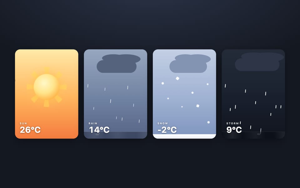
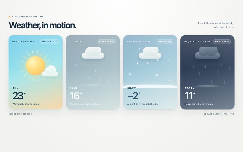
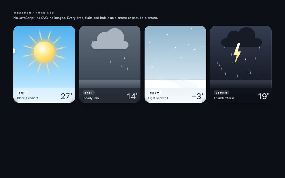
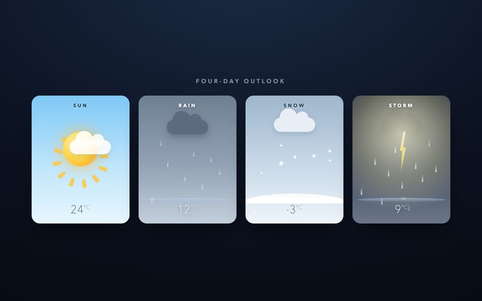
One email when a new model lands on the board or in the showcase. Unsubscribe anytime.