
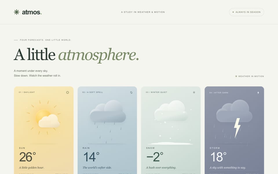
Four weather cards — CSS only, built by DeepSeek V4.1 Flash 1017
Hostedvia OpenCodeOpenRouter
4476tok/s
First token included
152.2Ktokens
34.0s
$0.11
Show the code the model wroteHide the code
<!doctype html>
<html lang="en">
<head>
<meta charset="utf-8">
<meta name="viewport" content="width=device-width, initial-scale=1">
<meta name="theme-color" content="#111714">
<meta name="description" content="Four animated weather cards — sun, rain, snow and thunderstorm — built entirely with CSS. No scripts, no images.">
<title>AER — Four Skies</title>
<style>
/* =========================================================
AER — Four Skies
A CSS-only weather study. No images, no scripts.
========================================================= */
:root {
--bg: #111714;
--bone: #f2ece2;
--ink: #1d2521;
--soft: #98a19a;
--faint: #838e86;
--line: rgba(241, 237, 228, 0.15);
--serif: "Iowan Old Style", "Palatino Linotype", "Book Antiqua", Palatino, Georgia, serif;
--sans: "Helvetica Neue", Helvetica, Arial, sans-serif;
--mono: "SFMono-Regular", "SF Mono", ui-monospace, Menlo, Consolas, monospace;
--card-h: 440px;
--pad: 7px;
}
*,
*::before,
*::after {
box-sizing: border-box;
}
html {
background: var(--bg);
}
body {
min-width: 320px;
margin: 0;
color: var(--bone);
background:
radial-gradient(900px 560px at 5% -15%, rgba(198, 139, 85, 0.13), transparent 66%),
radial-gradient(980px 650px at 104% 112%, rgba(84, 119, 137, 0.14), transparent 62%),
var(--bg);
font-family: var(--sans);
-webkit-font-smoothing: antialiased;
text-rendering: optimizeLegibility;
}
body::before {
position: fixed;
inset: 0;
z-index: -1;
background-image:
linear-gradient(rgba(255, 255, 255, 0.021) 1px, transparent 1px),
linear-gradient(90deg, rgba(255, 255, 255, 0.021) 1px, transparent 1px);
background-size: 72px 72px;
content: "";
pointer-events: none;
-webkit-mask-image: radial-gradient(ellipse 80% 70% at 50% 45%, #000 0%, transparent 85%);
mask-image: radial-gradient(ellipse 80% 70% at 50% 45%, #000 0%, transparent 85%);
}
h1,
h2,
p {
margin: 0;
}
.page {
display: flex;
flex-direction: column;
width: min(1240px, calc(100% - 64px));
min-height: 100svh;
margin: 0 auto;
padding: 28px 0 24px;
}
/* ---------------------------------------------------------
Masthead
--------------------------------------------------------- */
.masthead {
display: flex;
align-items: center;
justify-content: space-between;
gap: 28px;
padding-bottom: 17px;
border-bottom: 1px solid var(--line);
}
.brand {
display: inline-flex;
align-items: center;
gap: 10px;
}
.brand__mark {
width: 15px;
height: 15px;
border: 1px solid rgba(255, 255, 255, 0.23);
border-radius: 50%;
background: linear-gradient(180deg, #e8bb84 0 48%, #536b6c 48% 100%);
box-shadow: inset 0 0 0 2px rgba(17, 23, 20, 0.12);
}
.brand__word {
font-family: var(--sans);
font-size: 13px;
font-weight: 600;
letter-spacing: 0.34em;
line-height: 1;
}
.masthead__meta {
color: var(--faint);
font-family: var(--mono);
font-size: 9px;
letter-spacing: 0.12em;
line-height: 1.4;
text-transform: uppercase;
}
.masthead__meta span {
margin: 0 7px;
color: #4b554f;
}
/* ---------------------------------------------------------
Intro
--------------------------------------------------------- */
.intro {
display: grid;
grid-template-columns: minmax(0, 1fr) 320px;
align-items: end;
gap: 44px;
margin-top: 57px;
}
.eyebrow {
display: flex;
align-items: center;
gap: 9px;
margin-bottom: 17px;
color: var(--soft);
font-family: var(--mono);
font-size: 9px;
letter-spacing: 0.18em;
line-height: 1;
text-transform: uppercase;
}
.eyebrow__line {
display: inline-block;
width: 25px;
height: 1px;
background: #b18158;
}
.intro h1 {
max-width: 720px;
color: #efebe2;
font-family: var(--serif);
font-size: clamp(45px, 4.25vw, 59px);
font-weight: 400;
letter-spacing: -0.032em;
line-height: 0.99;
}
.intro h1 em {
color: #d7b693;
font-style: italic;
font-weight: 400;
}
.intro__copy {
max-width: 318px;
padding-bottom: 7px;
justify-self: end;
color: var(--soft);
font-size: 12.5px;
font-weight: 400;
letter-spacing: 0.005em;
line-height: 1.72;
}
.intro__copy span {
display: block;
margin-top: 12px;
color: #849087;
font-family: var(--mono);
font-size: 8.5px;
letter-spacing: 0.11em;
text-transform: uppercase;
}
/* ---------------------------------------------------------
Card grid + shared card anatomy
--------------------------------------------------------- */
.cards {
display: grid;
grid-template-columns: repeat(4, minmax(0, 1fr));
gap: 16px;
margin-top: 38px;
}
.card {
--accent: #b97a41;
--glow: rgba(185, 122, 65, 0.42);
--beat-delay: 0s;
position: relative;
display: flex;
flex-direction: column;
height: var(--card-h);
padding: var(--pad) var(--pad) 0;
overflow: hidden;
border-radius: 26px;
background: var(--bone);
box-shadow:
0 2px 0 rgba(255, 255, 255, 0.24) inset,
0 0 0 1px rgba(255, 255, 255, 0.08),
0 28px 55px -20px rgba(0, 0, 0, 0.6);
color: var(--ink);
transition:
transform 450ms cubic-bezier(0.2, 0.75, 0.25, 1),
box-shadow 450ms cubic-bezier(0.2, 0.75, 0.25, 1);
}
.cards .card:nth-child(1) { --beat-delay: -0.25s; }
.cards .card:nth-child(2) { --beat-delay: -1.55s; }
.cards .card:nth-child(3) { --beat-delay: -2.8s; }
.cards .card:nth-child(4) { --beat-delay: -3.65s; }
.scene {
position: relative;
flex: 1 1 auto;
min-height: 0;
overflow: hidden;
border-radius: 20px;
isolation: isolate;
}
.scene::after {
position: absolute;
inset: 0;
z-index: 30;
border-radius: inherit;
box-shadow:
inset 0 0 0 1px rgba(255, 255, 255, 0.18),
inset 0 1px 0 rgba(255, 255, 255, 0.15);
content: "";
pointer-events: none;
}
.card__info {
display: flex;
flex: 0 0 108px;
flex-direction: column;
justify-content: space-between;
height: 108px;
padding: 14px 15px 13px;
}
.card__top {
display: flex;
align-items: flex-end;
justify-content: space-between;
gap: 12px;
}
.card__id {
display: flex;
align-items: baseline;
gap: 8px;
padding-bottom: 4px;
}
.card__index {
color: #64665d;
font-family: var(--mono);
font-size: 8px;
letter-spacing: 0.06em;
line-height: 1;
}
.card__name {
color: var(--ink);
font-family: var(--sans);
font-size: 13px;
font-weight: 600;
letter-spacing: 0.21em;
line-height: 1;
text-transform: uppercase;
}
.card__temp {
color: #1b231f;
font-family: var(--sans);
font-size: 43px;
font-weight: 400;
letter-spacing: -0.07em;
line-height: 0.76;
white-space: nowrap;
}
.degree {
display: inline-block;
margin-left: 1px;
font-size: 0.48em;
font-weight: 400;
letter-spacing: 0;
vertical-align: 0.59em;
}
.card__bottom {
display: flex;
align-items: center;
justify-content: space-between;
gap: 10px;
padding-top: 9px;
border-top: 1px solid rgba(28, 36, 32, 0.14);
color: #5b5e56;
font-family: var(--mono);
font-size: 8.5px;
letter-spacing: 0.085em;
line-height: 1.2;
text-transform: uppercase;
}
.condition {
display: inline-flex;
align-items: center;
gap: 7px;
white-space: nowrap;
}
.status-dot {
display: inline-block;
width: 5px;
height: 5px;
flex: 0 0 5px;
border-radius: 50%;
background: var(--accent);
box-shadow: 0 0 0 0 var(--glow);
animation: status-pulse 4.9s ease-in-out var(--beat-delay) infinite;
}
.feels {
color: #5f6259;
white-space: nowrap;
}
@keyframes status-pulse {
0%,
100% {
opacity: 0.62;
transform: scale(0.9);
box-shadow: 0 0 0 0 var(--glow);
}
48% {
opacity: 1;
transform: scale(1);
box-shadow: 0 0 0 3px transparent;
}
}
/* ---------------------------------------------------------
01 — Sun
--------------------------------------------------------- */
.card--sun {
--accent: #bd7937;
--glow: rgba(189, 121, 55, 0.45);
}
.scene--sun {
background:
radial-gradient(70% 68% at 50% 43%, rgba(255, 247, 208, 0.55) 0%, rgba(255, 235, 177, 0.2) 44%, transparent 70%),
radial-gradient(120% 60% at 50% 104%, rgba(255, 222, 169, 0.64), transparent 64%),
linear-gradient(178deg, #ffdb9d 0%, #ffc78c 48%, #efa172 100%);
}
.sun-system {
position: absolute;
inset: 0;
animation: sun-dim 26s linear infinite;
will-change: filter;
}
.sun-halo {
position: absolute;
top: 45%;
left: 50%;
width: 276px;
height: 276px;
border-radius: 50%;
background: radial-gradient(
circle,
rgba(255, 252, 225, 0.95) 0%,
rgba(255, 229, 142, 0.56) 27%,
rgba(255, 198, 104, 0.2) 50%,
rgba(255, 178, 90, 0) 72%
);
filter: blur(8px);
opacity: 0.8;
animation: halo-pulse 7.6s ease-in-out -2.4s infinite;
transform: translate(-50%, -50%) scale(0.92);
}
.sun-rays {
position: absolute;
top: calc(45% - 140px);
left: calc(50% - 140px);
width: 280px;
height: 280px;
animation: sun-spin 64s linear infinite;
}
.sun-ray {
position: absolute;
inset: 0;
transform: rotate(calc(var(--i) * 22.5deg));
}
.sun-ray::before {
position: absolute;
top: 9px;
left: calc(50% - 1px);
width: 2px;
height: 57px;
border-radius: 2px;
background: linear-gradient(to bottom, rgba(255, 248, 218, 0.03), rgba(255, 249, 223, 0.7));
clip-path: polygon(50% 0%, 100% 100%, 0 100%);
content: "";
transform-origin: 50% 100%;
}
.sun-ray:nth-child(2n)::before {
top: 20px;
width: 1.5px;
height: 34px;
opacity: 0.65;
}
.sun-ray:nth-child(4n)::before {
top: 6px;
height: 65px;
opacity: 0.8;
}
.sun-ray:nth-child(4n + 2)::before {
opacity: 0.42;
}
.sun-disc {
position: absolute;
top: calc(45% - 46px);
left: calc(50% - 46px);
width: 92px;
height: 92px;
border-radius: 50%;
background:
radial-gradient(circle at 37% 31%, #fffef2 0%, #fffbe1 31%, #ffeb9f 62%, #ffd36d 100%);
box-shadow:
0 0 15px rgba(255, 252, 224, 0.95),
0 0 48px rgba(255, 216, 111, 0.72),
0 0 100px rgba(255, 172, 77, 0.34);
animation: sun-breathe 7.6s ease-in-out -1.1s infinite;
will-change: transform;
}
.sun-disc::after {
position: absolute;
inset: 16%;
border-radius: 50%;
background: radial-gradient(circle at 42% 35%, rgba(255, 255, 250, 0.65), transparent 68%);
content: "";
}
.sun-cloud {
position: absolute;
top: calc(45% - 9px);
left: -36%;
z-index: 4;
width: 92px;
height: 28px;
border-radius: 999px;
background: #fbf2e6;
box-shadow: inset 0 -7px 10px rgba(197, 131, 91, 0.1);
filter: drop-shadow(0 10px 16px rgba(154, 83, 45, 0.11));
opacity: 0;
animation:
sun-cloud-cross 26s linear infinite,
sun-cloud-bob 5.3s ease-in-out -1.8s infinite;
will-change: left, transform;
}
.sun-cloud::before,
.sun-cloud::after {
position: absolute;
border-radius: 50%;
background: #fbf2e6;
box-shadow: inset 0 -7px 10px rgba(197, 131, 91, 0.1);
content: "";
}
.sun-cloud::before {
top: -20px;
left: 13px;
width: 39px;
height: 39px;
}
.sun-cloud::after {
top: -36px;
left: 33px;
width: 53px;
height: 53px;
}
.sun-horizon {
position: absolute;
right: -18%;
bottom: -57px;
left: -18%;
height: 160px;
border-radius: 50% 50% 0 0 / 100% 100% 0 0;
background:
radial-gradient(54% 90% at 50% 100%, rgba(255, 241, 203, 0.3), transparent 72%),
linear-gradient(to top, rgba(221, 130, 93, 0.23), transparent);
pointer-events: none;
}
@keyframes sun-spin {
to { transform: rotate(360deg); }
}
@keyframes halo-pulse {
0%,
100% {
opacity: 0.68;
transform: translate(-50%, -50%) scale(0.91);
}
50% {
opacity: 0.96;
transform: translate(-50%, -50%) scale(1.06);
}
}
@keyframes sun-breathe {
0%,
100% {
transform: scale(0.977);
box-shadow:
0 0 14px rgba(255, 252, 224, 0.9),
0 0 44px rgba(255, 216, 111, 0.68),
0 0 92px rgba(255, 172, 77, 0.3);
}
50% {
transform: scale(1.035);
box-shadow:
0 0 18px rgba(255, 253, 234, 1),
0 0 64px rgba(255, 219, 120, 0.82),
0 0 126px rgba(255, 169, 77, 0.4);
}
}
@keyframes sun-dim {
0%,
38%,
58%,
100% {
filter: brightness(1) saturate(1);
}
45%,
50% {
filter: brightness(0.71) saturate(0.88);
}
}
@keyframes sun-cloud-cross {
0% {
left: -36%;
opacity: 0;
}
14% {
opacity: 0;
}
24%,
68% {
opacity: 0.93;
}
82% {
opacity: 0;
}
100% {
left: 116%;
opacity: 0;
}
}
@keyframes sun-cloud-bob {
0%,
100% { transform: translateY(0); }
50% { transform: translateY(-4px); }
}
/* ---------------------------------------------------------
02 — Rain
--------------------------------------------------------- */
.card--rain {
--accent: #426b7d;
--glow: rgba(66, 107, 125, 0.45);
}
.scene--rain {
background:
radial-gradient(120% 80% at 50% -6%, rgba(229, 236, 234, 0.23), transparent 56%),
linear-gradient(180deg, #91a1a6 0%, #647982 43%, #445c66 78%, #304650 100%);
}
.rain-cloud {
--cloud-shade:
inset 0 7px 11px rgba(255, 255, 255, 0.2),
inset 0 -11px 17px rgba(50, 73, 82, 0.1);
position: absolute;
left: 50%;
width: 174px;
height: 46px;
border-radius: 999px;
background: #c9d3d3;
box-shadow: var(--cloud-shade);
filter: drop-shadow(0 17px 20px rgba(24, 43, 51, 0.23));
translate: -50% 0;
}
.rain-cloud::before,
.rain-cloud::after,
.rain-cloud .cloud-puff {
position: absolute;
border-radius: 50%;
background: #c9d3d3;
box-shadow: var(--cloud-shade);
content: "";
}
.rain-cloud::before {
top: -39px;
left: 18px;
width: 73px;
height: 73px;
}
.rain-cloud::after {
top: -59px;
left: 64px;
width: 99px;
height: 99px;
}
.rain-cloud .cloud-puff {
top: -28px;
left: 116px;
width: 55px;
height: 55px;
z-index: 1;
}
.rain-cloud--front {
top: 24%;
z-index: 5;
animation: rain-cloud-drift 8.7s ease-in-out -2.2s infinite;
}
.rain-cloud--back {
top: 13%;
z-index: 1;
scale: 0.51;
opacity: 0.25;
filter: blur(0.7px);
animation: rain-cloud-drift 11.4s ease-in-out -5s infinite reverse;
}
.rainfall {
position: absolute;
inset: 0;
z-index: 2;
}
.drop {
position: absolute;
top: 42%;
left: var(--x);
width: var(--w);
height: var(--h);
border-radius: 999px;
background: linear-gradient(to bottom, rgba(218, 236, 241, 0.05) 0%, rgba(232, 244, 247, 0.88) 72%, rgba(245, 251, 252, 0.95) 100%);
opacity: 0;
animation: rain-fall var(--dur) cubic-bezier(0.45, 0.05, 0.84, 0.48) var(--delay) infinite;
will-change: transform, opacity;
}
.splash-field {
position: absolute;
inset: 0;
z-index: 4;
}
.splash {
position: absolute;
bottom: 42px;
left: var(--x);
width: var(--w);
height: 6px;
border: 1px solid rgba(218, 237, 241, 0.62);
border-radius: 50%;
opacity: 0;
animation: rain-splash var(--dur) linear var(--delay) infinite;
transform: translate(-50%, 0) scale(0.2);
will-change: transform, opacity;
}
.rain-ground {
position: absolute;
right: 0;
bottom: 0;
left: 0;
z-index: 3;
height: 64px;
background:
radial-gradient(90% 60% at 50% 100%, rgba(24, 42, 49, 0.62), transparent 74%),
linear-gradient(to top, rgba(24, 39, 46, 0.77), rgba(47, 69, 78, 0.2) 56%, transparent 100%);
}
.rain-ground::before {
position: absolute;
top: 17px;
right: 6%;
left: 6%;
height: 1px;
background: linear-gradient(90deg, transparent, rgba(213, 233, 237, 0.33) 18%, rgba(213, 233, 237, 0.28) 68%, transparent);
content: "";
}
.rain-ground::after {
position: absolute;
right: 0;
bottom: 0;
left: 0;
height: 30px;
background:
radial-gradient(32% 160% at 31% 100%, rgba(183, 211, 217, 0.11), transparent 64%),
radial-gradient(26% 130% at 72% 100%, rgba(208, 231, 234, 0.09), transparent 70%);
content: "";
}
.ripple {
position: absolute;
border: 1px solid rgba(207, 229, 234, 0.14);
border-radius: 50%;
animation: ripple-breathe 7s ease-in-out infinite;
}
.ripple--one {
right: 20%;
bottom: 20px;
width: 48px;
height: 8px;
animation-delay: -1.8s;
}
.ripple--two {
bottom: 13px;
left: 13%;
width: 32px;
height: 5px;
animation-delay: -4.6s;
}
.ripple--three {
right: 43%;
bottom: 33px;
width: 23px;
height: 4px;
animation-delay: -2.9s;
}
@keyframes rain-cloud-drift {
0%,
100% { transform: translateY(0); }
50% { transform: translateY(4px); }
}
@keyframes rain-fall {
0% {
opacity: 0;
transform: translate3d(0, -27px, 0) scaleY(0.62);
}
8% { opacity: 0.68; }
68% { opacity: 0.88; }
80% {
opacity: 0.9;
transform: translate3d(0, 142px, 0) scaleY(1.08);
}
83%,
100% {
opacity: 0;
transform: translate3d(0, 143px, 0) scaleY(0.7);
}
}
@keyframes rain-splash {
0%,
76% {
opacity: 0;
transform: translate(-50%, 0) scale(0.18);
}
80% {
opacity: 0.72;
transform: translate(-50%, -2px) scale(0.7);
}
91% {
opacity: 0.18;
transform: translate(-50%, 0) scale(1.5);
}
100% {
opacity: 0;
transform: translate(-50%, 0) scale(1.7);
}
}
@keyframes ripple-breathe {
0%,
100% {
opacity: 0.26;
transform: scaleX(0.87);
}
50% {
opacity: 0.66;
transform: scaleX(1.08);
}
}
/* ---------------------------------------------------------
03 — Snow
--------------------------------------------------------- */
.card--snow {
--accent: #6c92a3;
--glow: rgba(108, 146, 163, 0.45);
}
.scene--snow {
background:
radial-gradient(55% 47% at 77% 7%, rgba(255, 253, 242, 0.72), transparent 68%),
radial-gradient(115% 68% at 20% 110%, rgba(234, 245, 248, 0.72), transparent 68%),
linear-gradient(180deg, #adc5cf 0%, #93b0bc 52%, #7697a6 100%);
}
.snow-light {
position: absolute;
top: -16%;
right: -14%;
width: 265px;
height: 265px;
border-radius: 50%;
background: radial-gradient(circle, rgba(255, 252, 239, 0.62) 0%, rgba(255, 250, 233, 0.22) 38%, transparent 70%);
filter: blur(17px);
}
.snowfall {
position: absolute;
inset: 0;
z-index: 2;
}
.flake {
position: absolute;
top: -13px;
left: var(--x);
width: var(--s);
height: var(--s);
border-radius: 50%;
background: #fff;
box-shadow:
0 1px 2px rgba(48, 86, 102, 0.3),
0 0 5px rgba(255, 255, 255, 0.52);
opacity: 0;
animation: snow-fall var(--dur) linear var(--delay) infinite;
will-change: transform, opacity;
}
.flake--star {
border-radius: 0;
background:
linear-gradient(0deg, transparent 44%, rgba(255, 255, 255, 0.94) 44% 56%, transparent 56%),
linear-gradient(60deg, transparent 44%, rgba(255, 255, 255, 0.94) 44% 56%, transparent 56%),
linear-gradient(120deg, transparent 44%, rgba(255, 255, 255, 0.94) 44% 56%, transparent 56%);
box-shadow: none;
filter:
drop-shadow(0 1px 1px rgba(49, 86, 101, 0.34))
drop-shadow(0 0 3px rgba(255, 255, 255, 0.58));
}
.snow-ground {
position: absolute;
right: -6%;
bottom: -26px;
left: -6%;
z-index: 3;
height: 64px;
border-radius: 56% 44% 0 0 / 100% 76% 0 0;
background:
radial-gradient(72% 180% at 22% 100%, rgba(255, 255, 255, 0.82), transparent 66%),
linear-gradient(180deg, #fbfeff 0%, #f0f8fa 58%, #e2eef2 100%);
box-shadow:
0 -7px 16px rgba(68, 104, 119, 0.13),
inset 0 2px 0 rgba(255, 255, 255, 0.8);
}
.snow-ground::before {
position: absolute;
top: 2px;
right: 9%;
left: 8%;
height: 13px;
border-radius: 50%;
background: linear-gradient(180deg, rgba(255, 255, 255, 0.72), transparent);
filter: blur(3px);
content: "";
}
.snow-ground::after {
position: absolute;
right: 0;
bottom: 0;
left: 0;
height: 17px;
background: linear-gradient(to top, rgba(108, 148, 162, 0.08), transparent);
content: "";
}
@keyframes snow-fall {
0% {
opacity: 0;
transform: translate3d(0, -19px, 0) rotate(0deg) scale(0.82);
}
8% { opacity: var(--o, 0.75); }
22% {
transform: translate3d(calc(var(--sway) * -0.8), 64px, 0) rotate(80deg) scale(1);
}
45% {
transform: translate3d(var(--sway), 148px, 0) rotate(180deg) scale(1.03);
}
68% {
transform: translate3d(calc(var(--sway) * -0.45), 238px, 0) rotate(268deg) scale(0.98);
}
88% { opacity: var(--o, 0.75); }
100% {
opacity: 0;
transform: translate3d(0, 354px, 0) rotate(360deg) scale(0.88);
}
}
/* ---------------------------------------------------------
04 — Storm
--------------------------------------------------------- */
.card--storm {
--accent: #607eac;
--glow: rgba(96, 126, 172, 0.48);
}
.scene--storm {
background:
radial-gradient(70% 52% at 55% 41%, rgba(80, 104, 137, 0.31), transparent 70%),
radial-gradient(90% 45% at 48% 102%, rgba(84, 108, 136, 0.23), transparent 69%),
linear-gradient(180deg, #0c141e 0%, #172230 47%, #263343 82%, #1a2530 100%);
}
.storm-cloud {
--cloud-shade:
inset 0 8px 13px rgba(157, 179, 204, 0.14),
inset 0 -14px 21px rgba(3, 8, 14, 0.2);
position: absolute;
left: 50%;
width: 192px;
height: 53px;
border-radius: 999px;
background: #344152;
box-shadow: var(--cloud-shade);
filter: drop-shadow(0 20px 26px rgba(2, 7, 13, 0.44));
translate: -50% 0;
}
.storm-cloud::before,
.storm-cloud::after,
.storm-cloud .cloud-puff {
position: absolute;
border-radius: 50%;
background: #344152;
box-shadow: var(--cloud-shade);
content: "";
}
.storm-cloud::before {
top: -43px;
left: 17px;
width: 80px;
height: 80px;
}
.storm-cloud::after {
top: -66px;
left: 68px;
width: 108px;
height: 108px;
}
.storm-cloud .cloud-puff {
top: -30px;
left: 129px;
width: 58px;
height: 58px;
z-index: 1;
}
.storm-cloud--front {
top: 23%;
z-index: 5;
animation: storm-cloud-drift 10.4s ease-in-out -3.1s infinite;
}
.storm-cloud--back {
top: 11%;
z-index: 1;
scale: 0.57;
opacity: 0.28;
filter: blur(0.8px);
animation: storm-cloud-drift 13.8s ease-in-out -7.2s infinite reverse;
}
.storm-haze {
position: absolute;
inset: 0;
z-index: 1;
background:
radial-gradient(50% 44% at 56% 29%, rgba(105, 132, 168, 0.14), transparent 76%),
linear-gradient(to top, rgba(6, 12, 19, 0.44), transparent 30%);
pointer-events: none;
}
.storm-rain {
position: absolute;
inset: 0;
z-index: 3;
}
.heavy-drop {
position: absolute;
top: 41%;
left: var(--x);
width: var(--w);
height: var(--h);
border-radius: 999px;
background: linear-gradient(to bottom, rgba(184, 211, 235, 0.02) 0%, rgba(207, 227, 245, 0.68) 72%, rgba(226, 240, 252, 0.86) 100%);
opacity: 0;
animation: storm-rain-fall var(--dur) cubic-bezier(0.46, 0.04, 0.84, 0.5) var(--delay) infinite;
will-change: transform, opacity;
}
.bolt {
position: absolute;
z-index: 2;
background: linear-gradient(180deg, #ffffff 0%, #f3f7ff 42%, #c8dcff 100%);
filter:
drop-shadow(0 0 7px rgba(248, 252, 255, 0.98))
drop-shadow(0 0 26px rgba(152, 188, 255, 0.8));
opacity: 0;
animation: lightning-bolt 29s linear infinite;
will-change: opacity;
}
.bolt--main {
top: 14%;
left: 53%;
width: 58px;
height: 231px;
clip-path: polygon(58% 0%, 81% 0%, 63% 35%, 89% 32%, 33% 100%, 47% 54%, 18% 58%, 43% 18%, 27% 21%);
}
.bolt--branch {
top: 29%;
left: 59%;
width: 35px;
height: 122px;
clip-path: polygon(58% 0%, 86% 0%, 64% 37%, 100% 34%, 21% 100%, 42% 59%, 8% 63%, 37% 21%, 18% 25%);
animation-delay: 0.045s;
filter:
drop-shadow(0 0 5px rgba(244, 250, 255, 0.92))
drop-shadow(0 0 18px rgba(137, 176, 255, 0.65));
}
.storm-ground {
position: absolute;
right: 0;
bottom: 0;
left: 0;
z-index: 4;
height: 48px;
background:
radial-gradient(38% 165% at 37% 100%, rgba(130, 161, 195, 0.12), transparent 68%),
linear-gradient(to top, rgba(5, 10, 16, 0.72), transparent);
}
.storm-ground::before {
position: absolute;
top: 12px;
right: 7%;
left: 7%;
height: 1px;
background: linear-gradient(90deg, transparent, rgba(131, 160, 191, 0.17) 30%, rgba(163, 188, 215, 0.12) 65%, transparent);
content: "";
}
.storm-flash {
position: absolute;
inset: 0;
z-index: 25;
border-radius: inherit;
background:
radial-gradient(58% 52% at 56% 35%, #ffffff 0%, #f0f5ff 34%, #d5e2fb 73%, #c0d4f4 100%);
opacity: 0;
pointer-events: none;
animation: storm-flash 29s linear infinite;
will-change: opacity;
}
@keyframes storm-cloud-drift {
0%,
100% { transform: translateY(0) translateX(0); }
50% { transform: translateY(4px) translateX(2px); }
}
@keyframes storm-rain-fall {
0% {
opacity: 0;
transform: translate3d(8px, -28px, 0) scaleY(0.55);
}
7% { opacity: 0.6; }
76% { opacity: 0.84; }
84% {
opacity: 0.9;
transform: translate3d(var(--lean), 158px, 0) scaleY(1.08);
}
87%,
100% {
opacity: 0;
transform: translate3d(var(--lean), 159px, 0) scaleY(0.7);
}
}
@keyframes lightning-bolt {
0%,
5.4%,
5.85%,
6.2%,
6.65%,
42.9%,
43.3%,
43.8%,
44.15%,
74%,
74.3%,
74.7%,
75.1%,
75.5%,
75.9%,
100% {
opacity: 0;
}
5.55% { opacity: 0.56; }
5.9% { opacity: 0.08; }
6.4% { opacity: 1; }
6.7% { opacity: 0; }
43.05% { opacity: 0.58; }
43.5% { opacity: 0.08; }
43.95% { opacity: 0.74; }
44.2% { opacity: 0; }
74.1% { opacity: 0.78; }
74.45% { opacity: 0.1; }
74.85% { opacity: 1; }
75.2% { opacity: 0.25; }
75.6% { opacity: 0.88; }
75.95% { opacity: 0; }
}
@keyframes storm-flash {
0%,
5.4%,
5.85%,
6.2%,
6.65%,
42.9%,
43.3%,
43.8%,
44.15%,
74%,
74.3%,
74.7%,
75.1%,
75.5%,
75.9%,
100% {
opacity: 0;
}
5.55% { opacity: 0.25; }
5.9% { opacity: 0.03; }
6.4% { opacity: 0.63; }
6.7% { opacity: 0; }
43.05% { opacity: 0.27; }
43.5% { opacity: 0.025; }
43.95% { opacity: 0.43; }
44.2% { opacity: 0; }
74.1% { opacity: 0.4; }
74.45% { opacity: 0.035; }
74.85% { opacity: 0.7; }
75.2% { opacity: 0.1; }
75.6% { opacity: 0.52; }
75.95% { opacity: 0; }
}
/* ---------------------------------------------------------
Footer
--------------------------------------------------------- */
.colophon {
display: flex;
align-items: center;
justify-content: space-between;
gap: 30px;
margin-top: auto;
padding-top: 36px;
color: #77837a;
font-family: var(--mono);
font-size: 8px;
letter-spacing: 0.1em;
line-height: 1.5;
text-transform: uppercase;
}
.colophon span {
margin: 0 5px;
color: #3e4942;
}
.colophon__meta {
text-align: right;
}
/* ---------------------------------------------------------
Hover polish
--------------------------------------------------------- */
@media (hover: hover) and (pointer: fine) {
.card:hover {
transform: translateY(-5px);
box-shadow:
0 2px 0 rgba(255, 255, 255, 0.26) inset,
0 0 0 1px rgba(255, 255, 255, 0.1),
0 36px 70px -24px rgba(0, 0, 0, 0.68);
}
}
/* ---------------------------------------------------------
Responsive composition
--------------------------------------------------------- */
@media (max-width: 1180px) {
.page {
width: min(820px, calc(100% - 48px));
}
.cards {
grid-template-columns: repeat(2, minmax(0, 1fr));
gap: 14px;
}
.intro {
grid-template-columns: minmax(0, 1fr) 290px;
gap: 34px;
}
.intro__copy {
font-size: 12px;
}
}
@media (max-width: 860px) {
.intro {
grid-template-columns: 1fr;
gap: 18px;
}
.intro__copy {
max-width: 430px;
padding-bottom: 0;
justify-self: start;
}
.colophon {
margin-top: 0;
}
}
@media (max-width: 640px) {
:root {
--card-h: 430px;
}
.page {
width: calc(100% - 32px);
padding-top: 20px;
padding-bottom: 18px;
}
.masthead {
gap: 16px;
padding-bottom: 14px;
}
.brand__word {
font-size: 12px;
}
.masthead__meta {
font-size: 7.5px;
letter-spacing: 0.06em;
}
.masthead__meta span {
margin: 0 3px;
}
.intro {
margin-top: 39px;
}
.intro h1 {
font-size: clamp(40px, 11vw, 52px);
}
.eyebrow {
margin-bottom: 13px;
font-size: 8px;
}
.cards {
grid-template-columns: minmax(0, 380px);
justify-content: center;
gap: 13px;
margin-top: 29px;
}
.card__info {
flex-basis: 106px;
height: 106px;
padding: 13px 14px 12px;
}
.card__temp {
font-size: 41px;
}
.colophon {
flex-direction: column;
align-items: flex-start;
gap: 5px;
padding-top: 27px;
text-align: left;
}
.colophon__meta {
text-align: left;
}
}
@media (max-width: 370px) {
.page {
width: calc(100% - 20px);
}
.brand__word {
letter-spacing: 0.25em;
}
.masthead__meta span:first-of-type,
.masthead__meta span:first-of-type + span {
display: none;
}
}
/* ---------------------------------------------------------
Calm mode
--------------------------------------------------------- */
@media (prefers-reduced-motion: reduce) {
*,
*::before,
*::after {
animation-play-state: paused !important;
transition-duration: 0.01ms !important;
}
.card:hover {
transform: none;
}
}
</style>
</head>
<body>
<div class="page">
<header class="masthead">
<div class="brand">
<span class="brand__mark" aria-hidden="true"></span>
<span class="brand__word">AER</span>
</div>
<p class="masthead__meta">Weather index <span>/</span> Vol. 04 <span>/</span> 17 Oct 2026</p>
</header>
<section class="intro" aria-labelledby="page-title">
<div class="intro__title">
<p class="eyebrow"><span class="eyebrow__line" aria-hidden="true"></span>Conditions at a glance</p>
<h1 id="page-title">Four skies,<br><em>one afternoon.</em></h1>
</div>
<p class="intro__copy">
Four small weather systems, drawn entirely in CSS. Light, water, snow and electricity — every drop, flake and flicker is made of code.
<span>No scripts. No images.</span>
</p>
</section>
<main class="cards" aria-label="Weather conditions">
<article class="card card--sun" aria-labelledby="sun-name">
<div class="scene scene--sun" role="img" aria-label="A glowing sun with slowly turning rays while a small cloud drifts past">
<div class="sun-system" aria-hidden="true">
<span class="sun-halo"></span>
<span class="sun-rays">
<i class="sun-ray" style="--i: 0"></i>
<i class="sun-ray" style="--i: 1"></i>
<i class="sun-ray" style="--i: 2"></i>
<i class="sun-ray" style="--i: 3"></i>
<i class="sun-ray" style="--i: 4"></i>
<i class="sun-ray" style="--i: 5"></i>
<i class="sun-ray" style="--i: 6"></i>
<i class="sun-ray" style="--i: 7"></i>
<i class="sun-ray" style="--i: 8"></i>
<i class="sun-ray" style="--i: 9"></i>
<i class="sun-ray" style="--i: 10"></i>
<i class="sun-ray" style="--i: 11"></i>
<i class="sun-ray" style="--i: 12"></i>
<i class="sun-ray" style="--i: 13"></i>
<i class="sun-ray" style="--i: 14"></i>
<i class="sun-ray" style="--i: 15"></i>
</span>
<span class="sun-disc"></span>
</div>
<span class="sun-cloud" aria-hidden="true"></span>
<span class="sun-horizon" aria-hidden="true"></span>
</div>
<div class="card__info">
<div class="card__top">
<div class="card__id">
<span class="card__index">01</span>
<h2 class="card__name" id="sun-name">Sun</h2>
</div>
<p class="card__temp">31<span class="degree">°</span></p>
</div>
<div class="card__bottom">
<span class="condition"><i class="status-dot" aria-hidden="true"></i>Clear skies</span>
<span class="feels">Feels 33°</span>
</div>
</div>
</article>
<article class="card card--rain" aria-labelledby="rain-name">
<div class="scene scene--rain" role="img" aria-label="A grey cloud releasing staggered rain into a rippling puddle">
<span class="rain-cloud rain-cloud--back" aria-hidden="true"></span>
<span class="rain-cloud rain-cloud--front" aria-hidden="true"><i class="cloud-puff"></i></span>
<span class="rainfall" aria-hidden="true">
<i class="drop" style="--x: 25%; --w: 1.4px; --h: 15px; --dur: 1.45s; --delay: -0.20s"></i>
<i class="drop" style="--x: 31%; --w: 1.6px; --h: 18px; --dur: 1.68s; --delay: -1.10s"></i>
<i class="drop" style="--x: 36%; --w: 1.2px; --h: 13px; --dur: 1.30s; --delay: -0.72s"></i>
<i class="drop" style="--x: 41%; --w: 1.5px; --h: 16px; --dur: 1.78s; --delay: -1.48s"></i>
<i class="drop" style="--x: 47%; --w: 1.3px; --h: 20px; --dur: 1.56s; --delay: -0.42s"></i>
<i class="drop" style="--x: 52%; --w: 1.7px; --h: 15px; --dur: 1.36s; --delay: -1.27s"></i>
<i class="drop" style="--x: 57%; --w: 1.4px; --h: 17px; --dur: 1.72s; --delay: -0.06s"></i>
<i class="drop" style="--x: 62%; --w: 1.2px; --h: 13px; --dur: 1.40s; --delay: -0.94s"></i>
<i class="drop" style="--x: 67%; --w: 1.6px; --h: 19px; --dur: 1.62s; --delay: -1.56s"></i>
<i class="drop" style="--x: 72%; --w: 1.3px; --h: 15px; --dur: 1.50s; --delay: -0.58s"></i>
<i class="drop" style="--x: 28%; --w: 1.5px; --h: 17px; --dur: 1.76s; --delay: -1.32s"></i>
<i class="drop" style="--x: 44%; --w: 1.2px; --h: 14px; --dur: 1.34s; --delay: -1.02s"></i>
<i class="drop" style="--x: 54%; --w: 1.5px; --h: 18px; --dur: 1.64s; --delay: -0.34s"></i>
<i class="drop" style="--x: 68%; --w: 1.3px; --h: 14px; --dur: 1.54s; --delay: -1.51s"></i>
</span>
<span class="splash-field" aria-hidden="true">
<i class="splash" style="--x: 25%; --w: 15px; --dur: 1.45s; --delay: -0.20s"></i>
<i class="splash" style="--x: 36%; --w: 11px; --dur: 1.30s; --delay: -0.72s"></i>
<i class="splash" style="--x: 47%; --w: 17px; --dur: 1.56s; --delay: -0.42s"></i>
<i class="splash" style="--x: 57%; --w: 13px; --dur: 1.72s; --delay: -0.06s"></i>
<i class="splash" style="--x: 67%; --w: 16px; --dur: 1.62s; --delay: -1.56s"></i>
<i class="splash" style="--x: 28%; --w: 12px; --dur: 1.76s; --delay: -1.32s"></i>
<i class="splash" style="--x: 44%; --w: 10px; --dur: 1.34s; --delay: -1.02s"></i>
<i class="splash" style="--x: 68%; --w: 14px; --dur: 1.54s; --delay: -1.51s"></i>
</span>
<span class="rain-ground" aria-hidden="true">
<i class="ripple ripple--one"></i>
<i class="ripple ripple--two"></i>
<i class="ripple ripple--three"></i>
</span>
</div>
<div class="card__info">
<div class="card__top">
<div class="card__id">
<span class="card__index">02</span>
<h2 class="card__name" id="rain-name">Rain</h2>
</div>
<p class="card__temp">16<span class="degree">°</span></p>
</div>
<div class="card__bottom">
<span class="condition"><i class="status-dot" aria-hidden="true"></i>Steady rain</span>
<span class="feels">Feels 14°</span>
</div>
</div>
</article>
<article class="card card--snow" aria-labelledby="snow-name">
<div class="scene scene--snow" role="img" aria-label="Snowflakes of different sizes drifting slowly down to a soft mound of snow">
<span class="snow-light" aria-hidden="true"></span>
<span class="snowfall" aria-hidden="true">
<i class="flake" style="--x: 7%; --s: 4px; --dur: 11.5s; --delay: -4.1s; --sway: 18px; --o: .68"></i>
<i class="flake" style="--x: 14%; --s: 6px; --dur: 9.8s; --delay: -2.2s; --sway: 24px; --o: .82"></i>
<i class="flake flake--star" style="--x: 22%; --s: 10px; --dur: 13.2s; --delay: -7.3s; --sway: 16px; --o: .76"></i>
<i class="flake" style="--x: 30%; --s: 3px; --dur: 12.4s; --delay: -5.5s; --sway: 26px; --o: .55"></i>
<i class="flake" style="--x: 38%; --s: 7px; --dur: 8.7s; --delay: -1.4s; --sway: 20px; --o: .9"></i>
<i class="flake" style="--x: 45%; --s: 4px; --dur: 13.8s; --delay: -9.2s; --sway: 30px; --o: .62"></i>
<i class="flake" style="--x: 52%; --s: 5px; --dur: 10.3s; --delay: -3.7s; --sway: 14px; --o: .75"></i>
<i class="flake flake--star" style="--x: 59%; --s: 8px; --dur: 14.2s; --delay: -6.6s; --sway: 22px; --o: .7"></i>
<i class="flake" style="--x: 66%; --s: 3px; --dur: 9.4s; --delay: -4.9s; --sway: 18px; --o: .58"></i>
<i class="flake" style="--x: 73%; --s: 6px; --dur: 11.1s; --delay: -1.9s; --sway: 28px; --o: .85"></i>
<i class="flake" style="--x: 81%; --s: 4px; --dur: 12.8s; --delay: -8.1s; --sway: 20px; --o: .6"></i>
<i class="flake flake--star" style="--x: 89%; --s: 11px; --dur: 10.8s; --delay: -5.9s; --sway: 12px; --o: .78"></i>
<i class="flake" style="--x: 94%; --s: 3px; --dur: 13.5s; --delay: -3.1s; --sway: 24px; --o: .5"></i>
<i class="flake" style="--x: 18%; --s: 8px; --dur: 12.1s; --delay: -10.4s; --sway: 32px; --o: .72"></i>
<i class="flake" style="--x: 34%; --s: 5px; --dur: 10.9s; --delay: -6.9s; --sway: 16px; --o: .66"></i>
<i class="flake" style="--x: 49%; --s: 9px; --dur: 14.6s; --delay: -11.2s; --sway: 26px; --o: .77"></i>
<i class="flake" style="--x: 63%; --s: 4px; --dur: 11.7s; --delay: -2.8s; --sway: 22px; --o: .6"></i>
<i class="flake" style="--x: 78%; --s: 7px; --dur: 9.1s; --delay: -7.7s; --sway: 18px; --o: .88"></i>
<i class="flake" style="--x: 86%; --s: 5px; --dur: 12.7s; --delay: -4.5s; --sway: 30px; --o: .7"></i>
<i class="flake" style="--x: 42%; --s: 3px; --dur: 13.3s; --delay: -8.8s; --sway: 20px; --o: .48"></i>
</span>
<span class="snow-ground" aria-hidden="true"></span>
</div>
<div class="card__info">
<div class="card__top">
<div class="card__id">
<span class="card__index">03</span>
<h2 class="card__name" id="snow-name">Snow</h2>
</div>
<p class="card__temp">−4<span class="degree">°</span></p>
</div>
<div class="card__bottom">
<span class="condition"><i class="status-dot" aria-hidden="true"></i>Light flurries</span>
<span class="feels">Feels −8°</span>
</div>
</div>
</article>
<article class="card card--storm" aria-labelledby="storm-name">
<div class="scene scene--storm" role="img" aria-label="A dark thundercloud with heavy rain, a jagged lightning bolt and irregular flashes of light">
<span class="storm-cloud storm-cloud--back" aria-hidden="true"></span>
<span class="storm-haze" aria-hidden="true"></span>
<span class="storm-rain" aria-hidden="true">
<i class="heavy-drop" style="--x: 16%; --w: 1.5px; --h: 22px; --dur: 1.02s; --delay: -0.12s; --lean: -10px"></i>
<i class="heavy-drop" style="--x: 22%; --w: 2px; --h: 27px; --dur: 0.90s; --delay: -0.58s; --lean: -7px"></i>
<i class="heavy-drop" style="--x: 27%; --w: 1.3px; --h: 19px; --dur: 1.08s; --delay: -0.31s; --lean: -12px"></i>
<i class="heavy-drop" style="--x: 33%; --w: 1.8px; --h: 24px; --dur: 0.96s; --delay: -0.74s; --lean: -8px"></i>
<i class="heavy-drop" style="--x: 38%; --w: 1.4px; --h: 21px; --dur: 1.12s; --delay: -0.05s; --lean: -11px"></i>
<i class="heavy-drop" style="--x: 43%; --w: 2.1px; --h: 28px; --dur: 0.86s; --delay: -0.47s; --lean: -7px"></i>
<i class="heavy-drop" style="--x: 48%; --w: 1.5px; --h: 23px; --dur: 1.04s; --delay: -0.83s; --lean: -10px"></i>
<i class="heavy-drop" style="--x: 53%; --w: 1.7px; --h: 26px; --dur: 0.94s; --delay: -0.22s; --lean: -8px"></i>
<i class="heavy-drop" style="--x: 59%; --w: 1.3px; --h: 20px; --dur: 1.10s; --delay: -0.61s; --lean: -12px"></i>
<i class="heavy-drop" style="--x: 64%; --w: 2px; --h: 25px; --dur: 0.88s; --delay: -0.38s; --lean: -7px"></i>
<i class="heavy-drop" style="--x: 69%; --w: 1.4px; --h: 22px; --dur: 1.06s; --delay: -0.91s; --lean: -10px"></i>
<i class="heavy-drop" style="--x: 74%; --w: 1.8px; --h: 27px; --dur: 0.92s; --delay: -0.15s; --lean: -8px"></i>
<i class="heavy-drop" style="--x: 79%; --w: 1.2px; --h: 19px; --dur: 1.14s; --delay: -0.53s; --lean: -11px"></i>
<i class="heavy-drop" style="--x: 85%; --w: 1.6px; --h: 23px; --dur: 1.00s; --delay: -0.79s; --lean: -9px"></i>
<i class="heavy-drop" style="--x: 31%; --w: 1.4px; --h: 21px; --dur: 0.98s; --delay: -0.67s; --lean: -10px"></i>
<i class="heavy-drop" style="--x: 56%; --w: 1.8px; --h: 25px; --dur: 0.84s; --delay: -0.28s; --lean: -7px"></i>
<i class="heavy-drop" style="--x: 71%; --w: 1.4px; --h: 20px; --dur: 1.05s; --delay: -0.44s; --lean: -11px"></i>
<i class="heavy-drop" style="--x: 90%; --w: 1.3px; --h: 22px; --dur: 0.94s; --delay: -0.36s; --lean: -9px"></i>
<i class="heavy-drop" style="--x: 12%; --w: 1.4px; --h: 21px; --dur: 0.88s; --delay: -0.19s; --lean: -9px"></i>
<i class="heavy-drop" style="--x: 19%; --w: 1.7px; --h: 25px; --dur: 1.04s; --delay: -0.66s; --lean: -8px"></i>
<i class="heavy-drop" style="--x: 24%; --w: 1.3px; --h: 20px; --dur: 0.82s; --delay: -0.32s; --lean: -11px"></i>
<i class="heavy-drop" style="--x: 36%; --w: 1.6px; --h: 24px; --dur: 0.93s; --delay: -0.88s; --lean: -8px"></i>
<i class="heavy-drop" style="--x: 46%; --w: 1.3px; --h: 19px; --dur: 1.07s; --delay: -0.41s; --lean: -10px"></i>
<i class="heavy-drop" style="--x: 51%; --w: 1.8px; --h: 26px; --dur: 0.80s; --delay: -0.09s; --lean: -7px"></i>
<i class="heavy-drop" style="--x: 58%; --w: 1.4px; --h: 21px; --dur: 1.01s; --delay: -0.72s; --lean: -11px"></i>
<i class="heavy-drop" style="--x: 63%; --w: 1.6px; --h: 24px; --dur: 0.86s; --delay: -0.25s; --lean: -8px"></i>
<i class="heavy-drop" style="--x: 67%; --w: 1.2px; --h: 18px; --dur: 1.09s; --delay: -0.55s; --lean: -10px"></i>
<i class="heavy-drop" style="--x: 76%; --w: 1.7px; --h: 26px; --dur: 0.90s; --delay: -0.48s; --lean: -7px"></i>
<i class="heavy-drop" style="--x: 83%; --w: 1.4px; --h: 21px; --dur: 1.03s; --delay: -0.77s; --lean: -11px"></i>
<i class="heavy-drop" style="--x: 88%; --w: 1.8px; --h: 25px; --dur: 0.84s; --delay: -0.13s; --lean: -8px"></i>
</span>
<span class="bolt bolt--main" aria-hidden="true"></span>
<span class="bolt bolt--branch" aria-hidden="true"></span>
<span class="storm-cloud storm-cloud--front" aria-hidden="true"><i class="cloud-puff"></i></span>
<span class="storm-ground" aria-hidden="true"></span>
</div>
<div class="card__info">
<div class="card__top">
<div class="card__id">
<span class="card__index">04</span>
<h2 class="card__name" id="storm-name">Storm</h2>
</div>
<p class="card__temp">21<span class="degree">°</span></p>
</div>
<div class="card__bottom">
<span class="condition"><i class="status-dot" aria-hidden="true"></i>Thunder cells</span>
<span class="feels">Feels 19°</span>
</div>
</div>
<span class="storm-flash" aria-hidden="true"></span>
</article>
</main>
<footer class="colophon">
<p>Made of light, water & static <span>/</span> Pure CSS, no JavaScript</p>
<p class="colophon__meta">52.3676° N <span>·</span> 4.9041° E <span>·</span> Updated 16:40</p>
</footer>
</div>
</body>
</html>Watch the test
Video tests of this model on coding and agent work.
Same prompt, other models
One email when a new model lands on the board or in the showcase. Unsubscribe anytime.